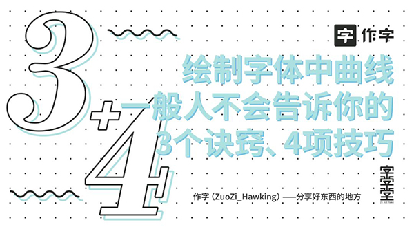
Editor: Green Onion Author: Qian Hao Hawking
Lines are the most basic components of fonts. Apart from straight lines, the drawing of curves has become the focus of making characters, and it has also become a major difficulty. The quality of curves directly affects the quality of font works. I wrote an article about curves before. "The same is the nine-year compulsory education, why do you do so well on the curve?" "

But many students are still confused, don't know how to start, and can't tell whether the curve they drew is correct? Sometimes it takes half a day or a day to adjust the curve, but the effect is still very poor...everyone wants to "die"!
Next, let's talk in detail about the tricks of drawing curves.
What kind of curve is comfortable
The word "comfortable" is relatively abstract. We can't formulate a standard to measure the curve you make, which gives people a comfortable feeling. But some rules can be summed up to help everyone make a curve that is not so inferior.
I have sorted out three tricks: point layout, handle and smoothness, which may be a bit too abstract, and then let me explain.
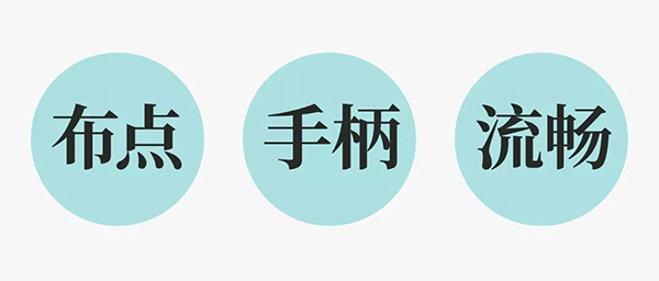
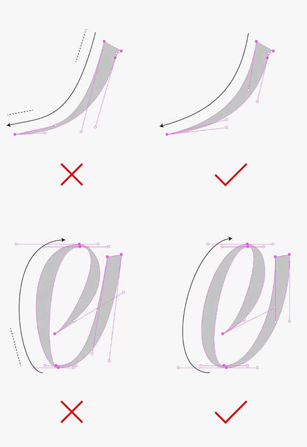
1. Layout
First of all, "arrangement" refers to the position of the anchor points. For a large-scale spiral curve, the anchor points are distributed on the extreme points of the curve, that is, the horizontal and vertical points in the curve. It can be seen intuitively in the body, and the distribution of anchor points should be uniform.
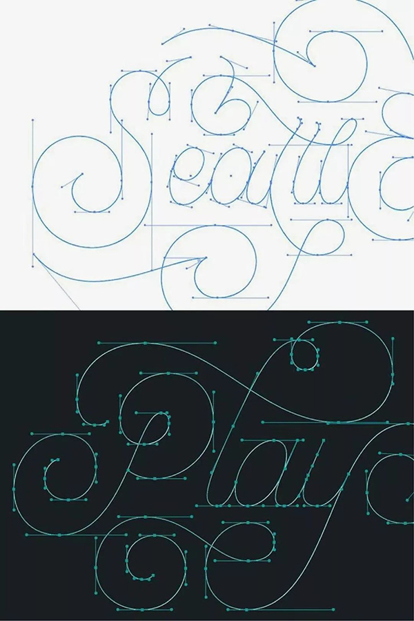
In Chinese fonts, we can understand the strokes of left and right strokes as curves. In rare cases, they will be made into large-scale curves like Western curlicues. At this time, the above method of picking points is no longer applicable. Just take points at both ends of the curve, not in the middle.

Second, handle
Secondly, "handle" refers to the joystick of the anchor point, which can also be divided into two situations. For a large-scale curve like a flower body, the handles at both ends should be extended. Short and easy to coordinate the length of the handles at both ends, so that the drawn curves will be smooth.
For a small range of curves, only the handle at one end can be activated, which can simplify the difficulty of drawing the curve and improve the efficiency of our curve adjustment.
Three, smooth
The last is the smoothness of the curve, which is the most difficult point for beginners. No matter how you adjust it, it is not ideal, until you exhaust your last patience, you can only do it hastily...
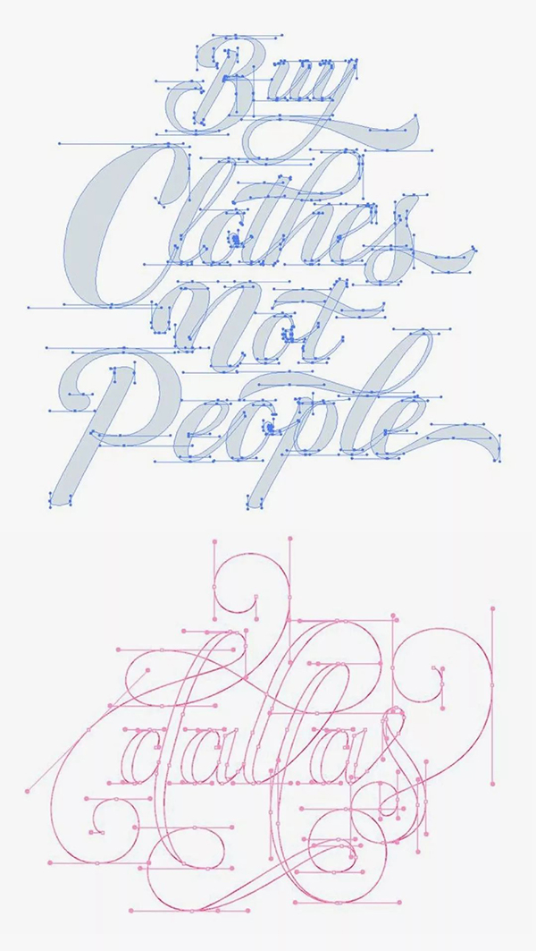
In fact, this is not so easy for designers with certain experience. It takes a long time to adjust it to the ideal state. There are still some skills to help you determine whether the curve is smooth. It is to ensure that there are no straight lines in the curve, so that the drawn curve will be smooth.
The Western font work listed in the picture below has no problem with the layout and handle, but the smoothness of the curve is not ideal. The problem is that there are a lot of straight lines in his curves, which eventually lead to unsmooth and stiff curvature.
After the above three points can be achieved, you need to do some copying to achieve the goal of proficiency. You can find some western cursive styles for copying.
In this way, presumably the quality of the curves drawn by everyone will have a qualitative leap, and a new skill for distinguishing good and bad curves has been added.
After understanding the three key points that need to be mastered, through the explanation of the proposition cases in the three "word school" and "one word a week" activities, 4 skills are summed up, so that everyone can deepen and understand the principles.
Using stroke style wisely
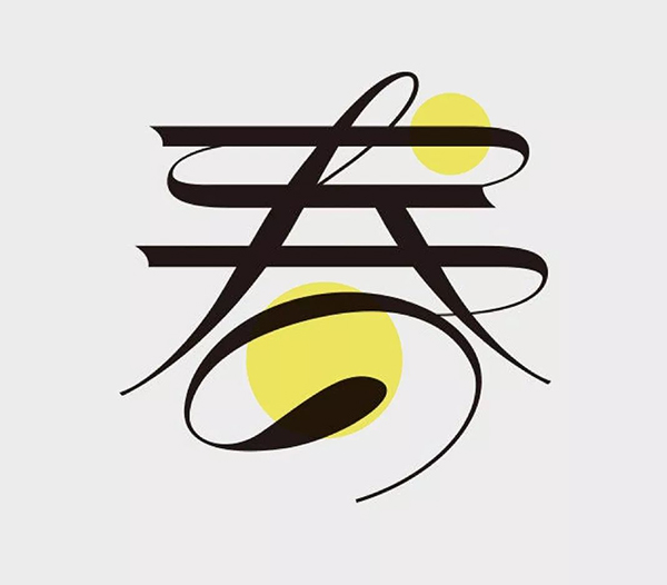
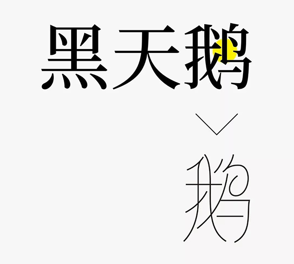
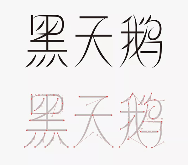
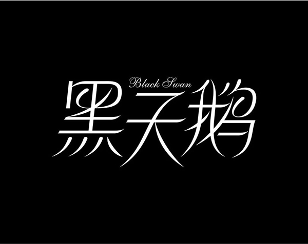
"Black Swan" from the point of view of the meaning, the use of curves is perfect. If there is no good idea at this time and the brain is blank, we can find some font works as references, draw nutrients from them, and use them for our own use. The character "spring" in the picture below must have been seen by everyone. The quality of the curves in his character is very high, and the most conspicuous is the treatment of the character "日", which is also a highlight of his work. In addition, it can also be observed that the main body of his horizontal paintings is a straight line. This is currently done to highlight the bright spots, so that the glyphs have primary and secondary, and enhance the level of the font.
For those who do not have the ability to draw, you can use strokes to draw the skeleton and curves of the font, and then make the bones and flesh, which will improve the efficiency of writing.
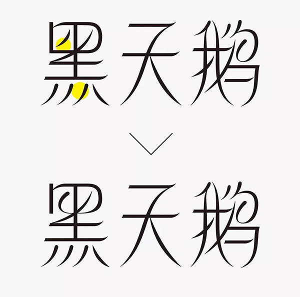
Next, let's observe the structure of the three characters "Black Swan" and see where we can add the treatment of the word "日" in the reference works. These three characters do not contain the word "日" and can only be realized by trying to simplify other structures. Among them, the character "goose" has the most strokes, which provides a good condition for simplification. We can start with this Words start.
The upper part of the "bird" in the word "goose" can be simplified to the "day" shape we want; the outline at the bottom is all adjusted to a curved shape to achieve the effect of enhancing the characteristics of the curve, but note that the radian of the curve is in accordance with the shape of the font The form itself is adjusted, so the radians are all different; the word "bird" with dense strokes is simplified; in order to emphasize the characteristics of the stroke, the stippling of the word "I" is adjusted to the stroke; finally, to further highlight the curve For softness, choose a large stroke, adjust it to an arc, and increase the center of gravity of the font, adducting the middle palace.
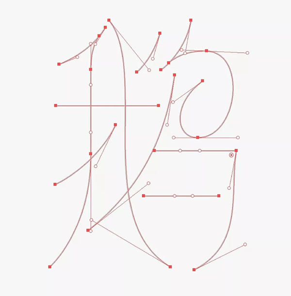
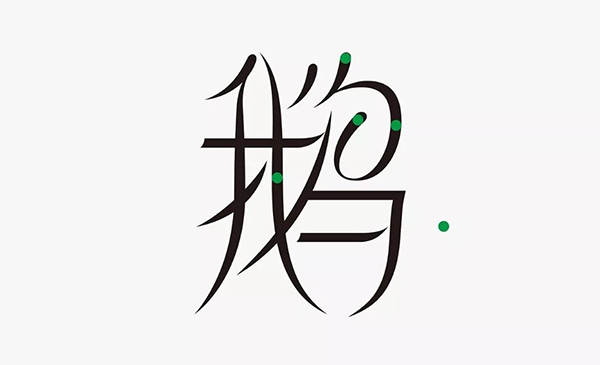
Let’s take a closer look at the path state of the curve in the “goose” skeleton.
In this way, the size of the literal is determined through the character with the most strokes. On the one hand, we design the first two characters, and the characteristics of strokes and arcs should also be reflected in the other two characters. Therefore, in order to increase the form of painting, the direction of stippling in "black" is adjusted. At the same time, arcs are added to the word "天".
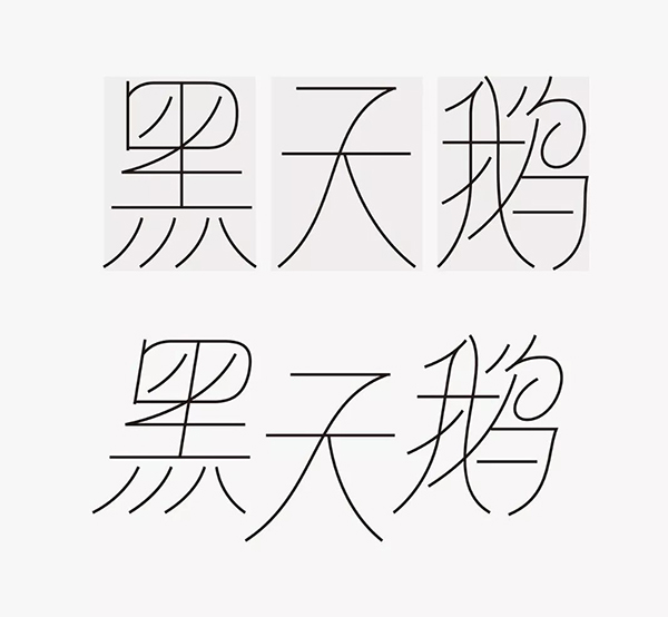
In this way, the preliminary font skeleton design is completed. In fact, this can be used as a finished draft.
A. "Stroke width configuration style" can reduce the difficulty of curves
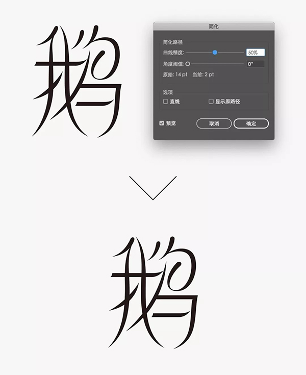
Next, you can use the stroke width configuration style that comes with the software.
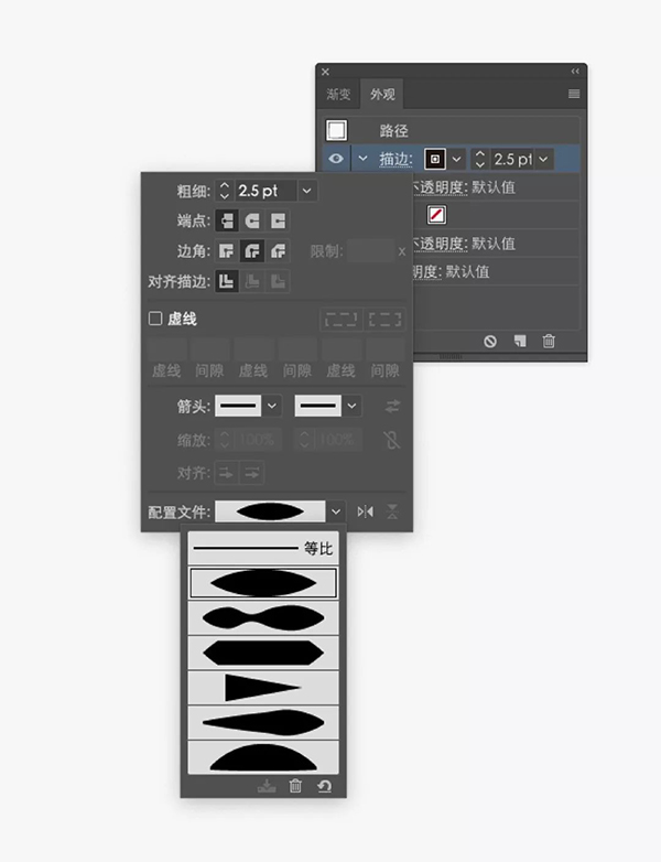
Adjust all the stroke shapes in the glyph, which can simplify the difficulty of making such curves to a certain extent.
After the strokes are uniformly transformed, adjust the shorter strokes to the shape of "teardrops".

The emphasis is on the adjustment of the large-area curve at the bright spot of the word "bird". This kind of curve can only be beautiful if the thickness changes are added at the turning point.
B. "Ellipse tool" assists in measuring the width of the curve
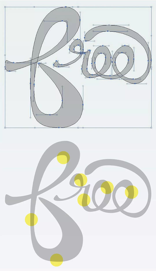
Among them, many students have poor control over the width of the curved strokes. We can use the "ellipse tool" to take out the width of the vertical strokes in the font, and use the circle as a tool to measure the width of the curved strokes.
For strokes that use the stroke width configuration style, we need to simplify the path before we can adjust the curve.
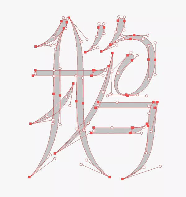
Look at the path map of the word "goose" alone.
After the initial completion, it was observed that the character "Hei" was obviously inconsistent with other characters. The problem occurred in the processing of the shape of the word "口" in the character "Hei". The glyph effect is much more harmonious.
Finally, tilt the glyphs as a whole, dislocate the arrangement, make the glyphs fuller as a whole, and add western fonts, so the design of this case is over.
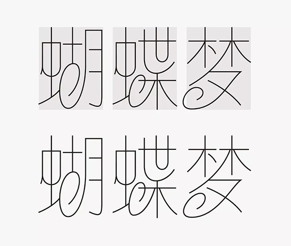
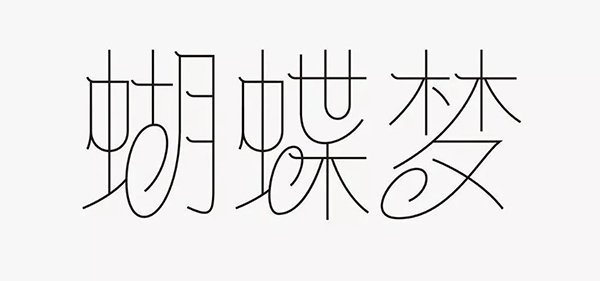
Part of the curve
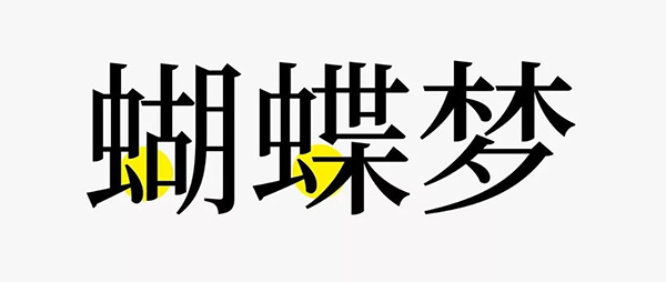
We design with the content of "Butterfly Dream". Sometimes when it comes to curved fonts, some students will adjust all strokes to curved shapes. If your ability to adjust and control is poor, this is undoubtedly digging a hole for yourself. You can also intuitively see it through the homework you received , if the adjustment is not sufficient, the font will appear loose and weak.
We can find another way, don't let the strokes have curves, only keep some strokes with curves, so that the difficulty factor of the design will be greatly reduced, and the font will have a sense of hierarchy, so as to achieve a beautiful effect.
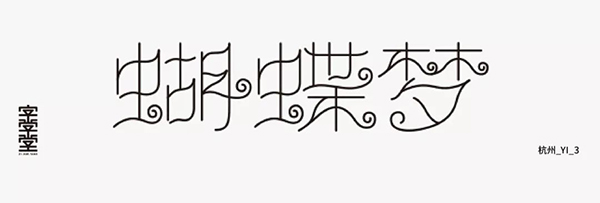
Let's take a look at the structure of the three characters "Butterfly Dream" to be done this time. The first two characters have more strokes, especially the character "胡". Consider using simplification where the strokes are dense.
C. Soft and hard contrast can highlight the curve
Firstly, the Chinese character "胡" is designed by stroke method. The whole shape of the font is guaranteed to be hard at the top and soft at the bottom. Only a wide range of curves are used in the simplification, so that the font designed in this way has changes in unity.

Then design the other two characters, and use the simplified spiral pattern as the main highlight of the whole group of characters to ensure that there is one place in each font. Among them, the word "Meng" has not found a good way to deal with it. The stroke is extended so that the structure of the bright spots regularly appears at the bottom of the font.
A tiny arc is added to the starting point of the horizontal stroke to further enhance the overall characteristics of the font.
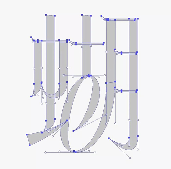
Next, from bone to flesh, you can first widen the vertical strokes in the stroke glyphs to determine the width of the vertical strokes, and then adjust them uniformly. In order to control the width of the curve, a measured circle can be made, in which the spiral line of "Meng" does not play the role of replacing strokes, so its width is set thinner. The shape of other basic strokes should also pay attention to the smoothness of the curve.

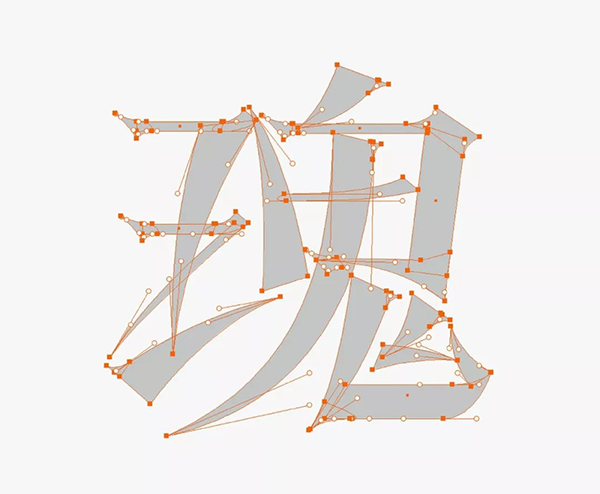
Look at the path map of the character "蝶" alone.
After the glyphs were uniformly tilted, it was found that the word "Meng" was not full enough, so the scope of the spiral line was increased, so that the overall effect was much more harmonious.

Through simple graphic adjustments, the interspersed relationship of the spiral lines is enhanced, making the curves much clearer, and with a Western font similar to the font, the design of this case is over.

The beauty of curves
The above two cases both contain a spiral structure. In fact, this structure is not used very frequently. It is more about the beauty of the curve of the font structure itself.
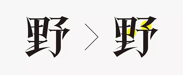
We design with "wild rose" as the content, focusing on shaping the curve of the glyph itself. Also first observe the structure of the font, combined with Song engraved style, to create a handwritten feeling. Pay attention to the influence of the intersection point of the word "朵" on the center of gravity.
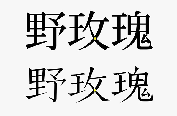
The skeleton of the font is also designed in the stroke method, and some of the vertical strokes are adjusted to a curved structure to create a sense of handwriting.
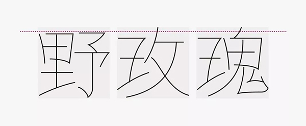
After the structure is determined, set the stroke shape to be sharp and exaggerated.
Use the stroke structure as an aid to add body decoration.
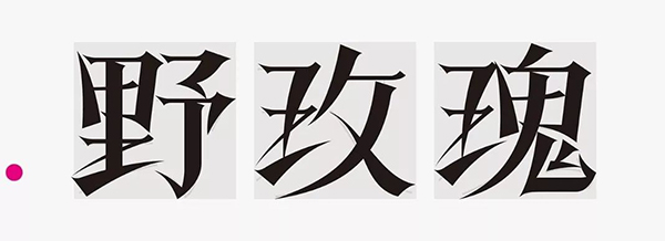
D. Do not change the stroke thickness of curves too quickly
This kind of curve is a curve at both ends of the end, remember not to take a point in the middle, pay attention to the influence of radian on the elasticity of the curve, the path diagram of the glyph can be observed in the figure below. Wherein, the change of the thickness of strokes such as left and right curves should be coordinated, and should not be changed too quickly, but should have a slow change process.
Focus on adjusting the "wild" characters with unsatisfactory interframe structures and curves.
Slant the glyph as a whole and adjust the word spacing to make it more compact.
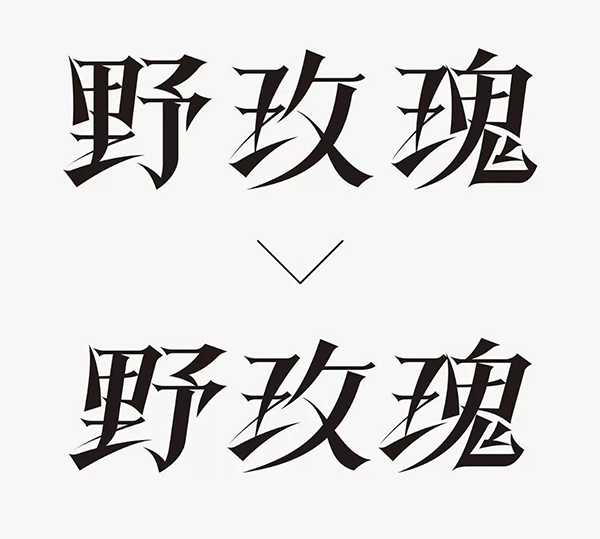
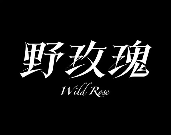
The design of this more aggressive and wild glyph is over.
Above, I sorted out 3 tricks and 4 techniques, and explained through 3 cases, from the shallower to the deeper, to introduce to you how to draw the curve in the font efficiently. I hope that everyone can be targeted and no longer lose their way.
The above reference works are all from the Internet without signature
at last
You forward, comment, like
I can eat enough
Thank you everyone! !
Articles are uploaded by users and are for non-commercial browsing only. Posted by: Lomu, please indicate the source: https://www.daogebangong.com/en/articles/detail/3%20tricks%20and%204%20tips%20for%20drawing%20curves%20in%20fonts%20that%20most%20people%20wont%20tell%20you.html
 支付宝扫一扫
评论列表(196条)
测试