
These codes are often used, such as some special effects, rounded borders, CSS transparency, trapezoidal wrapping, CSS small triangles, etc. I hope it will be useful to you
1 Simple and nice Blockquote style

The CSS code is as follows
blockquote { background:#f9f9f9; border-left:10px solid #ccc; margin:1.5em 10px; padding:.5em 10px; quotes:"\201C""\201D""\2018""\2019"; }blockquote:before { color:#ccc; content:open-quote; font-size:4em; line-height:.1em; margin-right:.25em; vertical-align:-.4em;}blockquote p { display: inline;}2 Absolute positioning of the image in the horizontal or vertical direction
css code
img { position: absolute; top: 50%; left: 50%; width: 500px; height: 500px; margin-top: -250px; /* Half the height */ margin-left: -250px; /* Half the width */} 3 Minify CSS code with PHP
<?php ob_start ("ob_gzhandler"); header("Content-type: text/css; charset: UTF-8"); header("Cache-Control: must-revalidate"); $offset = 60 * 60 ; $ExpStr = "Expires: " . gmdate("D, d M Y H:i:s", time() + $offset) . "GMT"; header($ExpStr);?>body { color: red ; }4 How to realize the small triangle symbol with css
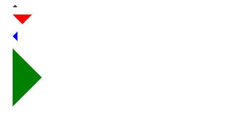
The specific code is as follows First is the html code
<div class="arrow-up"></div><div class="arrow-down"></div><div class="arrow-left">< ;/div><div class="arrow-right"></div>
css code
.arrow-up { width: 0; height: 0; border-left: 5px solid transparent; border-right: 5px solid transparent; border-bottom: 5px solid black;}.arrow-down { width: 0; height: 0; border-left: 20px solid transparent; border-right: 20px solid transparent; border-top: 20px solid #f00;}.arrow-right { width: 0; height: 0; border-top: 60px solid transparent border-bottom: 60px solid transparent; border-left: 60px solid green;}.arrow-left { width: 0; height: 0; border-top: 10px solid transparent; border-bottom: 10px solid transparent; :10px solid blue; }5. Flip the picture
CSS code
img { -moz-transform: scaleX(-1); -o-transform: scaleX(-1); -webkit-transform: scaleX(-1); transform: scaleX(-1); filter: FlipH; -ms-filter: "FlipH";}Use these codes to achieve 360 flipping of the image, the effect is as follows, there is no picture before flipping
flipped image
6 Clearfix
.clearfix:after { visibility: hidden; display: block; font-size: 0; content: " "; clear: both; height: 0;}.clearfix { display: inline-block; }/* start commented backslash hack \*/* html .clearfix { height: 1%; }.clearfix { display: block; }/* close commented backslash hack */7 Fixed positioning in IE6
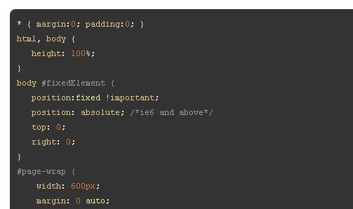
8 Hide and text text indentation
h1 { text-indent:-9999px; margin:0 auto; width:400px; height:100px; background:transparent url("images/logo.jpg") no-repeat scroll;} The above CSS code sets the text-indent to a negative value, and the text just moves to the left, which can hide part of the text
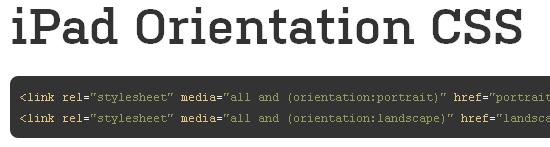
9 Locate CSS code in iPad
10 Display different links according to different file types, see the code below
/* external links */a[href^="http://"]{ padding-right: 20px; background: url(external.gif) no-repeat center right;}/* emails */a[ href^="mailto:"]{ padding-right: 20px; background: url(email.png) no-repeat center right;}/* pdfs */a[href$=".pdf"]{ padding-right: 20px; background: url(pdf.png) no-repeat center right;}This code snippet is often used to enhance user experience. Often on the Internet we find that some links will display different small icons when they are moved to it. You can use this snippet where you tell the user whether it's an external link, email, pdf, or other icon
11 Border rounded corners
.round{ -moz-border-radius: 10px; -webkit-border-radius: 10px; border-radius: 10px; /* future proofing */ -khtml-border-radius: 10px; /* for old Konqueror browsers */}12 Remove the scroll bar effect of textarea in IE
textarea{ overflow:auto;}13 Center the page
.wrapper { width:960px; margin:0 auto;}14 CSS Text Shadow Effects
p { text-shadow: 1px 1px 1px #000; }15 CSS Transparency http://www.1stwebdesigner.com/design/useful-css-snippets/
When it comes to transparency, this is really a headache. Obviously, the effect is good in Firefox and Google Chrome, but it changes in IE. Fortunately, it can be solved by the following CSS code
.transparent { filter:alpha(opacity=50); -moz-opacity:0.5; -khtml-opacity: 0.5; opacity: 0.5;}16 Vertical Center http://css-tricks.com/snippets/css/sticky-footer/
.container { min-height: 10em; display: table-cell; vertical-align: middle;}17 Min-height in IE
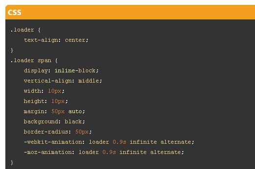
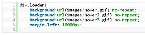
.box { min-height:500px; height:auto !important; height:500px;}18 Make gif images bouncing back and forth
19 Print page breaks
.page-break{page-break-before:always;}20 Fixed footer position
#footer { position:fixed; left:0px; bottom:0px; height:32px; width:100%; background:#333;}/* IE 6 */* html #footer { position:absolute; expression((0-(footer.offsetHeight)+(document.documentElement.clientHeight ? document.documentElement.clientHeight : document.body.clientHeight)+(ignoreMe = document.documentElement.scrollTop ? document.documentElement.scrollTop : document.body. scrollTop))+'px');}21 text rotation
.rotate { /* Safari */ -webkit-transform: rotate(-90deg); /* Firefox */ -moz-transform: rotate(-90deg); /* IE */ -ms-transform: rotate( -90deg); /* Opera */ -o-transform: rotate(-90deg); /* Internet Explorer */ filter: progid:DXImageTransform.Microsoft.BasicImage(rotation=3);}22 A link pseudo-classes (in order)
CSS code
a:link {color: blue;}a:visited {color: purple;}a:hover {color: red;}a:active {color: yellow;}23 Set ul shadow effect and border rounded corners
The CSS code is as follows
ul.box { position: relative; z-index: 1; /* prevent shadows falling behind containers with backgrounds */ overflow: hidden; list-style: none; margin: 0; padding: 0;}ul.box li { position: relative; float: left; width: 250px; height: 150px; padding: 0; border: 1px solid #efefef; margin: 0 30px 30px 0; 4px rgba(0, 0, 0, 0.27), 0 0 40px rgba(0, 0, 0, 0.06) inset; -moz-box-shadow: 0 1px 4px rgba(0, 0, 0, 0.27), 0 0 40px rgba(0, 0, 0, 0.06) inset; box-shadow: 0 1px 4px rgba(0, 0, 0, 0.27), 0 0 40px rgba(0, 0, 0, 0.06) inset;}ul.box li:before, ul.box li:after { content: ''; z-index: -1; position: absolute; left: 10px; bottom: 10px; width: 70%; max-width: 300px; /* avoid rotation causing ugly appearance at large container widths */ max-height: 100px; height: 55%; -webkit-box-shadow: 0 8px 16px rgba(0, 0, 0, 0.3); -moz-box-shadow: 0 8px 16px rgba(0, 0, 0, 0.3); box-shadow: 0 8px 16px rgba(0, 0, 0, 0.3); -webkit-transform: skew(-15deg) rotate(-6deg); -moz-transform : skew(-15deg) rotate(-6deg); -ms-transform: skew(-15deg) rotate(-6deg); -o-transform: skew(-15deg) rotate(-6deg); transform: skew(-15deg ) rotate(-6deg);}ul.box li:after { left: auto; right: 10px; -webkit-transform: skew(15deg) rotate(6deg); -moz-transform: skew(15deg) rotate(6deg) ; -ms-transform: skew(15deg) rotate(6deg); -o-transform: skew(15deg) rotate(6deg); transform: skew(15deg) rotate(6deg);}24 picture preloading function
25 Design Ladder Text
h1 { font-size: 72px; background: -webkit-gradient(linear, left top, left bottom, from(#eee), to(#333)); -webkit-background-clip: text; -text-fill-color: transparent;}Articles are uploaded by users and are for non-commercial browsing only. Posted by: Lomu, please indicate the source: https://www.daogebangong.com/en/articles/detail/25%20powerful%20CSS%20codes%20which%20are%20said%20to%20be%20tricky%20codes%20that%20developers%20often%20encounter.html
 支付宝扫一扫
评论列表(196条)
测试