The following articles are from Flying House Design Micro-magazine, author Flying House Design

www.ifeiwu.com, everything related to web design
Reprint Statement: This article is authorized to be reprinted from "Flying House DesignMicro Magazine"
ID "ifeiwu81"
Foreword
As a web designer, you may not have as much freedom with typography as other graphic designers. For example, you have no way to use other Chinese fonts in the webpage. Due to technical limitations, except for a few relatively fixed Chinese fonts (Microsoft Yahei, Song Ti, Hei Ti, etc.), the current special design of Chinese fonts can only use pictures displayed in a manner. But in the use of English, in fact, in the field of web design, there is already a very wide degree of freedom. This is also the aspect of English dissemination, based on the constant combination of 26 letters, which greatly shortens the time for information processing.
Finally, we have to face up to the problem of English application. Maybe your website is not a bilingual version, but there are still times when you need to use English (such as the display of email addresses). At this time, if you can try to use a different The default English font will make your design look different.
This time we will introduce 23 English fonts that Flying House designers often use when designing web pages. Most of the following English fonts are relatively complete "character families", and there are often changes in thickness such as "regular", "bold", "light", "thin", etc. These fonts can also be directly displayed as "text" on the webpage, so they have better extensibility and freedom. Since not every font can be used on a web page, these finishing tasks have been a must for every web designer before.
Roboto
This font is a very standard and commonly used black body, with a simple stroke design, and the Chinese collocation of "Siyuan Black Body" is very classic. It is a font that is used more often.
Quicksand
The characteristics of this font are similar to the "Youyuan" font. In terms of the structure of the font, the cavity is relatively large, and the suffix is arc-shaped, which is soft and introverted visually.
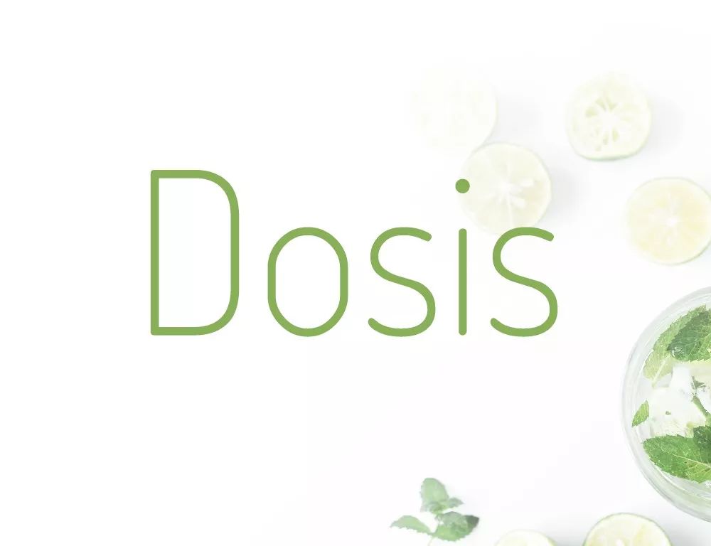
Dosis
is similar in character to the previous font, but the glyph is taller and thinner, and the character cavity presents a more special rounded rectangle.
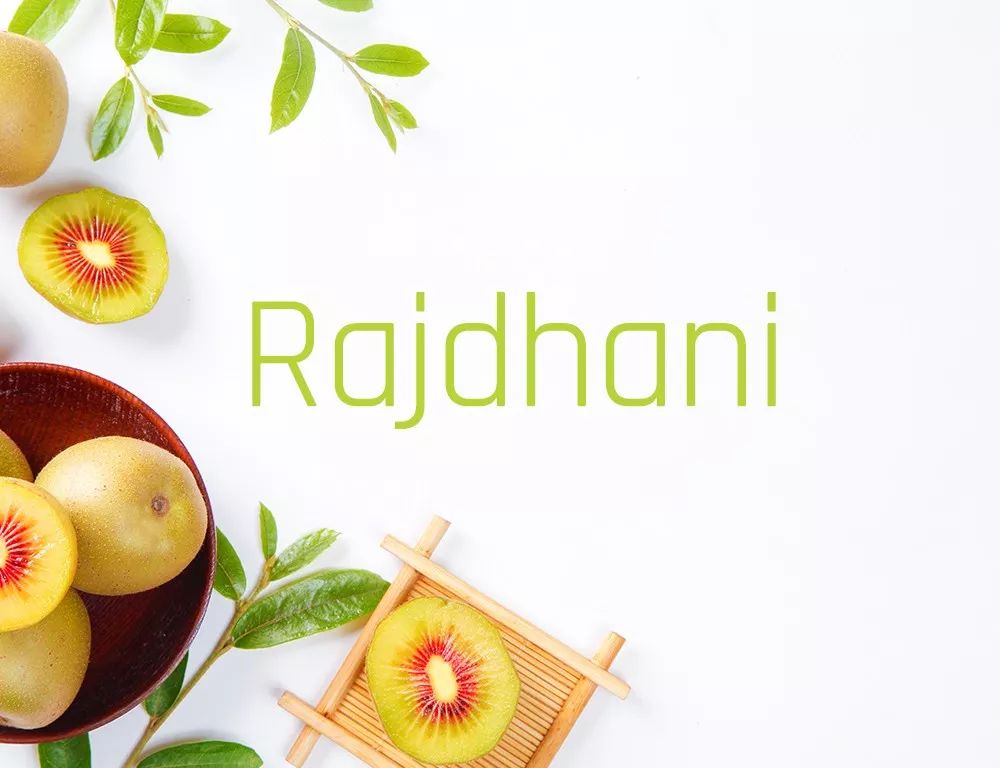
Rajdhani
is also relatively similar to the font of dosis, especially the prominent feature of the cavity, as if seeing many invisible rounded rectangles arranged in parallel, which looks very neat and regular. The suffix is a regular rectangle, which is different from the stroke shape at the end of an arc.
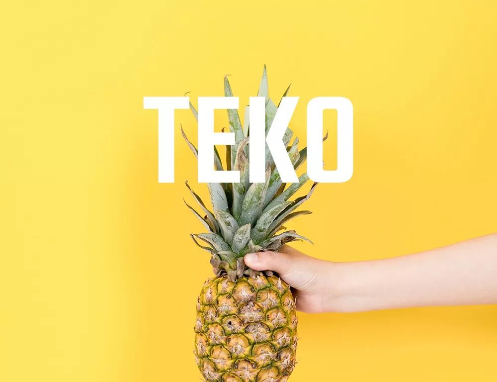
Teko
The boldness of this font is very powerful, also because of its relatively square shape and a sense of rhythm. The stroke design is very simple and sharp.
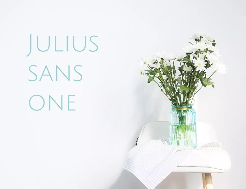
Julius>
This font is similar to the ROBOTO font, but its uppercase letters have a narrower character width, and the curved arc of the spine is smaller, which is relatively low-key, and is very suitable for minimalist web page display.

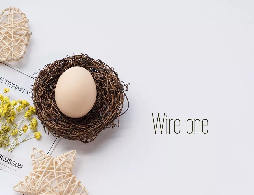
Wire>
This font can be inferred from its name. It is a linear font with a high height and a small width, showing a compact vertical shape. Such a font has a very obvious personality, and it will be quite suitable for use in web pages based on linear design.
Pattaya
This font has a slight combination of serif and handwriting features, and smooth stroke connections between letters. The cavity is small, and the overall presence of the font is strong.
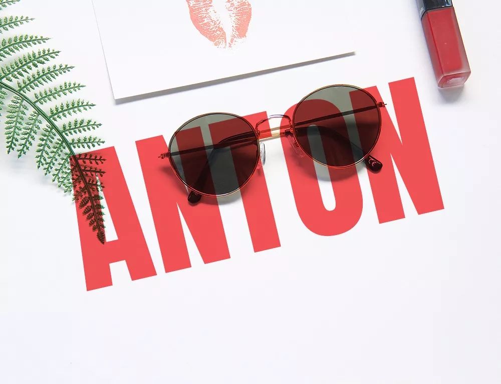
Anton
This font is also the "heavyweight" in the black body, with a vertical structure and simple and powerful stroke shape, which is very eye-catching.
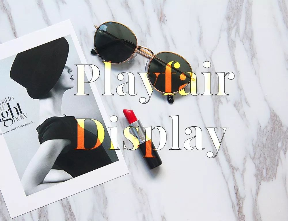
Playfair>
The strokes of this font are characterized by very thin strokes in the horizontal part and very thick strokes in the vertical part, forming a visual contrast between them, thereby enhancing the appeal of the font itself. The dots of the letters or the ears are designed as dots, which adds a sense of pattern. It can be said that this font is very suitable for display in the fashion industry.
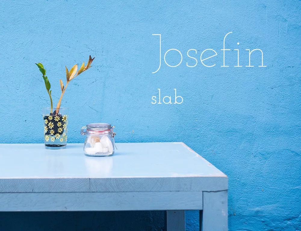
Josefin>
This font is also a relatively thin line design, which belongs to the range of serifs. Josefin also has a non-serif font. The name of the font is jossefin. Its design features are letters, such as "e" The horizontal lines in the font adopt an oblique angle, which increases the static and dull feeling of the font itself due to its uniform thickness, and adds a sense of dynamics.
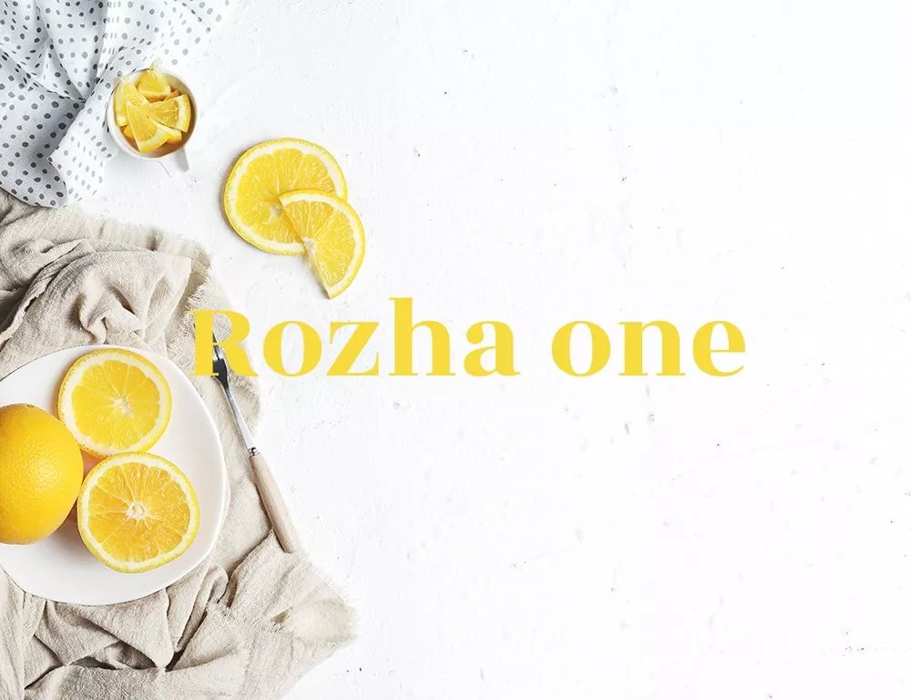
Rozha>
This font is also a very standard serif font. The design of the end of the word is a tightened cone, and the horizontal and vertical thicknesses are quite different. It has both the volume of black body and the elegance of serif body.
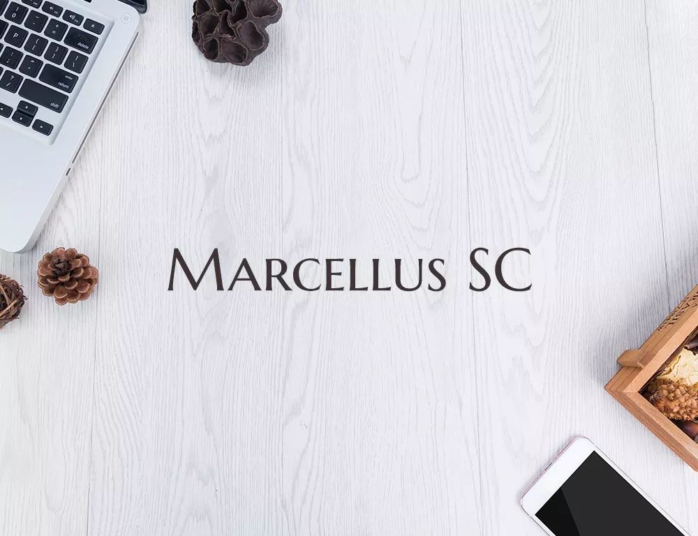
Marcellus>
This font is relatively classical, and the suffix has the characteristics of the era of stone inscriptions. Such a font has a certain sense of history and seriousness.
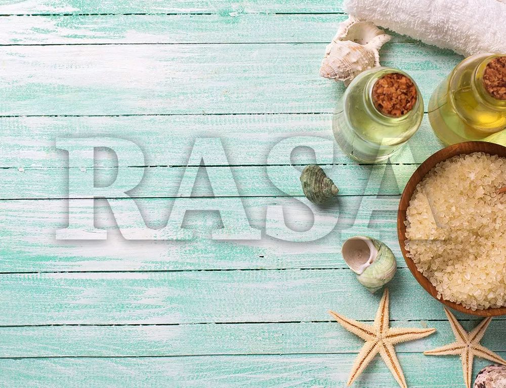
Rasa
This font is also a serif font, with a sense of volume, thick character spines, and a strong sense of presence in the overall stroke shape.
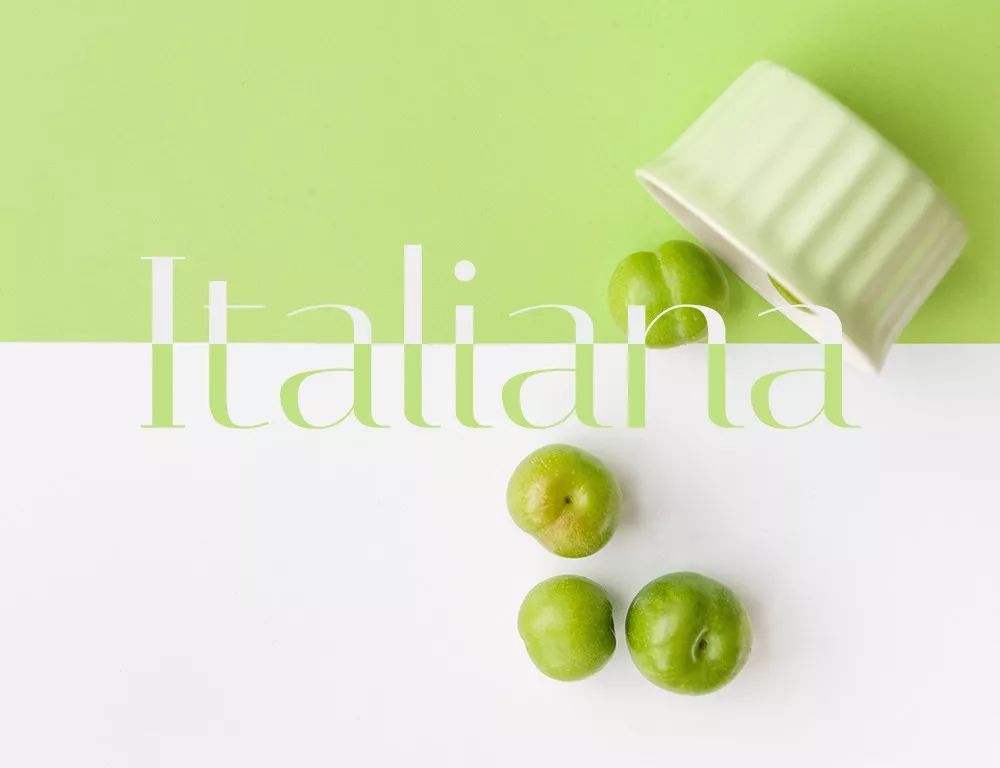
Italiana
This Italian-style font has a contracted slanted downward taper at the end of the word, and has a more prominent sharp line feature. It has the classical romance of Italian style and the simplicity and neatness of modern style.
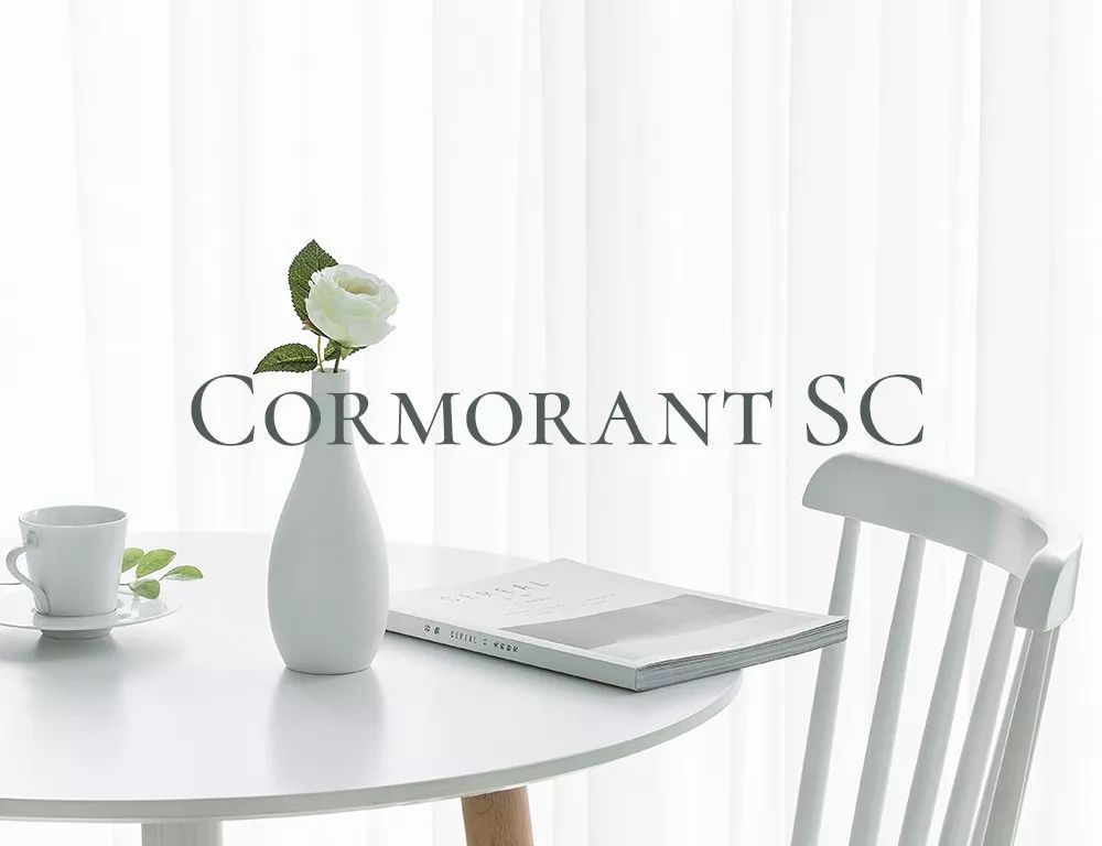
Cormorant>
Similar to the elegance of stele inscriptions, the serifs are longer and the shape is very solemn and elegant. It is used when the display content tends to be classical.

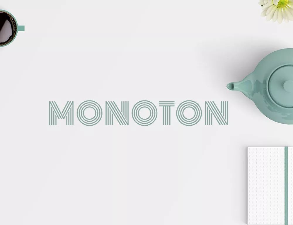
Monoton
The stroke characteristics of parallel lines, the style is very obvious. It is full of unique charm when used at the same time when displaying content with a similar line style.
Playball
Exemplary handwriting, with some features of cursive, but not obvious. Personalized style will often be equipped with handwriting.

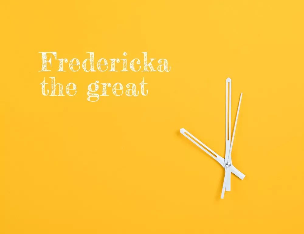
Fredericka>
The blackboard writing style of chalk characters forms a unique sentiment in various college styles. It works even better with similar chalk-style graffiti.
Raleway
The font characteristics of the serif body are not very obvious, and the serifs are arranged very low-key. The lines of the strokes are uniform in thickness, and the design of the W letter is the superposition of double V, which can be well utilized.
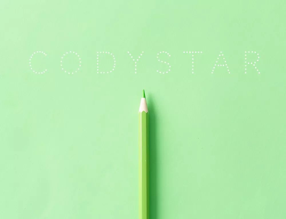
Codystar
The stylized font combined with dots has a weak sense of presence and the font is more decorative. The cuteness of the polka dots is enhanced in a similarly styled design.
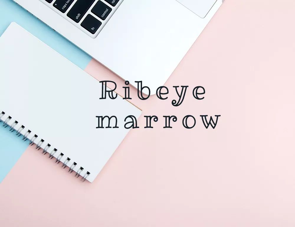
Ribeye>
Lovely children's hand-drawn font, bilinear vertical stroke design. It has a special sense of shape, and is generally used in occasions that are more childish.

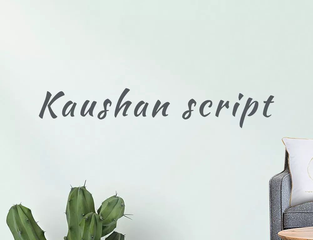
Kaushan>
Another expression of hand-drawn fonts, the letters are independent of each other, and the font will be more modern. The style is crisp, neat and highly personalized, expressing a certain sense of freedom.
Good use of fonts will bring different visual charm to your design. When using these fonts, you should also consider the overall collocation with pictures and other Chinese fonts. At the same time, you must also pay attention to the font spacing and thickness. to study. Through this study, you can realize that fonts are not as simple as text, especially in graphic design, it is both a graphic design element and a carrier of information transmission.
Download link of 23 web font compression packages, come, make a package~Link: https://pan.baidu.com/s/11e68- ccCLODIxaxAoSxq0QPassword: bqvx
Reminder: For the corresponding video explanation and material download of this set of fonts, please click the [Read the original text] link at the bottom left and enter my blog page to view it.
-END-
This content comes from the Internet, and the copyright belongs to the original author. It is for learning and communication. Commercial use is strictly prohibited. If there is any infringement, please contact us to delete it.
Articles are uploaded by users and are for non-commercial browsing only. Posted by: Lomu, please indicate the source: https://www.daogebangong.com/en/articles/detail/23%20musthave%20classic%20English%20fonts%20for%20web%20designers%20Videomaterial%20download.html
 支付宝扫一扫
评论列表(196条)
测试