"DiDiDiDi", whenever these three sounds come from the computer When it rings, the mouse on your hand will click the penguin icon in the lower right corner without hesitation to view the latest QQ information. However, this sound has been ringing for 22 years. Today, Tencent is my country's top Internet company , its business covers all aspects of social networking, games, audio and video, news portals, finance, etc. QQ has contributed a lot to making Tencent so huge. Fortunately, QQ was not sold for 500,000 at that time, otherwise such a business myth would be difficult to realize. Now, QQ has been around for 22 years. What changes has QQ’s logo undergone over the years?
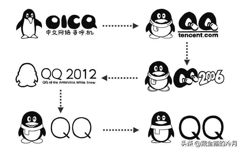
We all know that QQ’s logo is a penguin. Tencent was established in 1998. In February of the following year, OICQ, the predecessor of QQ, officially came out. In the early days of its emergence, it was mainlyEstablish an online paging system for paging stations, and its business is mainly targeted at enterprises. The reason why OICQ is used is actually because O is added in front of the AOL product ICQ. At that time, OICQ’s logo was still a lanky penguin.

By October 1999, the number of OICQ users increased, and it was replaced by ICQ parent company AOL After suing for name infringement, Boss Ma changed the name of OICQ to QQ and officially started to use QQ to dominate the Internet. At this time, QQ's logo changed into a fat penguin wearing a scarf. The last point of the "Q" was in the shape of a mouse. This logo was used for several years.

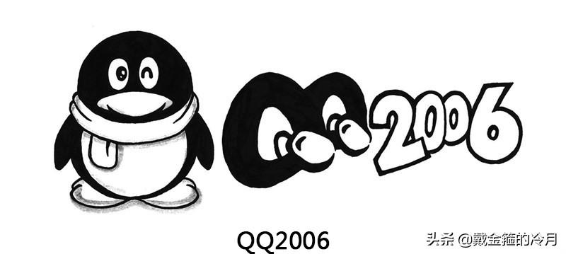
In the next few years, QQ’s penguin logo did not make any major adjustments. In 2006, the penguin was adjusted and the overall logo was elongated, and it was no longer as short and fat as before. , at the same time, "light" is added to the left eye. Moreover, QQ at this time began to adopt the "Penguin+QQ+Year" style.
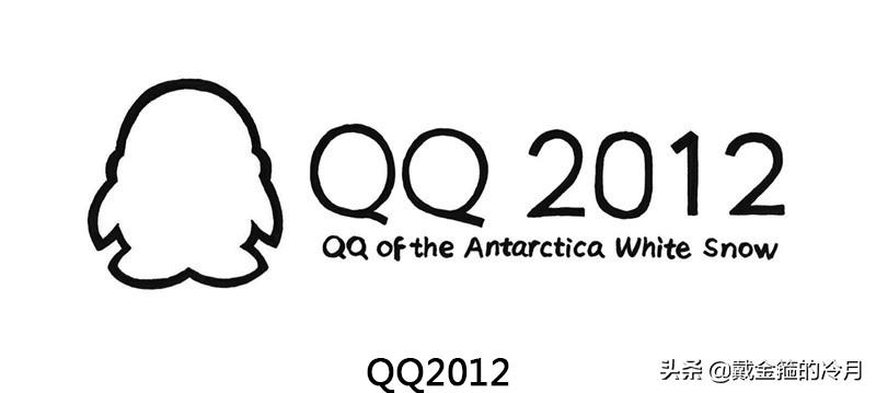
After using the "Penguin+QQ+Year" style for several years, in 2012, QQ launched a simple line-style logo, including the penguin, which was also completed with lines, and the word "Q" at the end It’s no longer represented by the mouse at all, but overall it’s still “Penguin+QQ+Year”.
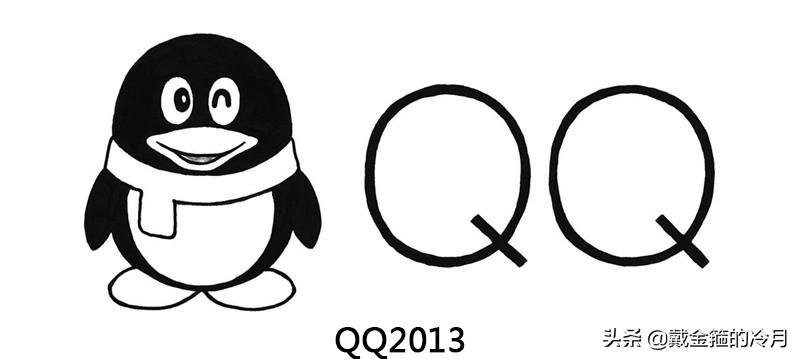
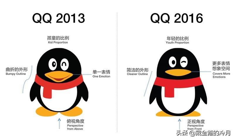
In 2013, the QQ logo made major adjustments again, abandoning the pure line logo a year ago (the login interface also used a line penguin). The penguin's scarf and eyes were also adjusted. The penguin He also grinned, and only "Penguin + QQ" remained on the overall logo, which no longer looked like a year. Moreover, after this adjustment, the penguin logos of all terminals will be unified.
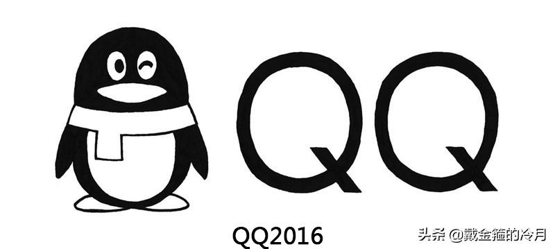
In 2016, QQ made its last major adjustment, basically from head to toe. The bright spots in the eyes disappeared, the expression was no longer grinning, and the outline of the white belly became more oval. , the curvature of the scarf has also changed. This logo has been used to this day.
Attached are two changes, which will be more intuitive.
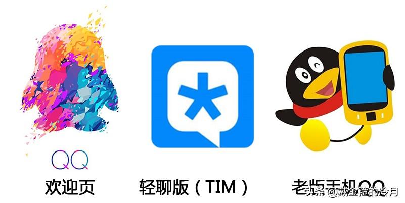
Of course, Penguin also made fine adjustments during the New Year, holidays or special circumstances, but the adjustments were based on the original basis.
Some pictures come from the Internet
Articles are uploaded by users and are for non-commercial browsing only. Posted by: Lomu, please indicate the source: https://www.daogebangong.com/en/articles/detail/22-nian-de-QQ-logo-zheng-ti-bian-hua-liu-ci.html
 支付宝扫一扫
评论列表(196条)
测试