LOGO master organizes and edits
ArticleAdobeDesignTeam
Translation:Hiiibrand
Dajun went back and looked at the few LOGO upgrade tweets he wrote recently, and found that brands seem to be playing with "fonts" when they change their LOGOs recently.
Lenovo quietly changed its logo with Chinese characters, and I didn’t even notice!
It turns out that OPPO's new LOGO is a true interpretation of "circle, circle, circle"...
Avon changes its LOGO, is it retro?
When consulting giant McKinsey changed its LOGO, it just hit the Enter key?
In addition to LOGO, there are so many places where fonts are used in design. As designers, we increasingly rely on fonts to create coherent narratives in our designs. So what are the new trends in font design this year? Dajun has added some practical examples based on the 2019 font design trends released by Adobe. Let’s take a look.
 “It has never been more important for people to learn how to ‘see’ type.”
Eight Trends
The simplest sans serif
Minimal
"Boldface will never go out of style." "Sansserifs will never die." Sans serif fonts have a very good performance in graphic design. Their slightly sophisticated modern mystique gives designers space to express and convey emotions. At the same time, sans serif became the new standard for “clean, uncluttered” design. “Modern sans-serif fonts have become mainstream spokespersons such as Helvetica.” Similarly, sans-serif fonts correspond to Chinese fonts, making boldface fonts the first choice for brand logos, visual system design, and web design. It seems that after the mass reading media shifted from paper to electronic screens, it became increasingly difficult for Song fonts to survive. viaTencent
High contrast
High
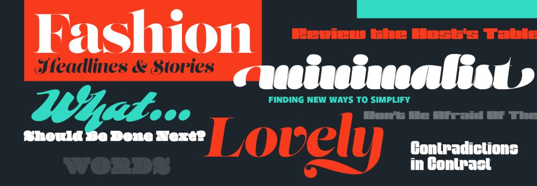
"More extreme customization and manipulation." Random design experiments are nothing in the design world. In fact, experimental work is increasingly being admired. So how can you keep up with the huge trend in graphic design? High contrast is your tool. Many font tools now allow designers to change the thickness, overlap, and spacing of fonts at will... there are too many places for us to change and adjust. Fill in some gaps. Maybe you can try using high contrast in your next UX or brand identity design.
Fauvism
Brutalism
“What can I do with this that I’m not supposed to?” Brutalism likes to push fonts directly to the edge of the page – many designers are jumping into it and trying things they shouldn’t do. "This is a new kind of postmodernism. This has a real impact on rules and standards." The font company Panagram Panagram Foundry said in related sharing: "Such brutalism is an excellent way to create tension in design. way. "When a raw and polished design jumps right in front of your eyes, it immediately catches people's attention. viaStefanHuerlemann Brutalist fonts can also create a manic, rebellious atmosphere, which is why this brutal style is so common in posters and experimental projects.
Variable fonts + dynamic display
Variable
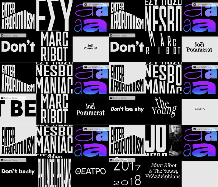
"This is probably one of the greatest type discoveries so far." "Possibly, one of the greatest type discoveries, yet." With the reform and innovation of open fonts, the previously unimaginable way of processing fonts and graphics has entered a world that can be endlessly enlarged. Shrunken customization opens up a new era. With variable fonts, you can enlarge, reduce, stretch or bend the font arbitrarily within a given range...
Articles are uploaded by users and are for non-commercial browsing only. Posted by: Lomu, please indicate the source: https://www.daogebangong.com/en/articles/detail/2019-zi-ti-she-ji-ba-da-chao-liu-qu-shi-jie-xi.html
 支付宝扫一扫


评论列表(196条)
测试