(to Front End Encyclopedia starred, Improve front-end skills)
Author: Overwinter
https://segmentfault.com/a/1190000019542534
Here I would like to share with you a collection of 20 useful rules and practical experiences summarized and recommended by major CSS websites. Some are for CSS beginners, and some knowledge points are advanced. I hope that everyone can learn useful knowledge through this article.
1. Pay attention to margin collapsing
Different from most other attributes, when vertical margin margins exist at the same time Margin collapse occurs. This means that when the bottom edge of one element touches the top edge of another element, only the larger of the two margin values will remain. Example:
- < li>
HTML<div class='square red'></div> span><div class='square blue'></div>CSS.square {< span class='code-snippet_outer' > width: 80px;height : 80px;}.red {background-color:margin-bottom: 40px;px; span>}.blue {background-color:margin-top: 30px;}

The top and bottom spacing between the red square and the blue square is 40px, not 70px. There are many ways to solve margin folding. For beginners, the easiest way is that all elements only use margin in one direction. For example, we use margin-bottom for all the upper and lower margins.
2. Use flex for layout
There is a reason for the emergence of flex elastic layout. Although floating and inline-block can also achieve many layout effects, they are essentially tools for text and block element layout, not for the entire web page. flex makes it easy to create layouts the way we expect them to.
Flex has a set of properties for "flex container" and a set of properties for "flex item", once you learn them, doing any responsive layout is a piece of cake. At present, the latest versions of various browsers have no problem supporting flex, so you should use more flex layouts.
.container {display: flex;}
3. Reset the CSS style of the element< br >
Although there have been great improvements over the years, there are still large differences in the default styles for various elements between different browsers. The best way to solve this problem is to set a common CSS Reset reset code for all elements at the beginning of CSS, so that you are laying out without any default inner and outer margins, so the resulting The effect is uniform.
There are already mature CSS code bases on the Internet to solve browser inconsistencies for us, such as normalize.css, minireset and ress, you can reference them in your project. If you don't want to use third-party code libraries, you can use the following styles to do a very basic CSS reset:
* {margin: 0;padding: 0;box-sizing: border-box;}
The code above looks a bit domineering, setting the inner and outer margins of all elements to 0, but there is no such default The influence of the inner and outer margins makes our subsequent CSS settings easier. At the same time box-sizing: border-box is also a great setting, we will introduce it shortly.
4. All elements are set to Border-box
Most beginners don’t know the property of box-sizing, but Actually it is very important. The box-sizing property has two values:
content-box (default) - when we set the width or height of an element, we set the size of its content . All padding and border values are excluded. For example, if a div has a width of 100 and a padding of 10, the element will occupy 120 pixels (100+2*10).
border-box - padding and border included in the element's width or height, one set to width: 100px and box-sizing:
The div element of border-box has a total width of 100px, regardless of its inner margin and border.
Setting all elements as border-box makes it easier to change the size of the element without worrying that the padding or border value will stretch the element out of shape or display it in a new line.
5. Use pictures as background
When adding pictures to the page, pictures are especially needed When it is responsive, it is best to use the background attribute to introduce images instead of the <img> tag.
This may seem more complicated with images, but it actually makes styling images much easier. With background-size, background-position and other attributes, it is more convenient to keep or change the original size and aspect ratio of the image.
For example:
HTML
- < li>
<section><p>Img element</p><img src='https://tutorialzine.com/media/2016/08/bicycle.jpg' alt='bicycle'></section>
< /span><section><p>Div with background image</p><div></div> ;</section>
CSS
- < li>
img {width: 300px;height: 200px;}div {width: 300px;height: 200px;< span class='code-snippet__attribute' >background: url('https://tutorialzine.com/ media/2016/08/bicycle.jpg');background-position : center center;background-size: cover;< /span>}
< /code>section{float: left;margin: 15px;}
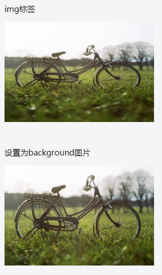
One disadvantage of introducing images in the background is that the web accessibility of the page will be slightly affected, because screen readers and search engines will not be able to correctly pick up the images. This problem can be solved by using the CSS object-fit property. So far, all browsers except IE can use object-fit.
6. Better table borders
Tables in HTML are always ugly. They are hard to make responsive, and generally hard to change styles. For example, if you want to add a simple border to a table and its cells, the most likely result is:
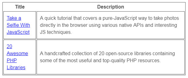
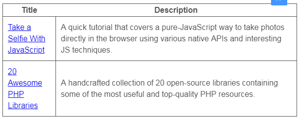
As you can see, there are a lot of repeated borders, which looks ugly. Here is a quick way to remove all double borders:border-collapse: collapse, just set this property, the border of the table looks much more pleasing to the eye :
7. More friendly comments
CSS may not be a programming language, but its Code still needs to be documented. Adding some simple comments can classify and distinguish the code, which is convenient for yourself and colleagues to maintain later.
For large area divisions or important components, the following comment styles can be used:
- < li>
/*--- ------------#Header---------------*/header { }header nav { }/*--------- ------#Slideshow---------------*/.slideshow { }
For details and less important styles, you can use single-line comments:
/* Footer Buttons */.footer button { }< span class='code-snippet_outer'>.footer button:hover { }
Also, remember that There are no // comments in CSS, only /**/ comments:
- < li>
/* Correct*/p {padding: 15px;/*border: 1px solid #222;*/}< /code>/* Error*/< /code>p {padding : 15px;// border: 1px solid #222;}
8. Short horizontal line naming
When class or When an ID contains multiple words, a hyphen (-) should be used, and CSS is not case-sensitive, so camelCase cannot be used. Similarly, it is not recommended to use the naming method of underscore connection in CSS.
- < /ul>
/* Correct*/< span class='code-snippet_outer' >.footer-column-left { }/* Error*/.footerColumnLeft { }.footer_column_left { }
When it comes to naming, you can also consider BEM, which follows a set of principles, provides a component-based approach to development and adds consistency.
9. Do not set repeatedly
The values of most CSS properties are obtained from the DOM tree Inherited by elements one level above in the , hence the name cascading style sheets. Take the font property as an example - it is always inherited from the parent and you don't have to set it individually for every element on the page.
Just add the font style you want to set to the <html> or <body> element, and let them automatically inherit downward.
html {font: normal 16px/1.4 sans-serif;}
Then we can change all the text styles on the page at once. Of course, not all properties in CSS are inheritable, and for these properties we still need to set them individually on each element.
10. Use the transform attribute to create animation
It is best to use the transform() function to create the displacement or size animation of the element , try not to directly change the width, height and left/top/bottom/right attribute values of the element.
In the example below, we add a left-to-right animation to the .ball element. It is recommended to use the transform: translateX() function instead of the left attribute.
- < li>
.ball {left: 50px;transition: 0.4s ease-out;}/* not recommended*/.ball.slide-out {left: 500px span>;}
< /span>/* Suggestion*/.ball.slide-out {transform: translateX(450px);}
transform and all its functions (translate, rotate, scale, etc.) have almost no browser compatibility issues and can be used at will.
11. Don't DIY, use more code bases
The CSS community is very large, and new code bases are constantly appearing. They have a variety of uses, from tiny pieces to monolithic frameworks for building responsive applications. Most of these are also open source.
The next time you're faced with a CSS problem, before you try to go all out on it, check to see if there's already a solution available on Github or Codepen.
12. Keep selectors low weight
css selectors and Not all are created equal. When I first learned CSS, I always thought that a selector would override everything on it. However, this is not the case, as we illustrate in the following example:
HTML
<a href='#' id=' blue-btn' class='active'>button</a>CSS
- < li>
a{color: #fff;padding : 15px;}a#blue-btn {background-color: blue;}< /code>a.active {background-color: red;}< /span>

We want the styles set in the .active class to take effect and make the button red. But it won't work because the button has an ID selector on it, which also sets the background-color, and the ID selector has a higher weight, so the color of the button is blue . The weight size specification of the selector is as follows:
ID (#id) > Class (.class) > Type (e.g. header)< span > The weight will also be superimposed, so the weight of a#button.active is higher than that of a#button. Using high-weight selectors at the beginning will cause you to continue to use higher-weight selectors in subsequent maintenance, and finally choose to use !important, which is not recommended, for specific reasons I'll get to that shortly.
13. Don't use !important
Seriously, don't use !important. What looks like a quick fix for now, may end up causing a lot of rewriting. Instead, we should take the time to find why the CSS selector is not working and change it.
The only time you can use !important is when you want to override inline styles in HTML, but inline styles are also a bad habit and should be avoided as much as possible.
14. Use text-transform to convert letters to uppercase
This article is suitable for English environment, not for Chinese
In HTML, you can write a word in all capital letters to express the meaning of emphasis. For example:
<h3>Employees MUST wear a helmet!</h3>If you need to convert a certain text to all uppercase, we can write it normally in HTML, and then convert it through CSS. This keeps the content of the context consistent.
<div class= 'movie-poster'>Star Wars: The Force Awakens</div>.movie-poster {text-transform : uppercase;}
15.Em, Rem and px
Set which unit should be used for the size of elements and text, em, rem, or px ? There has always been a lot of debate. The truth is that all three options are viable and have their pros and cons.
There is no final conclusion on when to use which project and which unit. Developers have different habits and different project requirements, so they may use different units. However, while there are no hard-and-fast rules, there are some caveats for each unit:
em - sets the element to 1em, its size relative to the font-size property of the parent element. This unit is used in media queries, especially for responsive development, but since the em unit is calculated relative to the parent element at each level, it is necessary to obtain a child element em unit The corresponding px value is sometimes very troublesome.
rem - Computed relative to the font-size of <html> elements, rem makes it very easy to uniformly change the text size of all headings and paragraphs on a page.
px - Pixel units are the most accurate, but not suitable for responsive designs. The px unit is reliable and easy to understand, and we can finely control the size and movement of elements up to 1px.
Most importantly, don't be afraid to experiment, try everything and see what works best. Sometimes em and rem can save a lot of work, especially when building responsive pages.
16. Use preprocessors for large projects
You must have heard of them - Sass, Less, PostCSS, Stylus . Preprocessors are the future of CSS. They provide things like variables, CSS functions, selector nesting and many other cool features that make CSS code more manageable, especially in large projects.
As a simple example, here is a snippet of SASS code that uses some CSS variables and functions:
- < li>
$accent-color: #2196F3;a {< /code>padding: 10px 15px;background-color: $accent-color;}a:hover {background-color: dark($ accent-color,10%);}
The only downside to preprocessors is that they still need to be compiled to plain CSS. The custom properties introduced by CSS are preprocessing in the true sense.
17. Use AutoPrefixer to achieve better compatibility
The browser prefix is in CSS One of the most annoying things is that the prefix required for each attribute is inconsistent, you never know which one you need, if you really have to manually add it one by one to the stylesheet, it is undoubtedly a boring nightmare.
Thankfully, there are tools that automatically provide us with the ability to add browser prefixes, and even decide which browsers need to be supported:
Online tools:Autoprefixer
Text Editor Plugins:Sublime Text, Atom
Codebase:Autoprefixer (PostCSS)
18. Compress CSS files
In order to improve the website and application load speed and page load, you should use compressed resources. A compressed version of the file will have all whitespace and repetition removed, thereby reducing the overall file size. Of course, this process also makes the stylesheet completely unreadable, so use the .min version in production, while keeping the regular version for development.
There are many different ways to minify CSS code:
Online tools:CSS Minifier, CSS Compressor
Text Editor Plugins: Sublime Text, Atom
Codebase: Minfiy (PHP), CSSO, CSSNano (PostCSS, Grunt, Gulp)
Depending on your workflow, you can use any of the above.
19. Caniuse
There are still many compatibility inconsistencies between web browsers for CSS properties. Use caniuse to check if the attribute you are using is widely supported? Is a prefix required? Or are there any caveats to using in a certain browser? With caniuse you will be more handy when writing CSS.
20. Validate
Validating CSS may not be as important as validating HTML or JavaScript code, but run your Code is still very useful. It will tell you if you have made any mistakes, warn about incorrect usages, and give you hints to improve your code.
Like compression and Autoprefixer, there are free tools to take advantage of:
Online tools:W3 Validator, CSS Lint
Text Editor Plugins:Sublime Text, Atom
Codebase:stylelint (Node.js, PostCSS), css-validator (Node.js)
Recommended reading
(Click on the title to jump to read)
The Story of a Flying Wire (SVG)
How to Learn CSS
9 CSS Tips to Boost Your Happiness
Find this article helpful to you? Please share with more people
Focus on "Front-end Daquan" and add stars to improve front-end skills
Good article, Ireading❤️
Articles are uploaded by users and are for non-commercial browsing only. Posted by: Lomu, please indicate the source: https://www.daogebangong.com/en/articles/detail/20%20CSS%20coding%20tricks%20to%20make%20you%20more%20efficient.html
 支付宝扫一扫
评论列表(196条)
测试