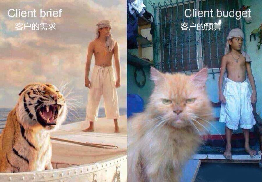
There is a magical existence called Party A. They have strange demands and strange aesthetics, and when they say no, their bodies are actually rejecting—"Oh, I don't know what I want, but please surprise me!" Facing these neurotic customer requests, Brother Qu I just want to say, Party A abused me thousands of times, so come on, who told you to look like someone's first love.
Source: Network @ Excellent Web Design
Organization: potted plants
=============================
1.
"I want the background of the website to be white, but look darker."
2.
"Can you follow up with DHS to make sure we don't have malware on our website?"
3.
Client: Use typewriter font for the return address.
Me: Like Courier? (typeface originally used on typewriters)
Customer: No, not Courier. Attention, it is a typewriter font!
I sent him an email in Courier font.
Me: like this, right?
Customer: Yes, it's perfect. Just listen to me sooner next time.
4.
Customer: How about making this information more prominent, with a larger font size, and the blank space next to it is no longer required.
Me: No, whitespace makes the information stand out visually and makes it easier to read. It is much more prominent than the large characters piled up together.
Customer: I want value for money, I'm not paying for blanks. Do as I say.
5.
Customer: Hello, I asked my friend and he said that you use Hotmail to make your website.
Me: Sorry, I don't understand what you mean.
Client: My website is made by you using Hotmail.
Me: This is really impossible, and no one can do it. Hotmail is Microsoft's free email service, not a development environment.
Client: My friend is a computer expert, he's sure.
Me: Is your friend around?
Customer: Yes.
Me: Let him answer the phone.
Friend: Admit it, my friend's website is made with Hotmail.
Me: Sir, we are not capable of this. What makes you think it's made with Hotmail?
Friend: All pages on the site end in .html.
6.
"The classical style seems too rustic and backward, and the modern style is not high-end, you should think about it!"
7.
Client: The photo of our chairman is too fat, please make me thinner.
me: ok.
Customer: In addition, the light is too dark, there are many wrinkles on the face, and there is also a lot of oil, so I get rid of them.
me: ok.
…
Me: The picture has been sent, do you think it is okay to modify it like this?
Customer: Why is it so ugly, please change it.
Me: using PS to blur...
After several revisions, I had no choice but to send the earliest unmodified picture.
Customer: All right, just use this one, it looks good.
I:......
8.
Customer: I found a problem with the website.
Me: Ok, what went wrong?
Customer: The color is wrong, the font is wrong, and the company name is wrong. None of us have confirmed the design. How did it happen?
Me: Sir, you opened the wrong website, your website is this link.
Customer: That's right, it looks better. Thank you for getting this done so quickly.
9.
I have a picture here that you are going to use in the ad that you are doing now, but I think it needs to be flipped. Can this be done?
The photo shows three people sitting in a bar with their backs to the camera.
Me: That's not a problem, just change the mirror image.
Client: No, I want you to flip it over so we can see their faces.
10.
Customer: What font is this, can you redesign it?
Me: This is Wang Xizhi's font, how should I design it?
Client: Where is Wang Xizhi himself? Why didn't you come to propose?
I:...
11.
Me: The website won't be finished by Wednesday at the latest, but you seem to be in a rush, so I'll try to get it done as soon as possible.
Customer: Oh? When can it be done?
Me: Wednesday, but I will as soon as possible.
Customer: Can you be more specific? Wednesday or what day of the week?
Me: Wednesday.
Customer: Then what do you mean as soon as possible?
Me: I made the site as fast as I could, hope this helps you.
Client: I don't understand.
Me: The website will be ready on Wednesday.
12.
Me: Okay, bigger thumbnails, huh? How about 2 or 3 thumbnails per line?
Client: How about something between 2 and 3?
13.
"The text looks too literal."
14.
"I went to France to see the Louvre, and it felt very luxurious, and our real estate also needs the same feeling!"
15.

16.
"The tree needs to look a little more natural...but it has to be purple."

17.
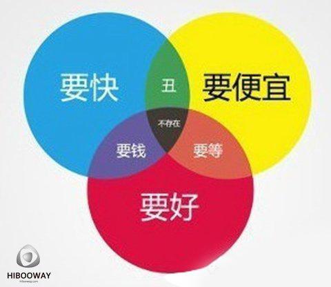
I just want to throw the picture below on Party A's face...

18.

Articles are uploaded by users and are for non-commercial browsing only. Posted by: Lomu, please indicate the source: https://www.daogebangong.com/en/articles/detail/18%20Strange%20Party%20A%20Sent%20by%20the%20Devil%20to%20Torture%20You.html

 支付宝扫一扫
评论列表(196条)
测试