All rights reserved
-
This article is authorize by GCFlernFree, and Published in Our blog of Graphic Design Study Diary. If you need to reprint, please contact: "GCFLearnFree.org" to obtain legal authorization.
Original Address: https://www.gcflearnfree.org/beginning-graphic-design/
-
Copyright
This article was applied to GCFlearnFree by @酷coo豆, and was published on Graphic Design Learning Diary Network after authorization. If you need to reprint, please contact "GCFLearnFree" to obtain legal authorization.
Chinese translation: @酷coo豆. WeChat public account: followdesign. Website: http://www.xxriji.cn
Introduction
Preface
-
This is the first of 5 tutorials in the "Quick Start for Self-study Graphic Design" series.
This series of articles, through video graphics, vividly explains graphic design: Typography, Color, Image, Typesetting composition, Design basics and other related knowledge points. It can help graphic design self-students to grasp the knowledge framework of learning graphic design and related professional terms more clearly and quickly.
Whether you are a clerical worker or a future graphic designer, you will benefit from it. The knowledge points learned can be directly applied to your PPT design, business plan, and professional graphic design projects. @酷coo豆 I personally think that the following knowledge should be defined as: Basic design knowledge that everyone can learn.
1. What is typography?
What is typography?
-
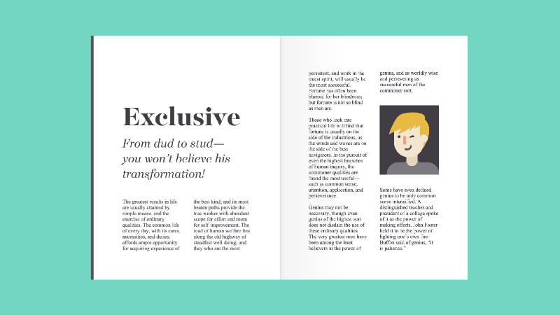
Typography, we see it almost everywhere. It exists in the books we read, websites, and in our daily life, such as road signs, car stickers, and product packaging.

So what exactly is typography? Simply put, Typography is designing the look or style of text. It can also refer to the art of working with text, and if you create various documents or other projects for work, school, or yourself, chances are you've been doing typography all along.
>>Watch the video below to learn more about typography.
2. Common font types
Common types of fonts
-
Typography can be an intimidating subject, but it doesn't have to be. You just need to know a little bit to make a huge difference in the designs you do every day. So, let's get started. First of all, you need to have a certain understanding of common types fonts.
2.1 Serif fonts
A serif font, with some extra strokes added to the main body of the letter (or Chinese character), is called serif.
Tip: 宋体 in Chinese characters is the most common serif font; and the most classic English serif font is: Times new Roman.
Because of their classic shape, serif fonts are a good choice when working on some traditional design projects. At the same time, they are also common in print publications such as magazines and newspapers.
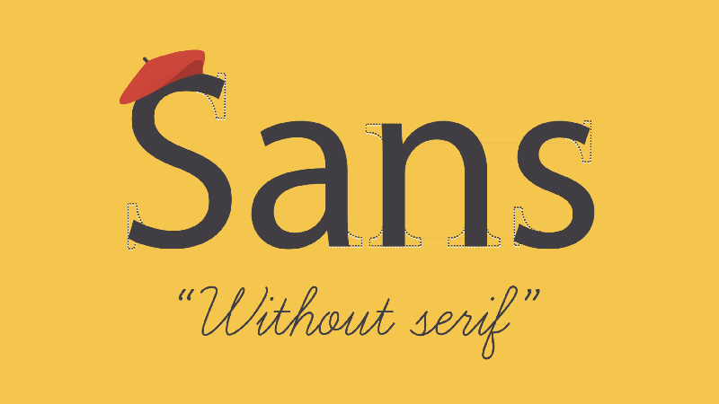
2.2 Sans serif fonts (Sans serif fonts)
Sans serif font, named because there are no additional decorations, the "no (Sans)" in "serif" is a French term.
This style of font is considered more clean and modern than serif fonts. And, it's easier to read on computer screens, smartphones, tablets
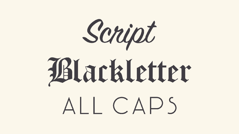
2.3 Display fonts (Display fonts)
Display fonts are fonts with a unique artistic style. There are many different styles, such as cursive, gothic, uppercase, and swash.
Due to their decorative properties, presentation fonts are best suited for text-less scenarios, such as headers and titles, and heavily graphic design scenarios.
Third, choose a font
Choosing a font
-
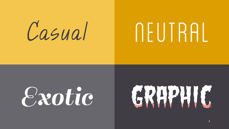
To some extent, each typeface has its own unique language. The meaning they can express has gone beyond the literal meaning of the text. They can be: casual, neutral, unique, or figurative impression. So you have to according to the content of your copy, and then choose a suitable font, which will be particularly important.
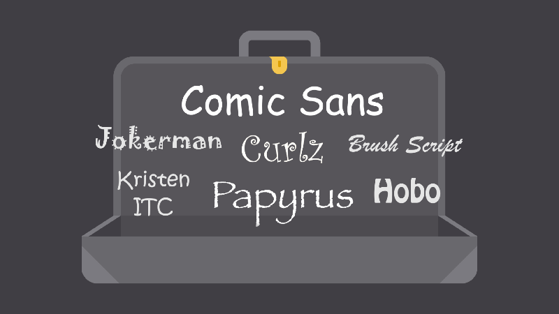
3.1 Fonts to avoid (Fonts to avoid)
There are some fonts with extra decoration, such as comic fonts, curly fonts like curly hair, mottled papyrus texture fonts. There's nothing particularly wrong with these fonts themselves, they're just outdated because they've been overused by too many people.
If you find yourself drawn to them, think twice and consider a different typeface. In fact, there are plenty of fonts that have a similar look and feel to the ones above, and using them is less likely to detract from the value of your message.
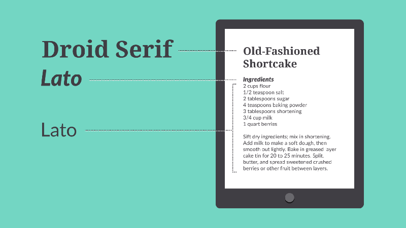
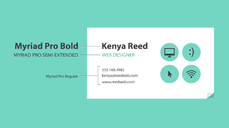
3.2 Combining fontsCombining fonts
When deciding which typeface to use, remember: Less is more. In a design project, it is best to limit to one or two fonts. If you need more contrast, try reusing one of the fonts in different sizes, weights, or styles. This trick is almost foolproof when it comes to creating interesting typography.
You've probably heard the saying "opposites attract", and yes, that applies to fonts as well. Don't worry about combining fonts that are different in style but complementary, such as sans-serif and serif, short and tall, or decorative and simple font. This may be challenging at first, but don't lose faith. Look at other great designs for inspiration, and you'll get the hang of it in no time.
Four. Other important terms
Other important terms
-
Chances are you've heard terms such as: Word spacing, Line spacing, Word width and Hierarchy . For those experienced designers, these concepts are crucial to creating more design-inspired work. As a beginner in graphic design, you don't need to know everything about these terms, they just help you talk about design more confidently and give you a better understanding of your work. Have confidence.
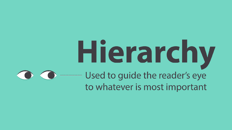
4.1 Hierarchy (Hierarchy)
Hierarchy is used to direct the reader's eye to the most important things. Using different levels of emphasis can directly show people where to start reading and where to look next.
Establishing a hierarchy is easy: just decide which visual element you want the reader to notice first, and prominent it. Higher-level projects are usually larger, more prominent, or stand alone. Remember: keep it uncluttered, and stick to some complementary styles.
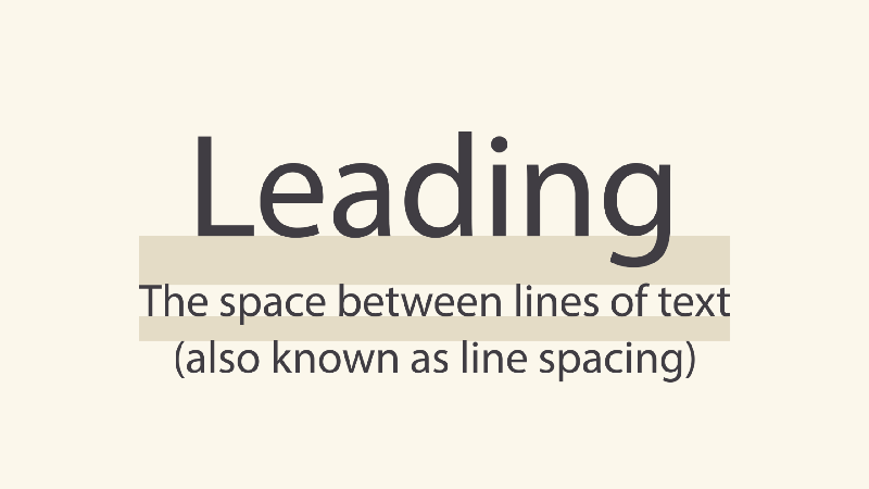
4.2 Line Spacing (Leading)
Line spacing, is the gap between lines of text, usually referred to as line spacing.
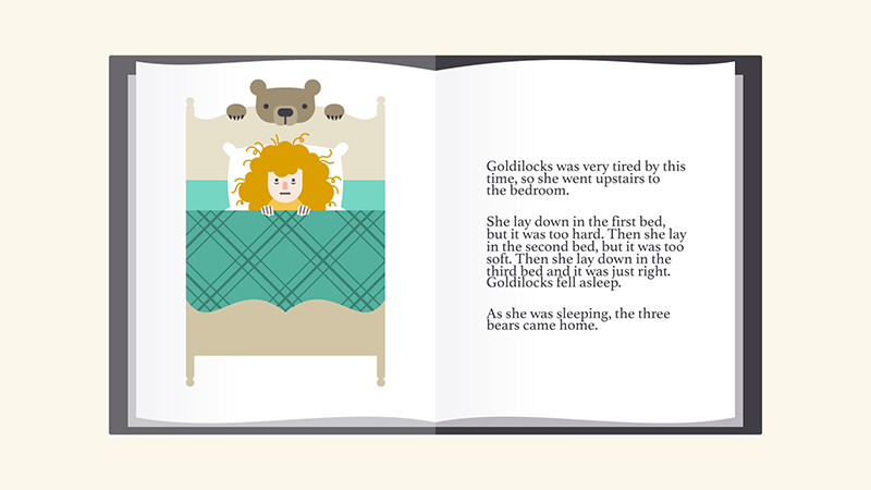
If you're not sure what leading to use, don't worry - the defaults are usually fine. Make your article as comfortable as possible to read, this is the ultimate goal. Line spacing that is too large or too small will make readers feel uncomfortable, just like the example below.
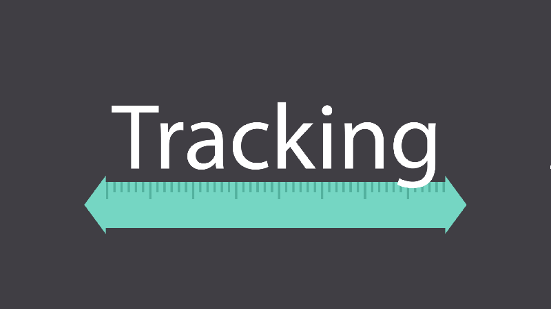
4.3 word width distance (Tracking)
The word width distance is the overall space occupied by all characters of a word, sometimes also called word width. Most programs allow you to shrink or increase the font width, depending on the needs of your project.
In some graphic design works, you can adjust your font width to create some unique artistic effects. It can also help you trim those underkerned fonts.
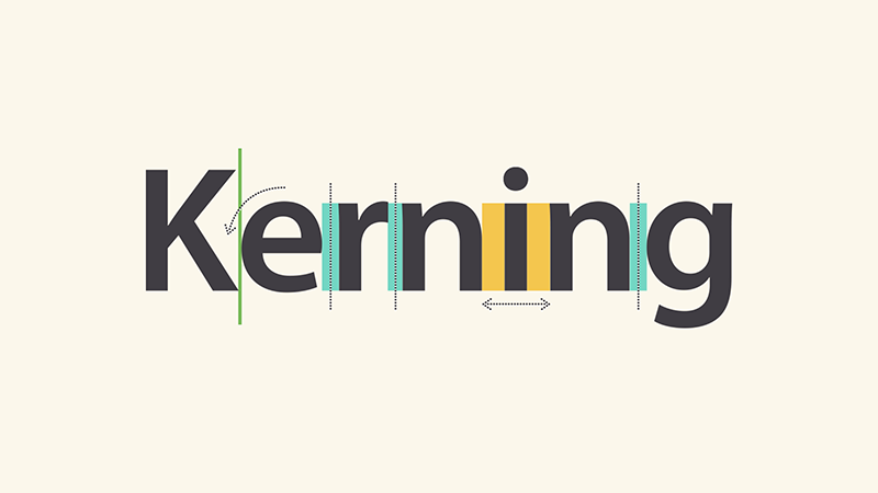
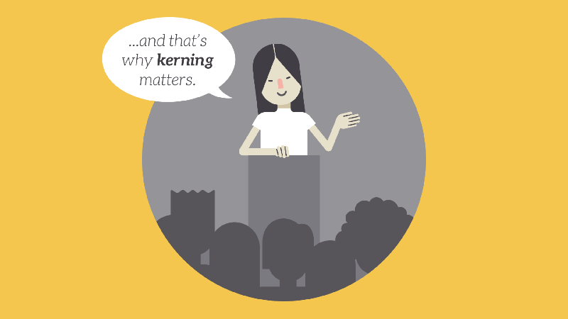
4.4 Kerning (Kerning)
Kerning is the space between specific characters. Different from the word width, because each letter has a different spacing, so the final printed word will have a variety of different effects.
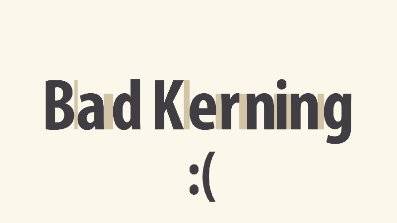
Some fonts have inherent flaws, what we call "bad kerning," that make certain letters look out of place. If you're using a font with "bad kerning", choose another font to minimize your loss.
V. Summary
Putting it all together
-
Well-designed typography can mean the difference between the ordinary and the extraordinary, even if you’re just starting out in graphic design. All it needs is more: your interest in typography, as you begin to notice and see more details, you will be able to works better.
For more advanced design tutorials, you can refer to: http://t.cn/RqRcUk9. If you are a student with zero foundation and don't know how to start, please refer to the learning path "100,000 Students Praise, Graphic Design Self-study Course" and my graphic design self-study guide series articles. I wish you success in your studies.
Graphic Design Self-study Guide Series Articles
Graphic design self-stydy guide serises article
-
1. Know what is graphic design? (Introduction)
Original address: http://www.zcool.com.cn/article/ZNDcyNDM2.html
2. How to learn graphic design by yourself with zero foundation? (method)
Original address: http://www.zcool.com.cn/article/ZNDcyMTg0.html
3. What do graphic design students need to learn? (experience)
Original address: http://www.zcool.com.cn/article/ZNDcyNzYw.html
4. What software do I need to learn to learn graphic design by myself? (details)
Original address: http://www.zcool.com.cn/article/ZNTUwMDc2.html
Last
In the end
-
@酷coo豆 Hope the above content is helpful to everyone. Of course, don't forget to learn other Introduction to Graphic Design related content, including: color theory, images, typography, basic principles of design, etc.

Thank you for reading, if you gain something, don't forget to like it.
Articles are uploaded by users and are for non-commercial browsing only. Posted by: Lomu, please indicate the source: https://www.daogebangong.com/en/articles/detail/15%20Selftaught%20Graphic%20Design%20Quick%20Start%20Tutorial%20Typography.html
 支付宝扫一扫
评论列表(196条)
测试