The fonts of early Chinese book covers were varied, and the atmosphere of the times was strong, which played a vital role in the development of graphic design. Today @汉仪字库 packs a set of nostalgic-style Chinese fonts for the students. They are all handwritten by masters, and the quality is superb. Students who have been looking for Chinese fonts, hurry up and collect them!
Han Yichang beauty black
1996/6/6
A artistic font combining the advantages of HeiTi and SongTi.

Hanyi Variety Show
1996/6/6
Art style characters, thick strokes, horizontal and vertical, soft strokes are decorative, the whole character changes between "square" and "round", without breaking the rules; the font is lively, rigorous, bold and majestic.

Han Yi circle stack
1999/3/23
Art fonts, the strokes are thick and thick, some strokes are overlapped during the design, and the overlaps are clearly outlined with white lines, clear, elegant, full and crystal clear in the thick and eye-catching.
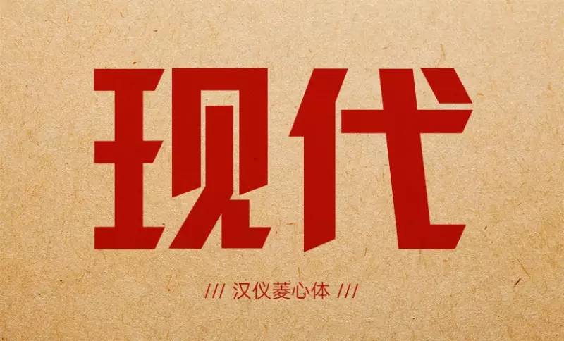
Hanyi Lingxin Body
2000/5/25
The strokes are strong, novel and unique, with appropriate changes and eye-catching and prominent visual effects.

Hanyi Yanling Style
2000/5/25
A font combining calligraphy and artistic style. The overall style is derived from official script, and individual strokes have the meaning of Wei Bei. Horizontally breaking the original parallel rules of official script, it has the aesthetic feeling of unevenness. The perspective effect of the knot is wide on the left and narrow on the right, giving people a sense of novelty. The folding pen has the edges and corners cut by a knife, which is very decorative. The contrast between the thickness of the strokes is strong, and the changes of soft strokes such as Na and Na are emphasized, making the whole character lively and innovative, eye-catching and full of interest.
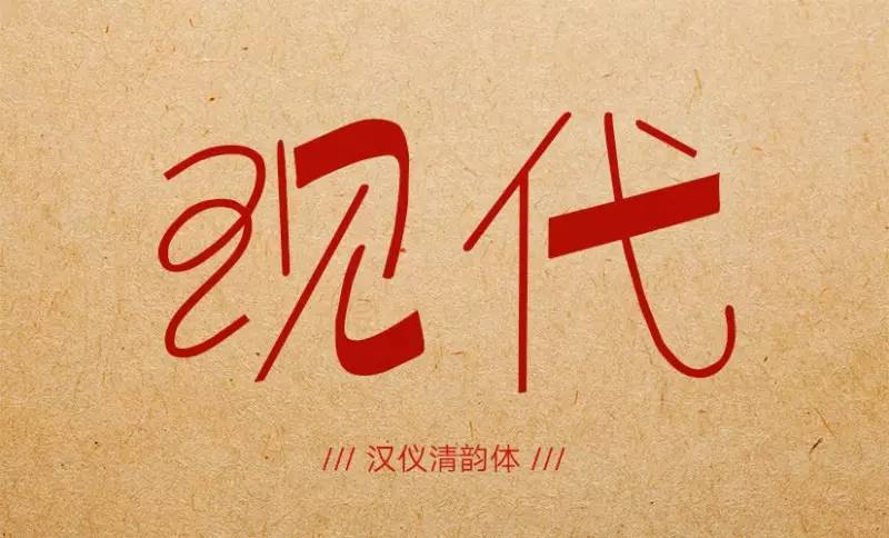
Hanyi Qingyun
2002/3/1
One of the art fonts, its characteristics are: the combination of stroke thickness and strokes, mixed with running script and continuous strokes, and has the characteristics of handwriting combination. The horizontal pen is slightly inclined upwards, full of rhythm. The entire set of characters looks lively, artistically innovative, unique, and contains the atmosphere of the times, thus achieving a dazzling effect.
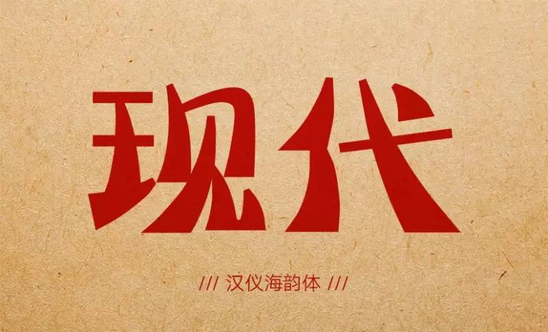
Hanyi Haiyun
2002/3/20
The font is beautiful, generous and concise. The horizontal strokes are straight and balanced, the vertical strokes are gradually thickened into arcs, and the soft strokes are soft but still upright; the characters are square and stable. The whole character seems to make people feel a kind of rhythm in demure.
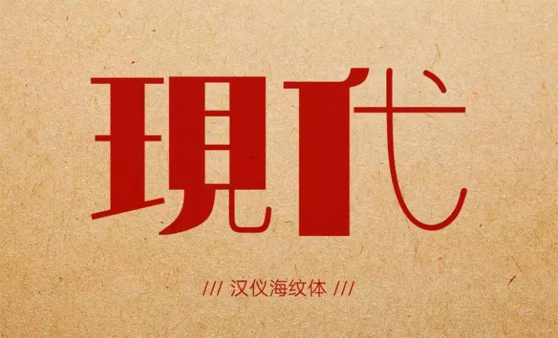
Hanyi sea texture
2010/7/16
Haiwen typeface exaggerates the characteristics of Song typeface characters to the extreme. Slender and thick complement each other to set off flexibility, and thick and heavy match slender to make it more majestic. The strong contrast shows the artistic style of vigorous body and strong bones.
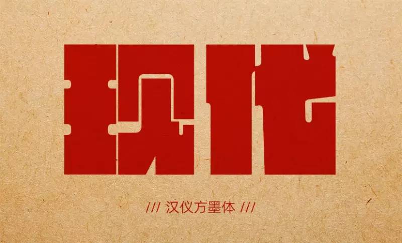
Hanyi Fangmo
2010/9/8
The structure is square, and the slender white space outlines a clear outline. The internal details are connected by arcs, showing the characteristics of a square on the outside and a circle on the inside. Thick strokes fill the entire text, building an indestructible force. Between square inches, the ink is perfect.
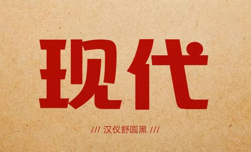
Hanyi Shuyuanhei
2012/10/20
Adopts the design of full-frame large characters. In terms of overall style, it is different from the cold and blunt feeling of "variety art style". beauty. Shu Yuan’s black strokes are designed with circles in the upper part, and squares in the circles, adding a touch of handwriting to the application of curves.
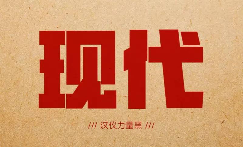
Hanyi Power Black
2013/5/8
It makes people feel a great sense of weight and block in a small text frame, and has a solid, solemn, stable and fulfilling feeling. Every stroke of the character is intentionally filled with the entire word frame as much as possible, and the corners of each stroke are designed to be angular and turning as much as possible. And the gaps between the characters and strokes are minimized to make the characters strong and breathable.
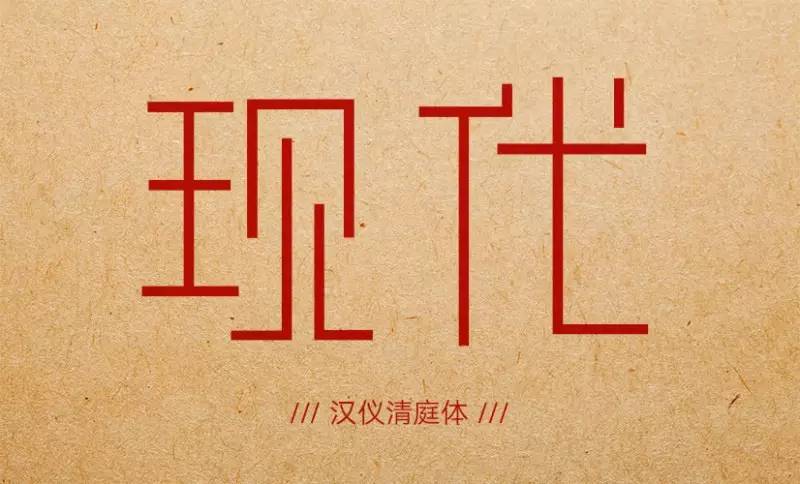
Han Yi Qing court style
2014/2/19
Using simple brushstrokes, it brings natural, fresh, quiet, elegant and peaceful visual effects, and pursues the natural feeling in the plain. This typeface adopts a slender trend, giving people a long and delicate texture as a whole. The knot adopts the trend of lifting the center of gravity, highlighting the fluency of the lower lines. The simple straight lines are treated with different lengths on the different strokes they describe to present the meaning expressed. The strokes of the characters in the whole picture are concise, and the blank space is uniform, so the overall effect is natural, harmonious and unified.
If you like it, click read the original text to download
Articles are uploaded by users and are for non-commercial browsing only. Posted by: Lomu, please indicate the source: https://www.daogebangong.com/en/articles/detail/12%20nostalgic%20style%20Chinese%20fonts%20you%20like.html
 支付宝扫一扫
评论列表(196条)
测试