△Isnew friend? Remember to click web front-end learning circleFollow me~

Preface
It's gold, silver and silver four interview season again, here I sorted it out... Hey! ? Sorry, I got off topic... I feel that the homepage of the Nuggets is full of interview-related content recently. I opened the Nuggets and didn't know what to look at. I was really helpless.
Last week, after reading a lot of materials about plane composition, I used CSS to draw something like a background pattern. Here I have selected 12 kinds for you, from the perspective of the observer, from easy to difficult, to explain the ideas for you. This article contains a lot of pictures and codes, so it is relatively long. It is recommended to like and collect it first.
⚠Warning, this article does not have a detailed explanation of the basic knowledge, but it is recommended to learn while reading the article and practice, which is more efficient.
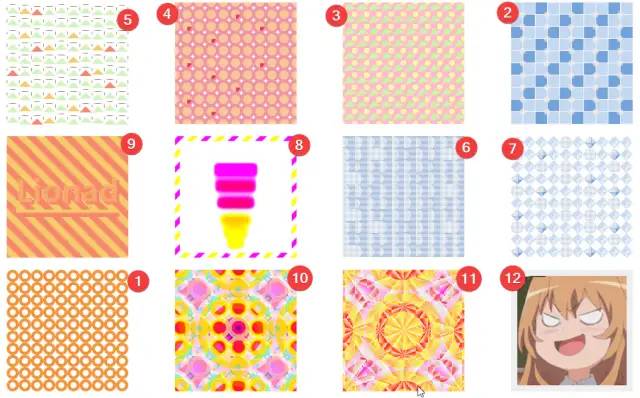
Effective picture display
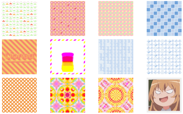
Introduction to the analysis sequence
After a rough look at the effect, we According to the number of pattern elements, the degree of element variation, the difficulty of animation, with or without clues and other factors, arrange the sections of the article in an order, as shown in the figure below. Each section has source code, and you can directly jump to the pattern you want to see through the title.
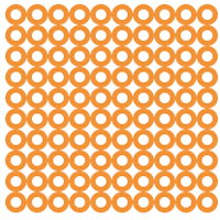
1. Ring deformation
< div class='card'><div class='node' v-for='item in 100'></div></div><style>// This style is applied to the card class tags of all other patterns , in order to reduce the length of the article, the following is omitted..card {width: 200px;height: 200px;display: flex;flex-wrap: wrap;justify-content: center;align-items: center;}</style>
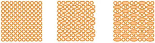
Through the animation effect of the picture, we can roughly get the mode of animation change.
Some of the rings are deformed into the length of two rings, and the background color is changed.
Observing the order of the variable-length rings, we can find the rule of "every third, it becomes longer". It is speculated that the :nth-child(3) selector is used.
The CSS source code is below.
- < li>
.card {justify-content: flex-start;overflow : hidden;cursor: pointer;// Every three elements, the animation is executed, the source code and the order of the animation we analyze On the contrary, the ring is from long to short, but it does not affect.node {border: solid 5px #F29338;< /code>border-radius: 50%;&:nth-child(3n) {width: 40px;width: 40px;&:nth-child(3n) span>flex-basis: 40px;background: #F8C798;animation: change-circle-width 2s ease alternate infinite;}}}@keyframes change-circle-width {from {width: 40px;flex- basis: 40px;background: #F8C798;}60% {width: 20px;flex-basis: 20px;background: transparent;}// Animation 60% - 100% During this period, the property does not change, so the pattern looks like it is still.to {width: 20px;flex-basis: 20px;< /code>background: transparent;}}
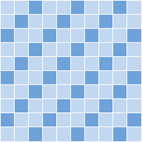
2. Tiles in the toilet
<div class='card'><div class='node' v-for='item in 100'></div></div>
and above The idea of a picture is similar, but there are some more round balls.
The animation of the ball should include the position offset and the change of color and transparency.
When the mouse hovers (note the mouse gesture in the lower right corner of the picture), there is a row of small balls in the picture, and the style and behavior are almost the same as the previous row of original balls.
It is speculated that the second row of balls uses the animation-delay effect.
Observe the number of balls, huh? It seems that there are some problems, the number of round balls and the number of tiles do not match. It should be a special treatment for the order of the display and hiding of the ball.
The CSS source code is below.
- < li>
- li>
.card {cursor: pointer;// Display the second row of small balls when the mouse hovers&:hover {.node {< /code>&:nth-child(2n)::after {visibility: unset;}< /code>}}.node {background: #71A2DB;< /span>outline: solid 1px white;// 3n-1, 3n+1 are equivalent to 3n when used together&:nth-child(3n-1),&:nth-last-child(3n+1) {background: #C2D7F0;}// Remove the pseudo-elements at the end of the last line and at the end of each line&:nth-child(10n)::after,&:nth-last-child(-n+10)::after {< code > display: none;}&::after {left: 75%;top: 75%;width: 50%;height: 50%;height: 50%;span>border-radius: 50%;background: white;animation: card-4-circle- move 1s linear alternate infinite;}&:nth-child(2n)::after {< code > animation: card-4-circle-move-delay 1s linear alternate infinite;animation-delay: .3s;visibility: hidden ;}}}@keyframes card-4-circle-move {from {left: 45%;top: 45%;opacity: 1;background: white;}< /code>to {left: 130%;top: 130%;opacity: 0;background: #F2C07D;}}< /code>@keyframes card-4-circle-move-delay {from {left: 45%;top: 45%;opacity: 1;background: #F2C07D;z-index: 2;}to {left: 130 %;top: 130%;opacity: 0;background: white;span>}}
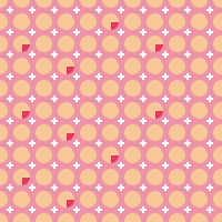
3. Triangle and ball printing
<div class ='card'><div class='node' v-for='item in 100'></div>< code > </div>
At first glance, drawing a circle and a triangle with pseudo-elements for each node completes it this picture.
It’s actually not right, don’t scroll down for the answer, think about why.
Answer dividing line, be careful to cross the line:
Observe pattern and HTML code:
From the perspective of each row, there are 10 triangles in each row, but 9 circles + 2 semicircles in each row.
Guessing that a circle is assembled from semicircles, combined with longitudinal observation, it can be inferred that a circle is composed of 4 1/4 circles.
But there is no way to draw a 1/4 circle with pseudo-elements. If your thinking is wrong, change your thinking again.
Guess that the pseudo-element is a full circle, use Box-Shadow to copy 4 copies, and place them in the four corners of the square. .card or .node use overflow to clip excess elements.
Look at the triangle again.
The drawing method of triangle is relatively common, and it can be drawn with transparent Border + colored Border.
The angle of the triangle changes very regularly. It can be roughly inferred that the rotation angle is related to the number of columns.
- li>
.card {overflow: hidden;cursor: pointer;// Determine the rotation angle according to the serial number of the triangle and the modulus of 10@for $i from 0 through 9 {.node:nth-child(10n - #{$i})::before {transform: rotate((-19 + $i) + unquote('deg'));}}< /span>// The above string of functions is compiled into the following long string of appearances// .node:nth-child(10n): :before {// transform: rotate(-19deg);// }/ / .node:nth-child(10n-1)::before {// transform: rotate(-18deg);// }// .node:nth-child(10n-2)::before {// transform: rotate(-17deg);// }// .node:nth-child(10n-3)::before {// transform: rotate(-16deg);// }// .node:nth-child(10n-4 )::before {// transform: rotate(-15deg);// }// .node:nth-child(10n-5)::before {// transform: rotate(-14deg);// }// .node:nth-child(10n-6)::before {// transform: rotate(-13deg );// }// .node:nth-child(10n-7)::before {// transform: rotate(-12deg);// }// .node:nth-child(10n -8)::before {// transform: rotate(-11deg);// }// .node:nth-child(10n-9)::before {// transform: rotate(-10deg);< code > // }.node {background: #F5C1CB;filter: saturated( 1.6);// Triangle drawn by pseudo-element Border&::before {left: 0;top: -8px;border: solid 10px transparent;border- bottom-color: #D2F3BF;z-index: 1;}// use The Box-Shadow attribute, which duplicates the circle three additional copies&::after {left: -5px;top: -5px;width: 9px;height: 9px;border-radius: 50%;background: #FBF5C5;z-index: 0;box-shadow: 20px 0 #FBF5C5, 20px 20px #FBF5C5, 0 20px #FBF5C5;}}}
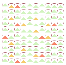
4. Tile variation
<div class='card'><div class='node' v-for='item in 100'> ;</div></div>
This picture should be roughly It's easier said than done. Additional attention needs to be paid to where those special colored circles appear.
Observing the scaling of the grid when the mouse moves, it can be speculated that each grid is composed of 4 1/4 circles and a cross.
The cross is easy to handle, and it can be completed by copying the 2*2 pixel pseudo-element through Box-Shadow.
According to the 1/4 circle, it can be inferred that each grid has overflow: hidden style.
There are several possible implementations of special colored circles.
First, when compiling Scss, call a random function to change the color of these random position circles.
Second, use the cicada principle or similar to achieve CSS pseudo-randomness.
Third, write to death.
Hazard~ Directly upload the source code here.
- li>
.card {.node {background: #EE92A5;overflow: hidden;transition: .3s;cursor: pointer;// Zoom in when the mouse hovers over the grid&:hover {transform: scale(1.4);< /span>}// The composition of the crosshair&::before {left: 8px;top: 8px;width: 2px;height: 2px;background: white;z-index: 0;box-shadow : 0 2px white, 2px 0 white, -2px 0 white, 0 -2px white;}// The composition of the circlespan>&::after {left: -8px;top: -8px;width: 15px;height: 15px;border-radius: 50%;background: #F8C798;z-index: 0;box-shadow: 20px 0 #F8C798, 20px 20px # F8C798, 0 20px #F8C798;}// CSS pseudo-randomly sets special colors for certain elements. In practice, you can adjust the following parameters yourself to achieve the desired effect.&:nth-child(2n)::after {background: #E03A5C;}&:nth-child(3n-1)::after,&:nth-child(3n)::after,< /span>&:nth-child(5n)::after,&:nth-child(6n)::after,< /code>&:nth-child(7n-3)::after {background: #F8C798}}}
5. Mountains and clouds
<div class='card'><div class='node' v-for='item in 100'> ;</div></div>
This pattern, well.. . To be reasonable, who can see what it is! In fact, I thought to myself, if it wasn’t for the fact that I drew it myself, I guess I wouldn’t be able to see through this pattern~~(Hongchen)~~, but let’s take a serious look at it below.
Triangle, easy to handle, draw with pseudo-elements. As for the color, you can follow the CSS pseudo-random idea of the previous picture. As for the animation of the mountain, it is not clear whether the mountain is moving or the mountain is moving with other elements.
Look at the horizontal lines again, hey, why are there so many horizontal and vertical lines in this picture, which pseudo-element and which one are not, what a shame...
Guess, the horizontal and vertical lines are the Outline of the grid. No, Outline can only be square.
Could it be Border? It can be seen from observation that the edges of these horizontal lines are translucent pixels, combined with triangles, they can be drawn with Border. It is speculated that the horizontal and vertical lines are the Border of the rounded rectangular grid, which is blocked by the white Border of the pseudo-element forming the triangle And part of it disappeared.
Continue to observe the lines and find that some horizontal lines will disappear, some horizontal lines will only shorten but not disappear, and all vertical lines will only shorten but will not disappear.
According to the fact that when the vertical line becomes longer, it must be accompanied by the shortening or disappearance of the horizontal line. It is speculated that the grid is experiencing a change in height, not a displacement. Continuing to speculate, the triangle may move along with the grid.
According to the fact that the horizontal line between the two mountains in the vertical direction is the same as the movement trend of the mountain, it is speculated that the horizontal line in the picture is the upper side of the grid instead of the lower side, and the lower side is covered.
It is guessed that the mountain covers the lower side of the grid, but this is inconsistent with the actual observation, because when the mountain moves upward, the vertical lines expand and contract. Part of the edge of the grid is not obscured by the Border of the pseudo-element that constitutes the mountain, but another pseudo-element, which is also roughly a rectangle.
We can roughly form this pattern: the grid is bound in the flex layout of align-items: center, and the triangle and another pseudo-element similar to the rectangle follow the grid Exercise while exercising.
Well... Take a long breath, if you don't understand the above, you should look at the picture below to compose it. This is what it looks like with the white mask removed.
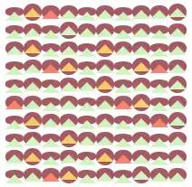
(Who give me a name)
The following is the CSS source code.
- li>
.card {cursor: pointer;// The horizontal and vertical lines are not the Border of the node, but formed by the background color + mask// The grid will Change in height according to animation.node {background: #A45963;border-radius : 90%;animation: card-1 .4s ease alternate infinite;// Grid animation delay processing&:nth-child(2n) {animation-delay: .2s;}&:nth-child(3n) {animation-delay: .3s;}&:nth-child(4n) {animation-delay: .3s;}// mountain color processing&:nth-child(2n)::before {border-bottom-color: #F5CB6C;}&:nth-child(3n)::before {border -bottom-color: #F5856C;}&:nth-child(4n)::before,&:nth-child(5n)::before,&:nth-child(6n)::before,&:nth-child(7n)::before,&:nth-child(8n)::before,&:nth- child(9n)::before,&:nth-child(10n)::before {border-bottom-color: #D2F3BF ;}// The composition of mountains&::before {< /code>left: 0;top: -5px;border: solid 10px transparent;border-bottom-color: #D2F3BF;z-index: 2;}// white mask&::after {left: 1px;top: 1px;width: 19px;height: 18px;background: white;< /span>}// This is a special treatment, in order to reduce the length of the white mask by 1 pixel to display the last column of the background color of each row of grids Pixel&:nth-child(10n)::after {width: 18px;}}}@keyframes card-1 {from {height: 19px;}to {< /code>height: 8px;}}
6. Cactus growing on the ice cliff
<div class='card'><div class='node' v-for='item in 100'> ;</div></div>
This picture is relatively simple.
The easy-to-know grid is composed of horizontal lines, dotted lines and background color.
It is easy to know that the cylindrical "cactus" is obtained by cutting each grid individually.
The animation of changing from a semicircle to a square can be clipped by the Clip-Path property. It is speculated that the vertical line and the horizontal line are respectively a pseudo-element drawing.
The following is the CSS source code.
- < li>
- li>
.card {.node {background: #71A2DB;// Some cacti add animation&:nth-child(3n)::after,&:nth-child(3n+2)::after,< /code>&:nth-child(5n-3)::after,&:nth-child(6n-2)::after,< /code>&:nth-child(7n+1)::after {animation: card-7-grow .6s ease alternate infinite;}// Some cacti do not need to be animated&:nth-child(3n-1)::after,&:nth-child(3n)::after,&:nth-child(5n)::after,&:nth-child(6n)::after,&:nth-child(7n-3)::after {clip-path: circle(75% at 0 50%);animation: none;}// Here is the background color + Box-Shadow line drawing. You can also use Border + Box-Shadow to draw lines&::before {top: 1px;< code > left: 0px;width: 100%;height: 1px;background: white;box-shadow: 0 2px white, 0 4px white, 0 6px white, 0 8px white, 0 10px white, 0 12px white, 0 14px white, 0 16px white, 0 18px white;}&::after {top: 0;left: 1px;width: 1px;height: 100%;background: white;box-shadow: 2px 0 white, 4px 0 white, 6px 0 white, 8px 0 white, 10px 0 white, 12px 0 white, 14px 0 white, 16px 0 white, 18px 0 white;transition: .6s;}}}}}span>// Display all lines when the mouse hovers (in order to make the Clip-Path have a transition effect, the attribute cannot be removed directly, but a larger value must be changed)&:hover {.node {&::after {animation: none;clip-path: circle(150% at 0% 50%);}}}}@keyframes card-7-grow {from {clip-path: circle(50% at 0 50%);}50% {clip-path: circle(50% at 0 50%);}}to {clip-path: circle(150% at 0 50%);}}
7. No Name 2
This thing is an upgraded version of the previous picture. It may be misleading to guess that the pseudo-element is a point, not a line, and then use a vacant pseudo-element to construct other things in the diamond-shaped grid.
- li>
.card:nth-child(8) {.node {border: solid 8px #71A2DB;border-top: 0;border-left: 0;background: #71A2DB;clip-path: polygon(50% 0, 100% 50%, 50% 100%, 0% 50%);transition: .3s;cursor: pointer;// remove Border for some grids&:nth-child(3n-1),&:nth-child(3n),& :nth-child(5n),&:nth-child(6n),&:nth-child(7n-3) {border: none;clip-path: circle(50%);&:hover {clip-path: circle(30%);}}//Crop a part of the grid into a diamond-shaped area. The four values of Clip-Path correspond to the positions of the four vertices of the rhombus.&:nth-child(2n),&:nth-child(3n) {border: solid 8px #CCDDF2;clip-path: polygon(50% 0, 100% 50%, 50% 100%, 0% 50%);< /code>}&::before {top: 1px;left : 0px;width: 100%;height: 1px;background: white;< /span>box-shadow: 0 2px white, 0 4px white, 0 6px white, 0 8px white, 0 10px white, 0 12px white, 0 14px white, 0 16px white, 0 18px white;}&::after {top: 0;left: 1px;width: 1px;height: 100%;background: white;box-shadow: 2px 0 white, 4px 0 white, 6px 0 white, 8px 0 white, 10px 0 white, 12px 0 white, 14px 0 white, 16px 0 white , 18px 0 white;}}}< /pre>
8. Squeeze ice cream
(⊙﹏⊙), I didn’t draw such disgusting intentionally, it’s because he needs to use the CSS contrast filter, which will increase the contrast and brighten the color.
The principle of the fusion effect is this: use a contrast filter on the parent element, and use a blur filter on the child element, and you will find that when the child elements are close to each other, a fusion effect will occur.
It should be very common to deal with image borders, and it can be done with Background-Image. In addition, "CSS Secret" also mentioned a method of using Background gradient overlay to generate image borders. You can also try the following (Advertisement: Come to Lionad’s Quangan communication group 805392878, there are various books and materials and fun things in the group)
The code is given directly below.
- < li>
- li>
// can see parent The element uses filter: contrast filter.card {position: relative;box- sizing: border-box;flex-direction: column;justify-content: flex-end;align-items: center;border: solid .5em transparent;border-image: 8 repeating-linear-gradient(- 45deg, #F5E66C 0, #F5E66C .5em, transparent 0, transparent 1em, #DA60D2 0, #DA60D2 1.5em, transparent 0, transparent 2em);background: white;background: white;cursor: pointer;filter: contrast(10);// Set each grid separately Set background color and animation delay$background:(#DA60D2, #E7667E, #E7667E, #F5866C, #F5866C, #F5E66C);@for $i from 1 through 6 {.node:nth-child(#{$i}) {width: (80 -(10 * ($i - 1)))+unquote('px');animation: card-6 .8s ease-in (0.1*$i)+unquote( 's') alternate infinite, card-6-margin .8s ease-in alternate infinite;background: nth($background, $i);}}// The grid uses a blur filter.node {< /span>flex-basis: 30px;margin-top: -15px;width: 30px;< /span>height: 50px;filter: blur(5px);}// Pause the animation when the mouse hovers, because of the melting effect of the sub-elements, you need to make the font thicker&:hover {&::before {content: 'Paused';position: absolute;left: 5px;top: 5px;font-weight: bolder;}< /span>.node {animation-play-state: paused;}}@keyframes card-6 {from {border-radius : 50%;}to {width: 80px;border-radius: 0;}}@keyframes card- 6-margin {from {margin-top: -13px;}to {margin-top: 0px;}}}
9. Lionad
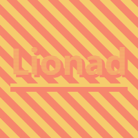
The end of victory is coming soon, hold on! w(゚Д゚)w
<div class='card 5'><div class='node' /></div>
This is the first time we have had background movement, but this image consists of Simple, here's the analysis.
The movement of the background is nothing more than CSS Animation + Background-* properties. The background gradient of this picture is a simple 45deg two texture gradient, it is speculated that the background uses Animation + Background-Position for translation.
Looking at the text part again, the Yide text is composed of a background with a 180deg gradient + Text-Shadow.
Can the text use a gradient background? Yes, the background pattern clipping function can be realized through Background-Clip.
Because the color of Text-Shadow is darker than the gradient, but the observation found that Text-Shadow has not been cut into the font, it is inferred that the text should be composed of two pseudo-elements, using the pseudo-element of the Background-Clip attribute Hierarchy is higher than pseudo-elements using Text-Shadow.
The last is the two horizontal lines below the text. There are too many ways to realize this painting, double pseudo-element Border can also be used, Box-Shadow can also be used, Border-Image can also be used, Background-Image can also be used...
Look at the source code below.
- li>
.card { background: linear-gradient(45deg, #F5CB6C 0%, #F5CB6C 20%, #F5856C 20%, #F5856C 45% ,#F5CB6C 45%, #F5CB6C 70%, #F5856C 70%, #F5856C 95%, #F5CB6C 95%, #F5CB6C 100%); background-size:30px 30px; background-position: 0 0; animation: card-5 1s infinite linear; cursor : pointer; .node { // Pseudo-element using Background-Clip &: :before { content: 'Lionad'; left: -1.5em; top: -.7em; font-size: 50px; font-weight: bolder;< /span> color: transparent; background: linear-gradient(180deg, #F5CB6C, #F5856C); background-size: 1px 2px; background-clip: text; -webkit-background-clip: text;< /code> z-index: 2; } // Generate Text-Shadow pseudo-element &::after { content: 'Lionad'; left: -1.5em; top: -.7em; font-size: 50px; font-weight: bolder; color: transparent; text-shadow: 4px 4px 0px #F5856C; box-shadow: 0 5px 0px #F5CB6C, 0 12px 0px #F5856C; } } @keyframes card-5 { 0%{ background-position: 0 0; } 100%{ background-position: 30px 0; } } }10.&11. Kaleidoscope
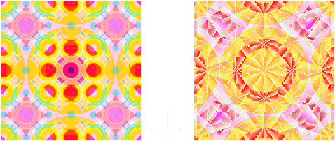
<div class='card 10'></div><div class='card 11'></div> ;
These two patterns are put together because the idea is the same. To be honest, the first time I saw this kind of pattern, I was also confused by this inexplicable color change, so I will directly talk about the principle here.
The two pictures are drawn with gradients. If you look carefully, you can find that the patterns on the left and right are the superposition of three layers of gradients.
The difference is that the smallest layer of gradient on the left is Radial-Gradient, and the one on the right is Conic-Gradient (English is called Conic-Gradient, pie charts can be drawn with this thing. )
The inexplicable color transformation (such as the center point on the left) uses the CSS Blend-Mode effect, which is responsible for calculating the final color when two colors are layered together. The displayed color can be understood as a filter.
I have seen it before moving the background. The left picture is the transformation of Background-Position, and the right picture is the transformation of Background-Size
The following is the source code.
- < li>
// style code for the right image.card {// Three layers of background gradients are used here, two layers of conical gradients and one layer of radial gradientsbackground-image:< code > repeating-conic-gradient(red 50%, #E1F5C4 60%),repeating-conic-gradient(red 50%, #E1F5C4 60%),< /code>radial-gradient(gold 0%, gold 35%,red 35%, red 40%,span>orangered 40%, orangered 50%,gold 50%, gold 60%,yellowgreen 60% , yellowgreen 70%,skyblue 70%, skyblue 80%,steelblue 80%, steelblue 90%,violet 90%);// Set the blending mode for each layer to be gradientbackground-blend-mode:lighten,overlay,lighten;< /span>// Set the background size for each gradient layer separately (40px is because it is exactly divisible by the 200px box)background-size:< /span>40px 40px,6em 6em,8em 8em;< code > background-position: 50% 50%;transition: .45s ease-in;cursor: pointer;< /code>// When the mouse hovers, change the gradient size&:hover {background-size:< /code>40px 40px,4em 4em,12em 12em;}< /span>}
< strong >12. トラ汤(Tiger)

It's just a whole picture, what's the big deal?
No, this is not a picture.
Do you think there are external links? no, no. This is トラ-chan drawn only with Box-Shadow.
Its CSS code looks like this:
- < li>
// gray Border.card {justify-content: flex-start;align-items: flex -start;border: solid 10px #eee;box-sizing: border-box;overflow: hidden;// トラ酱.node {width: 1px;< /span>height: 1px;box-shadow: ????? Guess, try hard to guess how long it is behind< /code>}}
As for the specific principle, let me see The last article of the Nuggets.
Exercise Questions
Finally, here are a few exercises that require a little thought for the remaining fighting spirit The practice of my classmates~~(I am not whoring for nothing!)~~.
《トラ汤》, use Box-Shadow + CSS Animation to realize GIF playback
"Cacti Growing on Ice Cliffs", can these horizontally growing cacti grow longer than two grids?
Oh, by the way, don't ask me what these exercises are for.
These exercises are for the same purpose as these patterns I drew - I don't know what to do, just for fun.
Having said that, the old buddies on the Nuggets are all skilled players, and they submit interview articles every day, which is too rigid. It’s not full of bells and whistles, no wonder you can’t find a female ticket~~ (If there is any similarity, please take a seat on the number, manually the dog head ( ̄ε(# ̄))~~.
LAST BUT IMPORTANT
From: https://juejin.im/post/5e983158f265da480e68e658
Disclaimer: The copyright of the article belongs to the author. If there is any infringement, please contact the editor to delete it.
Articles are uploaded by users and are for non-commercial browsing only. Posted by: Lomu, please indicate the source: https://www.daogebangong.com/en/articles/detail/12%20fancy%20CSS%20cool%20cases%20with%20source%20code.html
 支付宝扫一扫
评论列表(196条)
测试