Reposted from the official account: "Design Convenience Store"
Some time ago, a friend asked me what English fonts I usually use. Today, I would like to recommend several easy-to-use and durable English fonts to solve your difficulty in choosing.
1. Sans-serif
01.Font:>

△The first decision is Futura, because I often come into contact with fashion brands, and Futura is inspired by Bauhaus, that is, it inherits the minimalist design concept of Bauhaus - sharp, concise, but also a bit frigid . Designer Paul Renner first created Futura from 1924 to 1926.
02.Font: Helvetica
△When you can't think of what font to use, you can use Helvetica. Apple's royal fonts, and even many famous logos are directly made of Helvetica. For example, the logo of my alma mater UAL uses it as the standard font. There is also a book called "Helvetica Font Legend", which introduces the history of this font, you can buy it and have a look.
03.Font:>
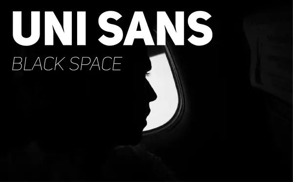
△UniSans is a futuristic font, whether it is font or strokes, and is suitable for designs with a strong sense of fashion.
04.Font:>
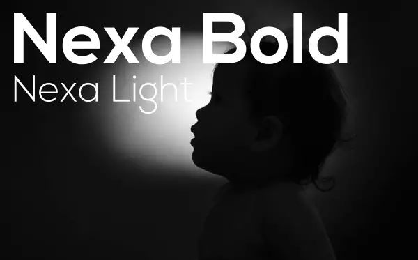
△I like to use Nexa as the title, because it has simple strokes and a strong sense of design, which is very suitable for use as a super-large title.
05.Font:>

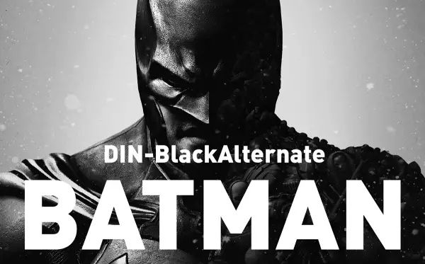
△DIN needs no introduction, it is easy to use and looks good.
06.Font:>
△A sporty font. Of course, this type of long font can also meet many layout needs. It is recommended to download and try it.
2. Serif
01.Font:>
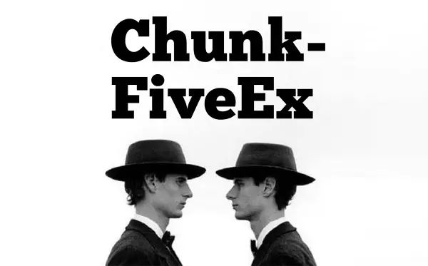
△ChunkFiveEx is a thick serif font, which is a type of serif. It is characterized by thick strokes and serifs. This type of font is much less than other types, and it is also suitable for use in titles.
02.Font:>

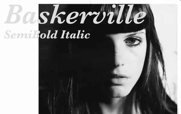
△The serif typeface is relatively conventional, but compared with the traditional serif type Time, it has a more modern feel. For me, when I have no idea, the sans-serif Helvetica is the first choice, and the serif is the first choice for Baskerville. I like its italic font the most, which looks good.
03.Font: Arctic
△I personally think that Arctic is a sans-serif stroke font, and then adds some serif decorations. It is in the middle position, and the point is that it looks good.
04.Font:>
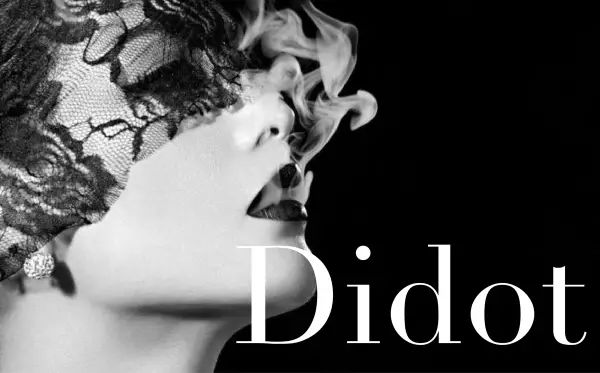
△Didot is fashionable and the most fashionable. Although it is badly used, it is still a good-looking type.
05.Font:>

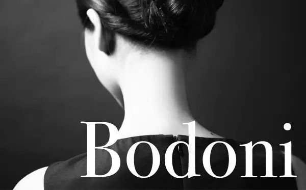
△ Bodoni is also a well-known serif font. It was born a little later than Didot. The two are often compared. I personally think that Bodoni is easier to use.
I don’t usually use many English fonts. The above ones have basically met most of my design needs. I hope they are useful to you. The fonts are for learning reference only. I know you are all lazy, even if I give you names, I won’t search them one by one, I’ve already packed them for you, no thanks!
Download address: https://pan.baidu.com/s/1dFCGBy5
Intracranial high nest! Memory Master super cool creative poster!
[This can work too! 】 Playing PS actually became an internet celebrity! ! !
[Anytime, anywhere] 25 mobile photo editing apps, there is always one that suits you
Let you explode in minutes! Ps super cool 3D function!
What should I do if I encounter bad weather when I go out? The powerful photographer secretly laughed
===========================================
U Design Multiplication and Nine Design
==================================================
For other essential posts, please reply to the following keywords:
Newbie, Fire Rose, Light and Shadow Particles, Burst Effect, Polygon, Wireframe Style, Dot Effect, Double Exposure, Drawing Hair, Drawing Apple, Tool Icon, Camera Icon, Doraemon, Rocket, Starry Sky, Pencil, Stone, Donut, Shield, Stone, Milk, Lilliputian, Crystal, Hand Drawn, Floating, Comic, Ripple, Emoji
Articles are uploaded by users and are for non-commercial browsing only. Posted by: Lomu, please indicate the source: https://www.daogebangong.com/en/articles/detail/11%20English%20fonts%20commonly%20used%20by%20professional%20graphic%20designers.html

 支付宝扫一扫
评论列表(196条)
测试