The following article comes from the layout design is very simple, author Zhou Miaoyan

Here are the layout dry goods you want to know, share with you every day, and take you to solve the layout problems
Designer
www.shejidaren.com
Love to design, love to share
Many designers find title design difficult, especially for beginners who don’t know how to start. This time I have sorted out 10 common title design skills, which are enough for you to design a good title.
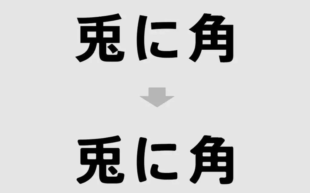
01#Right Angle Softening This is a super easy technique to master, and it can be done easily with the fillet tool. Simply round all or some of the corners to create a subdued title.
Mastery: ★★★★★

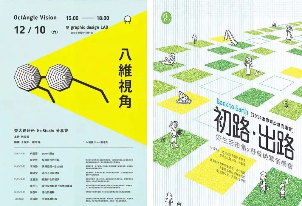
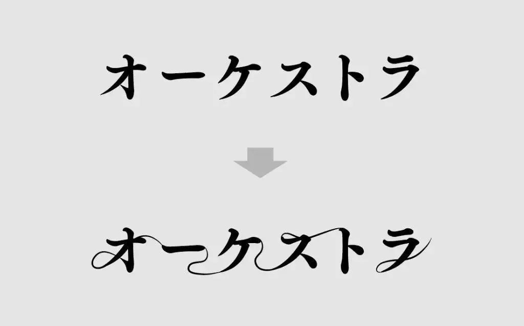
02#Linear Linearize or curve the strokes. This technique is often used in clean style fonts. The text retains the original character formatting and style properties.
Level of mastery: ★★★★☆
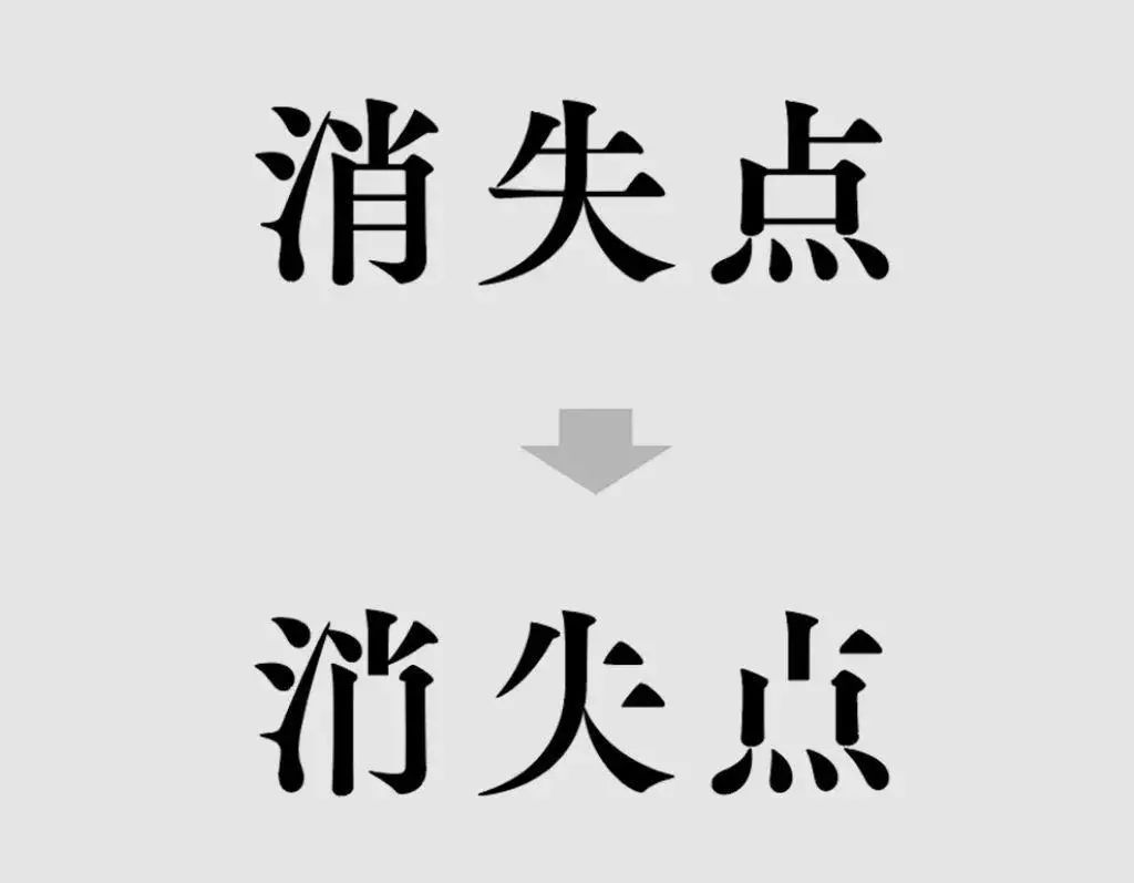
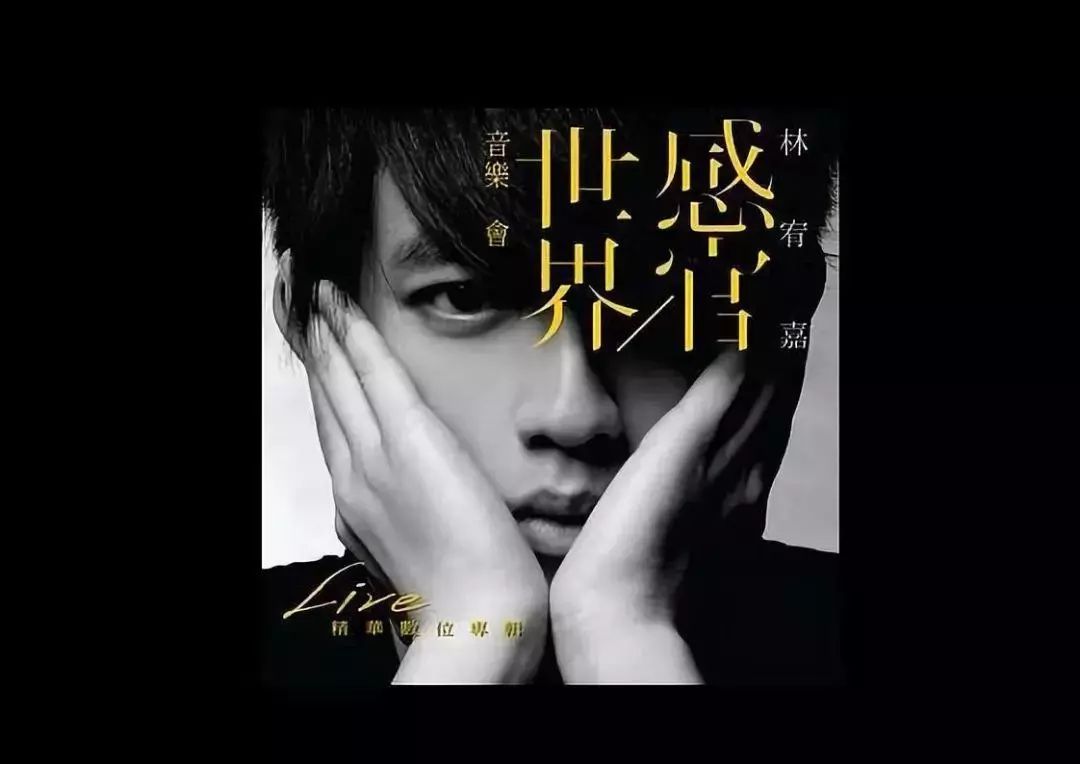
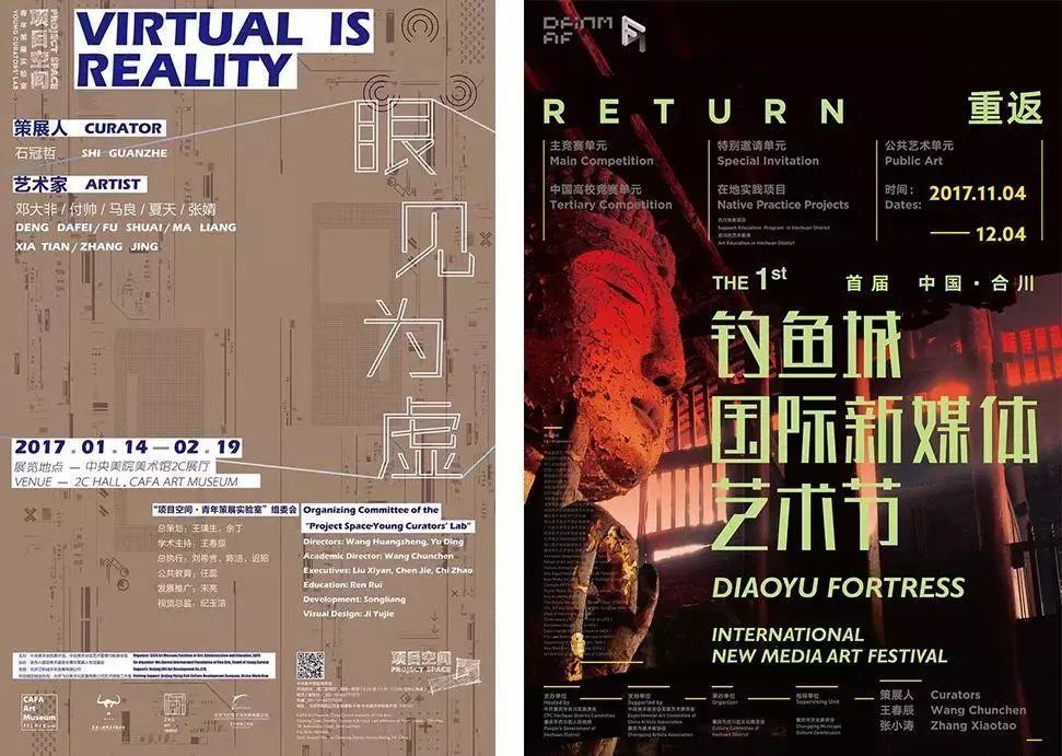
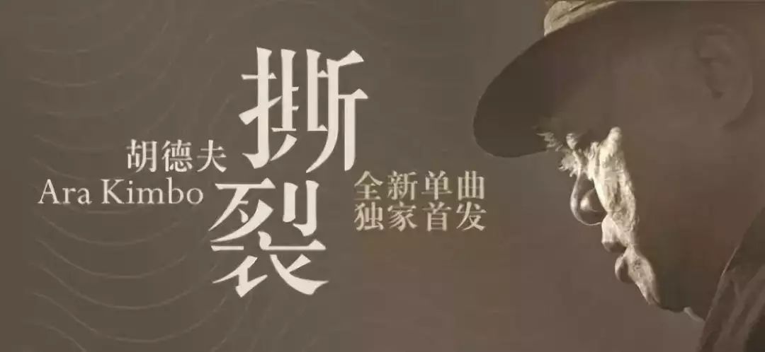
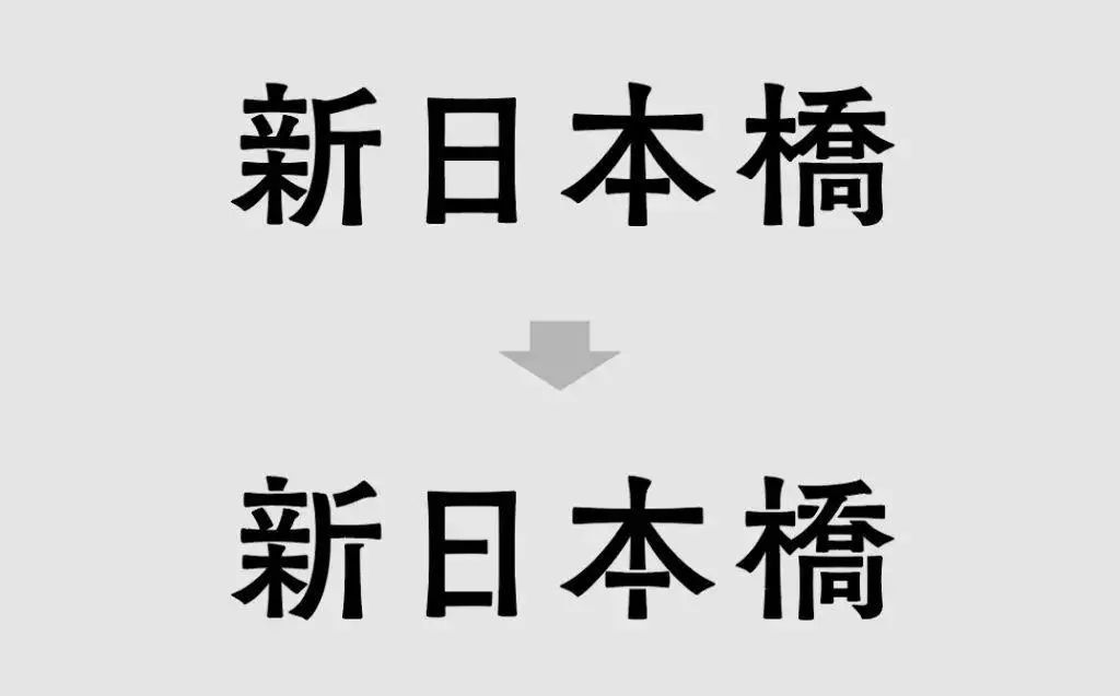
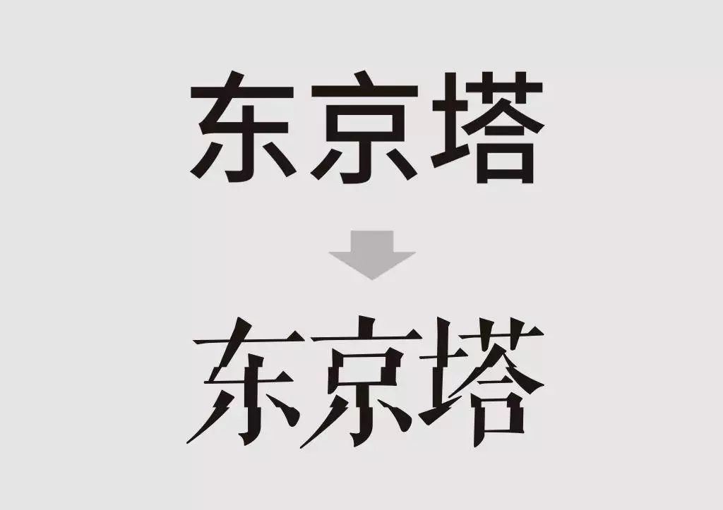
03#Missing strokes In font design, missing strokes is a common design technique. In order not to make the text lose its legibility, avoid deleting too many strokes. This method is generally suitable for serif fonts, and the strokes that are usually removed are horizontal strokes.
Level of mastery: ★★★★☆
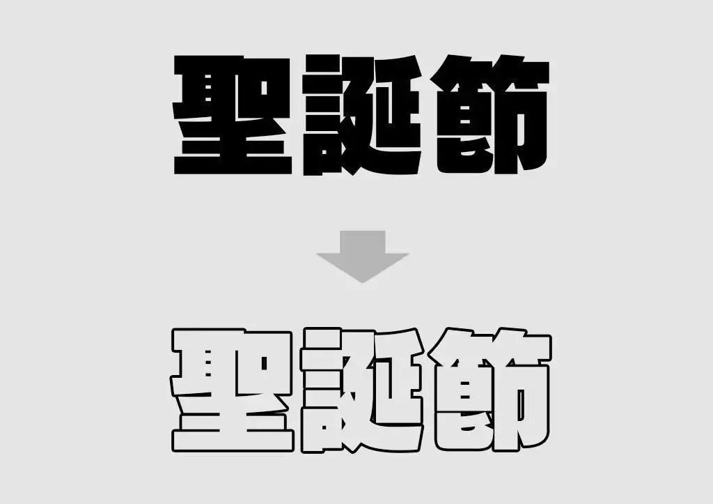
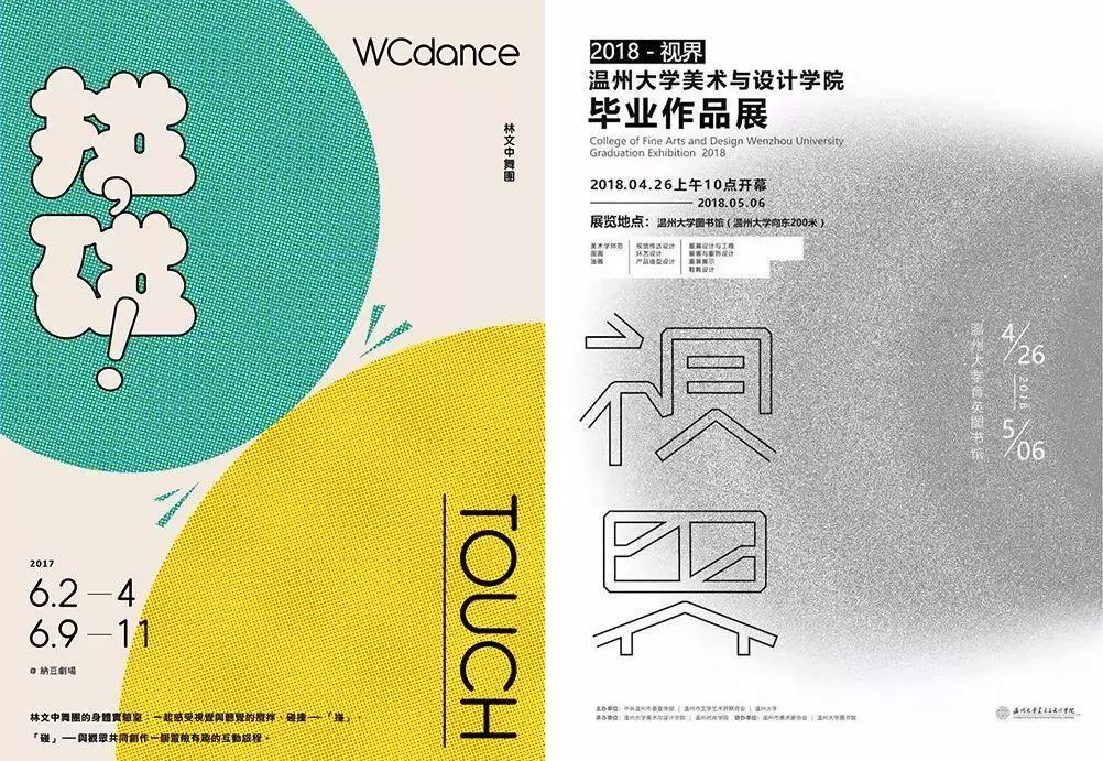
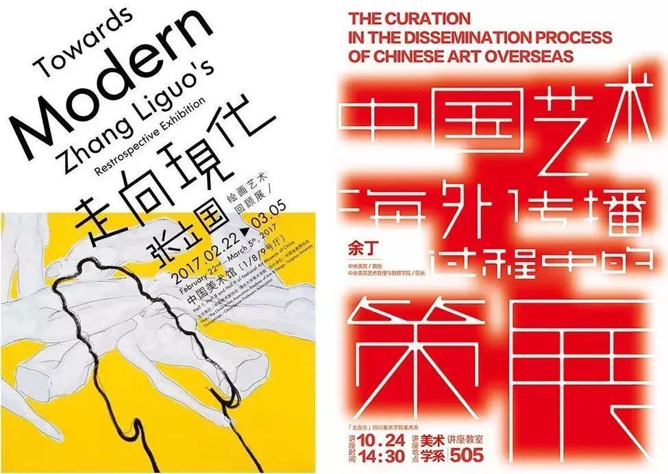
04#Stroke Stroke the important text information, and use the stroke to emphasize the edge line in an unconventional way. This kind of processing can produce an approximate graphic effect and increase the unique creativity of the picture. Strokes can be divided into hollow strokes, three-dimensional strokes, and double strokes.
Level of mastery: ★★★★☆


▲Normal stroke
▲Three-dimensional stroke
▲ double stroke
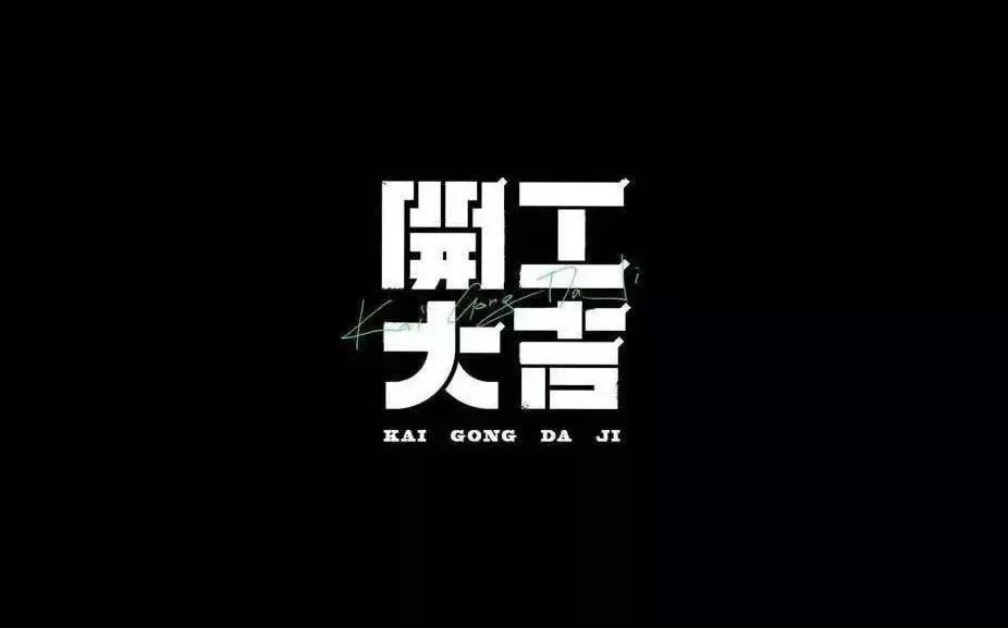
05#Cut and separation Cut and separation is a very common technique in font design. Separate the intersection of horizontal lines and vertical lines to make the font more design.
Level of mastery: ★★★☆☆
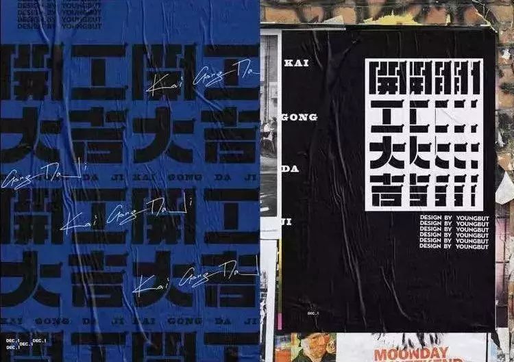
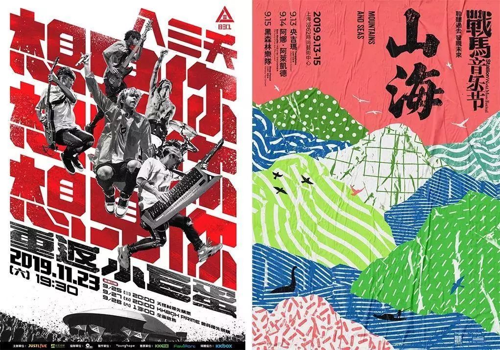
▲ designbyyoungbut
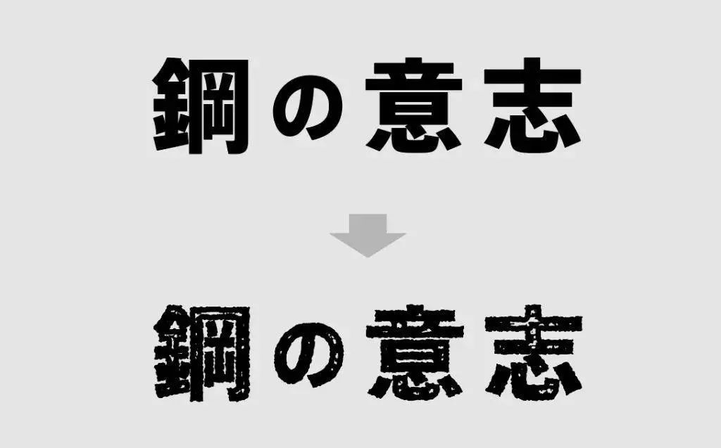
06#Texture processing Texture processing is to increase the sense of texture, handwriting and art. Texture refers to the texture of the surface of an object. If it is applied to fonts, it will produce different "beauty of texture", and instantly bring different artistic effects to the picture.
Level of mastery: ★★★☆☆
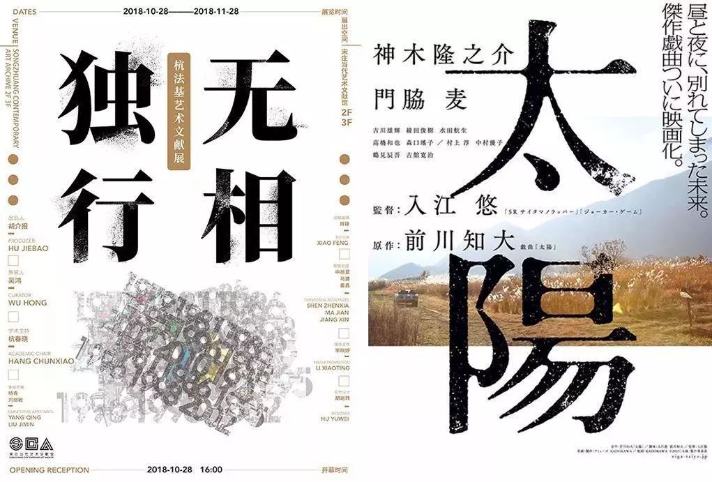
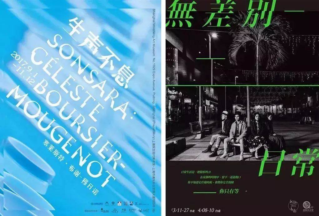
07#Stroke Misplacement Misplacement and offset of the strokes of the text can give people a strong sense of hierarchy and present a better visual sense in a new form. Even English fonts can use this processing method. Let the elements of the picture be flexible and have individuality, but you must pay attention to the recognition of the text when dislocation.
Level of mastery: ★★★☆☆
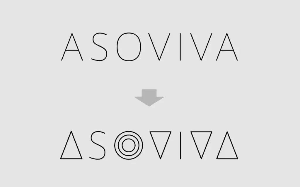
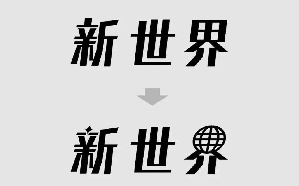
08#Stroke Replacement Without affecting the recognition of font structure, use elements (geometric figures, patterns, other strokes, etc.) to replace certain strokes, so that the original ordinary fonts can produce new visual effects and form A nice combination of words. For example, replacing certain strokes with geometric shapes such as triangles or circles can give it a modern impression. Or replace part of the text with its image pattern.
Level of mastery: ★★☆☆☆


Replace the dot in the upper left corner of the word "Xin" with a sparkling pattern, and replace the upper part of the word "Jie" with a graphic that contains the meaning of the world. In this case, there may be no graphics to replace, so this is also a relatively limited technique. If the graphics can be applied smoothly, it will bring a strong creative effect.
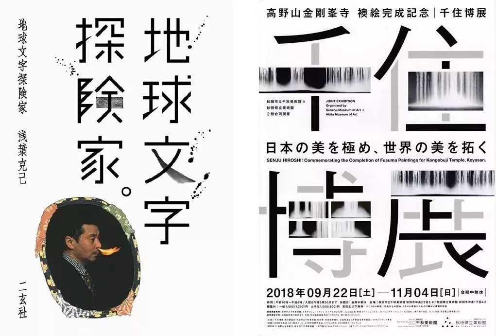
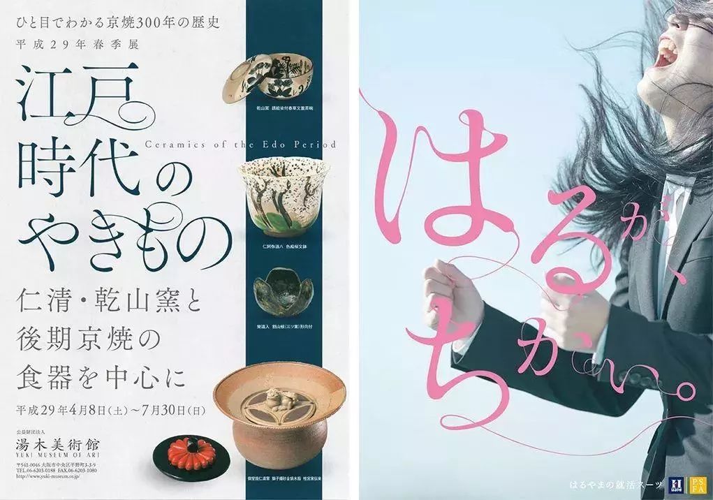
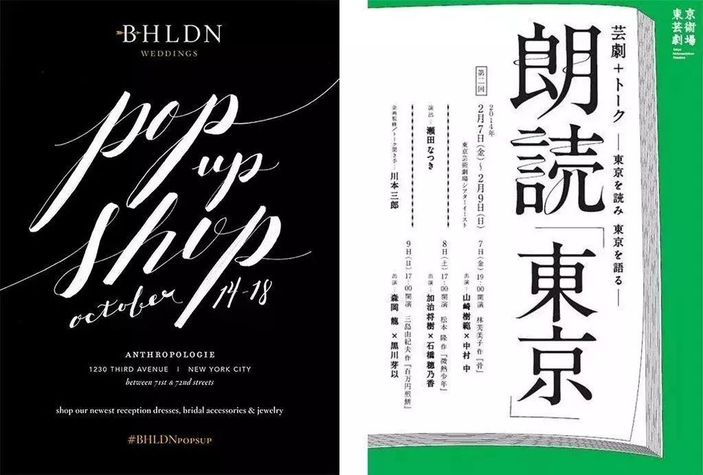
09#Thin Line Decoration Decorating the font with thin lines can bring a sense of slenderness and elegance.
Level of mastery: ★★☆☆☆
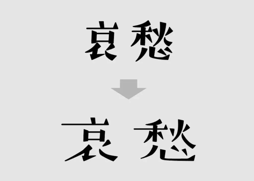

10#Decomposition and deformation Decompose the strokes of the text, and then deform the parts. According to different deformation processing methods, the expressed feeling will be quite different.
Level of mastery: ★☆☆☆☆

In addition to the above 10 commonly used techniques, there are also repeated font design, stroke stretching, stroke blurring, etc. There are many design techniques, but it is enough to master the commonly used ones, and you also need to consider the design requirements and themes in order to make the most of the techniques.
Thanks for reading!
Welcome to join the official design exchange group of design masters, scan the QR code below, and reply the password "Join the group". Communicate with the group.
////// END //////
—
It's timepromoteyourself
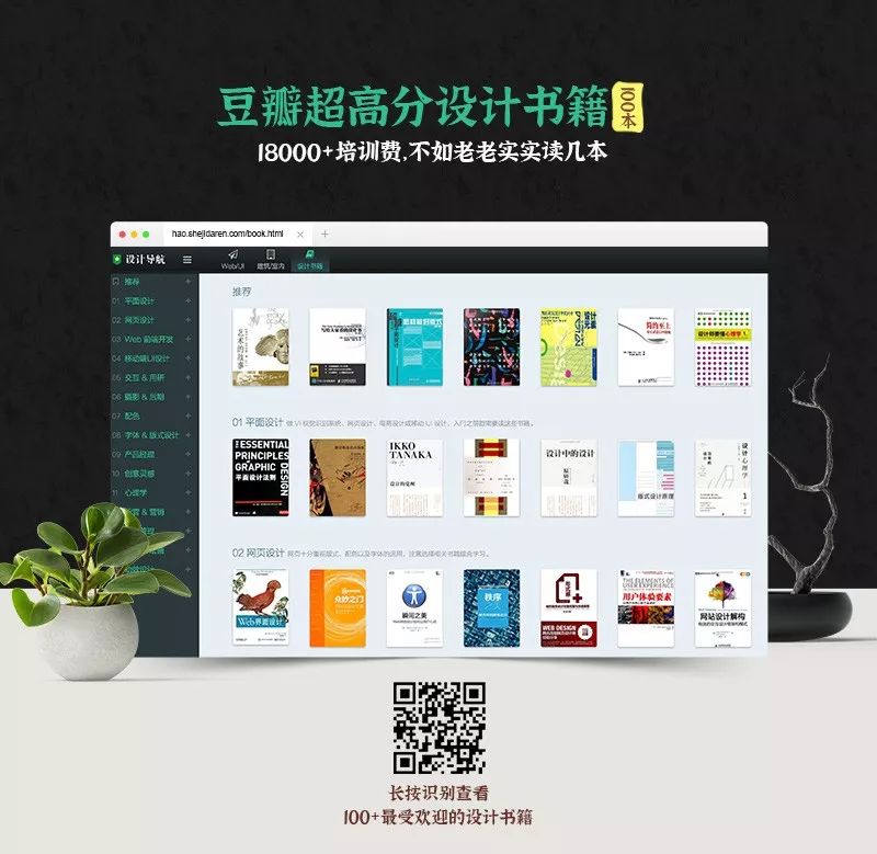
Look at Douban's high-score design books!
▼
Articles are uploaded by users and are for non-commercial browsing only. Posted by: Lomu, please indicate the source: https://www.daogebangong.com/en/articles/detail/10%20Goodlooking%20Title%20Font%20Design%20Tips.html

 支付宝扫一扫
评论列表(196条)
测试