
Have you struggled for a long time just to find a font that matches your work? Before starting your design project, have you already started thinking about which font you will use? Do you also hate receiving important news in comicsans? Or irritated by an insignificant message in all caps? Don't worry, you're not alone.
Architects and designers often use flat graphics as a means of expression in their illustrations. The most versatile are paintings presented in different techniques, styles and styles. But among the elements that connect panels and drawings, techniques and models, there is one particular part that improves typography and presentation, and that is, fonts.
Font is one of the cornerstones of graphic design, which can be defined as a set of systematic glyph representation. A glyph is a design assumed by a series of letters in a particular style group. In this group, there are many different font representations, such as the letters themselves (thin, italic and bold), the word boxes (uppercase and lowercase), source classifications, including Sans-Serif ( Sans serif), Serif (serif), Script (cursive) and Dingbat (miscellaneous). In addition to this, there are more similar special categories.
It is worth mentioning that in designers, especially architects, the importance of fonts is the basis for the understanding of non-traditional characters in graphic representation. Correct fonts can enable readers to use thinking logic to understand certain flat content (whether it is a drawing, text or even an overall scheme), making it an effective way to frame the relationship between reality and imagination.
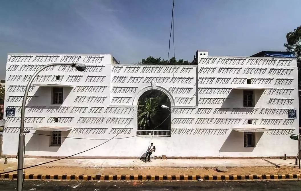
In architecture, font models are not limited to architects’ articles and graphic representations, but also appear on the exterior walls of buildings, in architectural visual representation schemes, and use local printing as a means of displaying contemporary popular culture Among them, these reveal the necessity of diverse expressions at different levels.
We have selected some font mockups that architects use in professional drawings and icons. Many of them are paid fonts, but you can also find good free fonts here. Here are the ten fonts we picked:
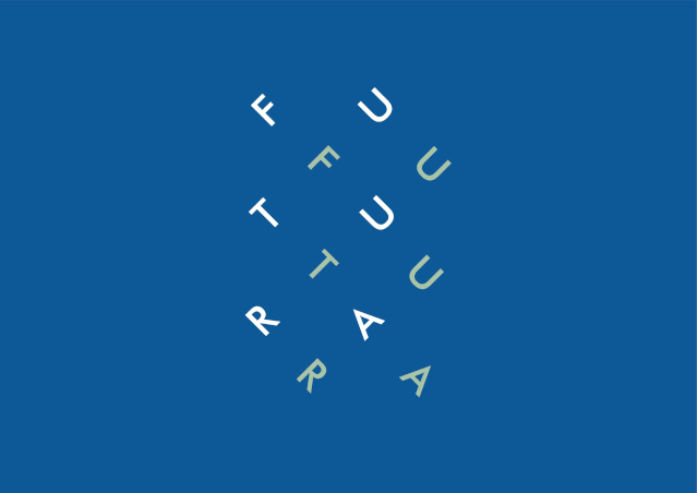
Futura
This typeface is a classic example of modern graphic design created by Paul Renner in the 1920s. Inspired by Bauhaus techniques, it harmoniously uses straight lines and curves to bring the text into balance. However, although this typeface is visually clear, it should not be used in long texts due to the fact that it promotes visual fatigue. Just like the precise words such as titles and subtitles on architectural posters, its visual expressiveness is highly used on corporate buildings.
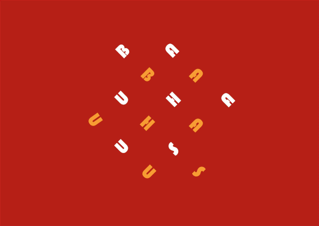
Bauhaus
This typeface was developed by graphic designer Herbert Bayer in 1925. Its concept is considered eternal and beyond time. Its creator studied at the Bauhaus School between 1921 and 1923 under the tutelage of Kandinsky and Moholy-Nagy. To this day, it is mainly used for titles and subtitles on exhibition boards.
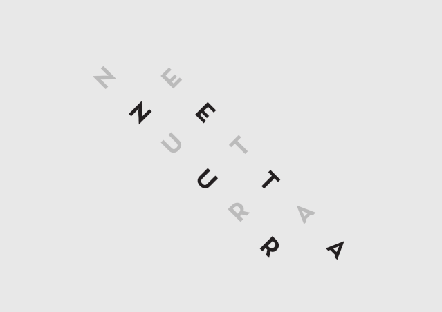
Neutra
In honor of the great modernist architect Richard Neutra, graphic designer Christian Schwartz designed the letters from the architect's manuscript. Julius Schulman and Dion Neutra were also involved in the design process. This typeface is highly used in architectural and design works, competing with Futura font.
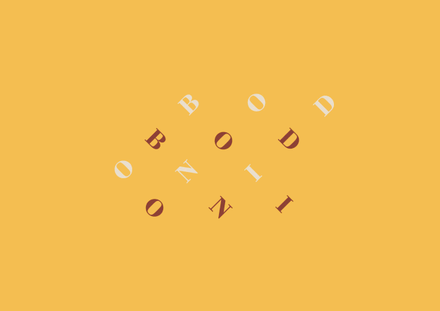
Bodoni
This typeface was created in 1767 by Giambattista Bodoni, who features a high artistic aesthetic and should be used sparingly. Due to its line combination and bold letterforms, it should not be used as long text, but it can be used as a strong accent, such as titles and details.
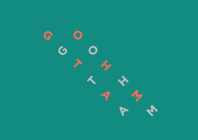
Gotham
Inspired by typical letters commonly used in signage and architectural visual representation, this typeface was conceived by designer Tobias Frere-Jones around 2000. Because of the idea of credibility conveyed by its lines, this typeface is widely used in publicity. In architecture, this font should be used for business cards and signs.
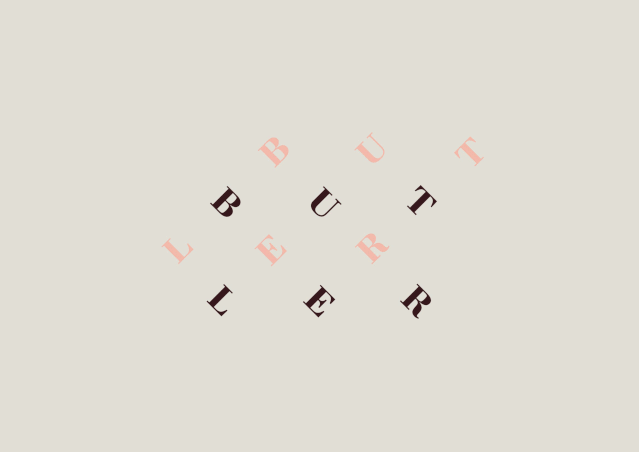
Butler
Butler font style is between Bodoni and DalaFloda, composed of curvilinear modern font style. It is used for titles and logos due to its distinctive character.
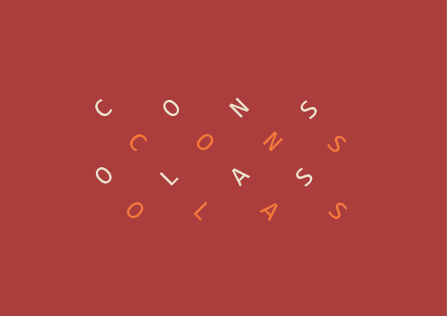
Consolas
This typeface is widely used for long text, and is ideal for architectural competitions and university display boards, or even text box type in flat details, because of its clean and beautiful lines and good proportions, it is suitable for long reading without overwhelming. People get bored. This typeface was designed by Lucas de Groot and is also widely used in books and professional architectural magazines. On Windows, this font along with Cambria, Constantia, Corbel, Candara and Calibri are the most commonly used font types,need not need to be purchased externally.
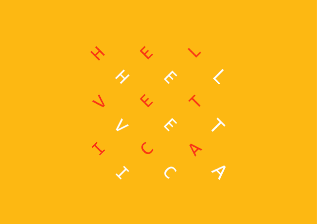
Helvetica
Most architects, even without advanced graphic design knowledge, will intuitively choose simple and straightforward sans serif fonts. Aside from this, Helvetica has also gained a reputation among professionals in the most commonly used texts. This typeface was designed by Max Miedinger and Eduard Hoffmann in the 20th century. It is closely related to modern graphic design due to its lines and layout as the neutral and simple design that the designer is looking for.
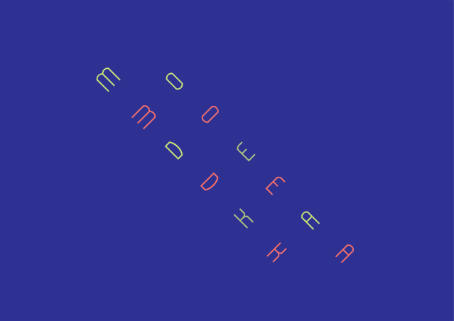
Modeka
This font is ideal for those who like variety and subtlety in their panels. In a system of mixed lines, between the rationalism of the straight line and the static break of the curve, Gatisvilaks created this typeface, showing its harmony. This font is recommended for titles, subtitles and text details in board graphics and graphic representations.

Poplar
This font was designed by Barbara Lind and is part of Adobe. Using this font presents its strong character and layout, which can be used in display boards, charts and schemes. This font also works well for headings, subheadings, and text details.

Editor:Mo Yintong, Han Shuang;Translator:Xu Shengyi
Articles are uploaded by users and are for non-commercial browsing only. Posted by: Lomu, please indicate the source: https://www.daogebangong.com/en/articles/detail/10%20English%20fonts%20to%20make%20the%20portfolio%20unique.html
 支付宝扫一扫
评论列表(196条)
测试