As we all know, Ai is a very powerful vector drawing software, whether it is making a Logo or Posters can use these tools to improve efficiency and save time. This issue provides 10 tips for using these tools on font effects. 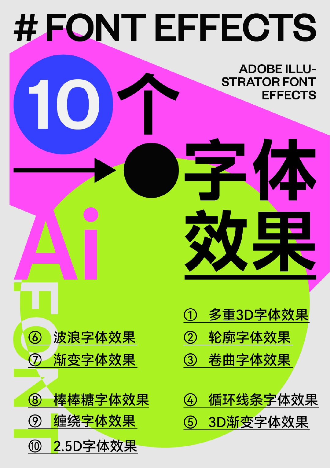
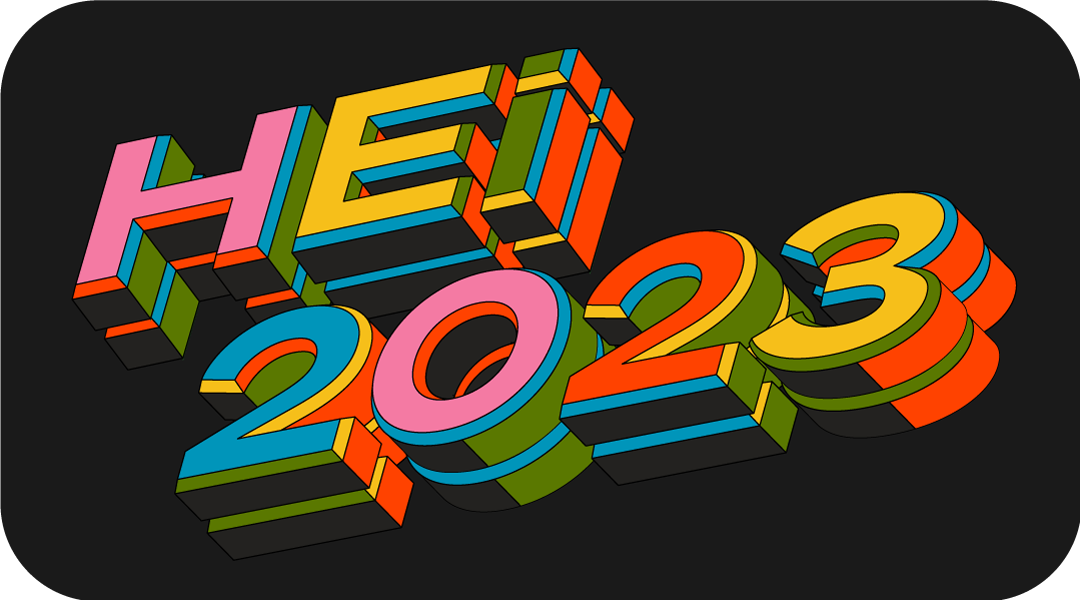
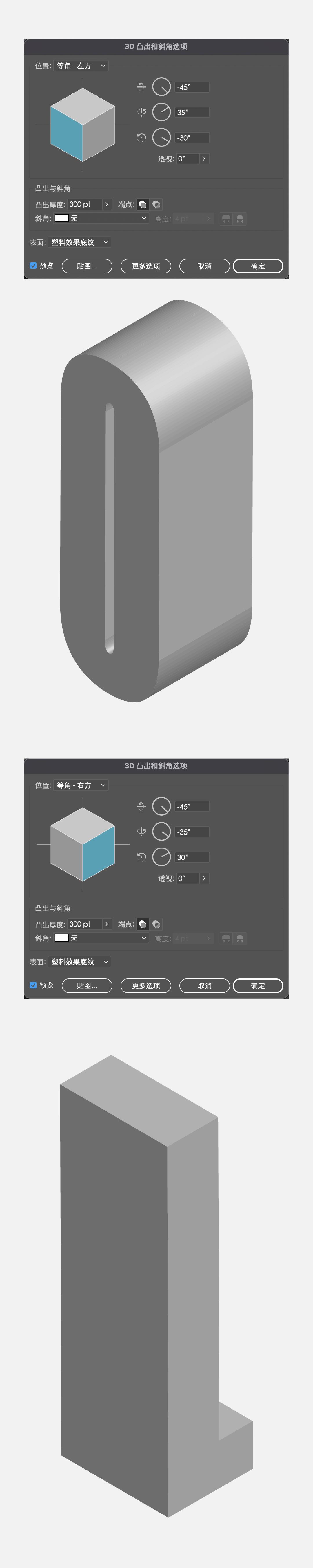
Type the text first, choose a font with a wider font ratio, fill it with gray, click [Effect]-[3D]-[Protrusion and Bevel], adjust the angle, and click the middle one [Bevel] Select [Classic], set the height value: 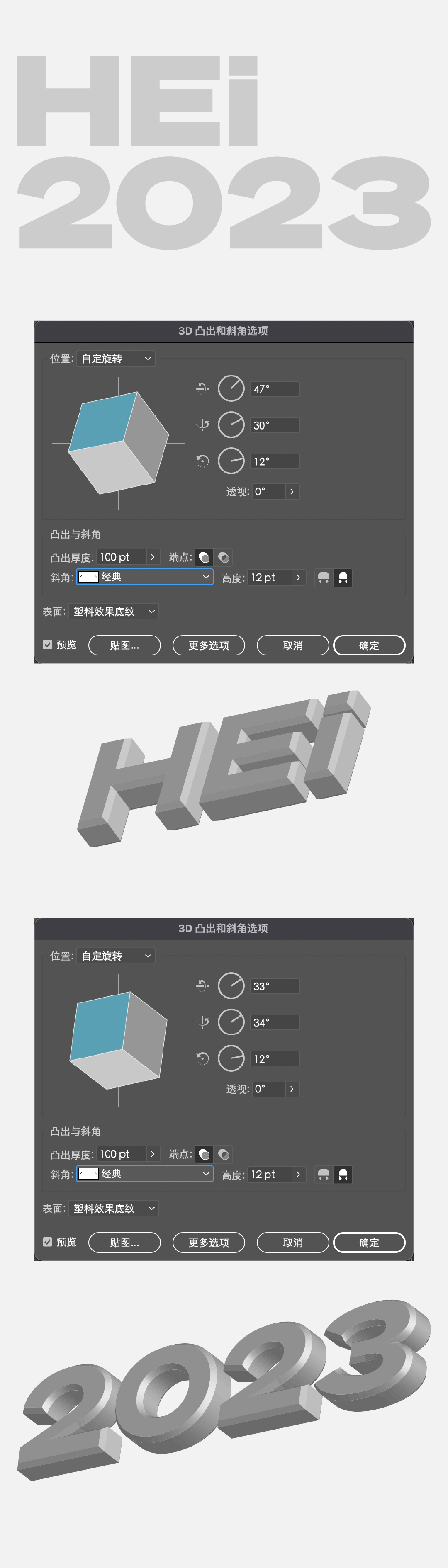
After adjusting the effect, expand the appearance, and then select the surface to modify the color. When adjusting the color, you can color according to the light and dark relationship of the font itself. 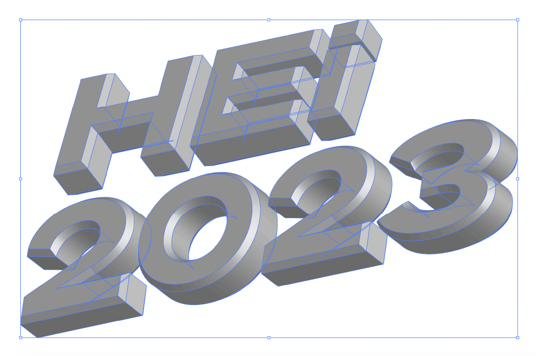
Finally, I copied and superimposed a layer to enhance the three-dimensional effect.
You can use the font library, or vector shape or pen tool to get this font path, and set it as a stroke effect. 
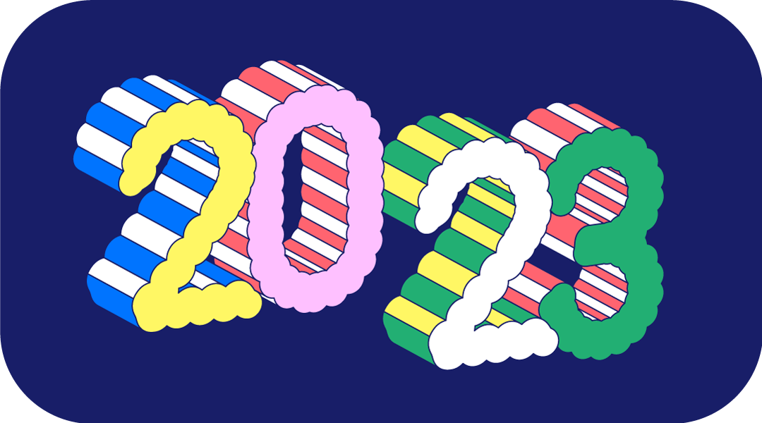
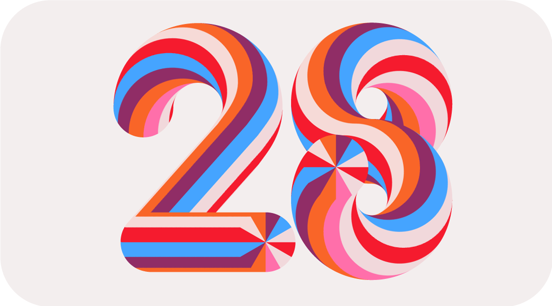
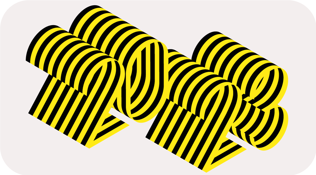
Select the number, click [Effect]-[Distortion and Transformation]-[Ripple Effect], the value is as follows, this number is related to the size of the number, you can try more. 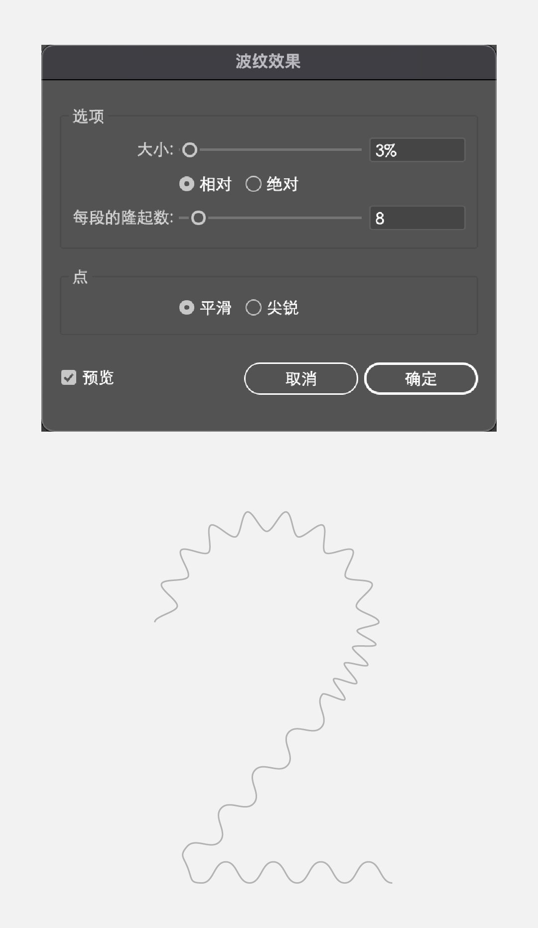
Then increase the stroke value, and adjust the endpoints and corners into rounded corners. 
Select the object and expand it twice to get: 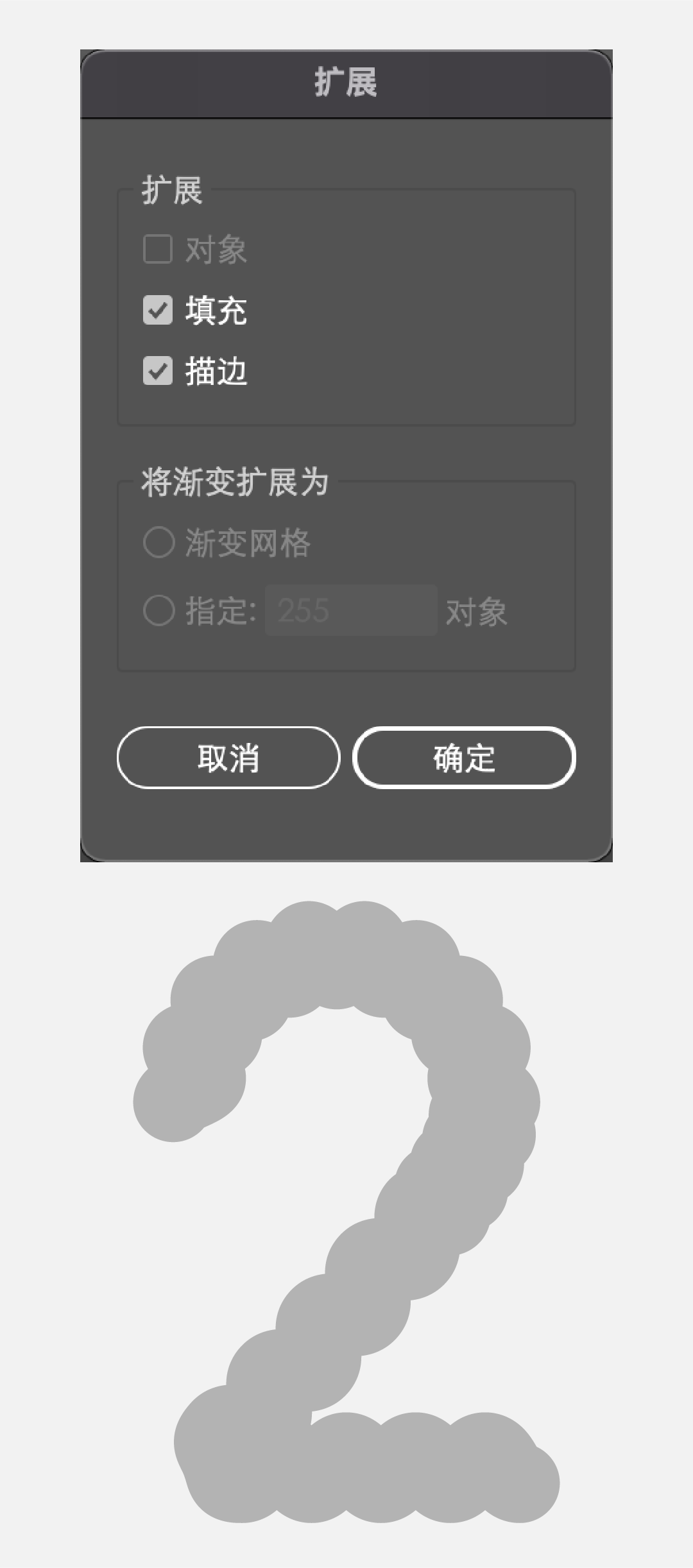
Select the object, click [Effect]-[3D]-[Protrusion and Bevel], the value reference is as follows: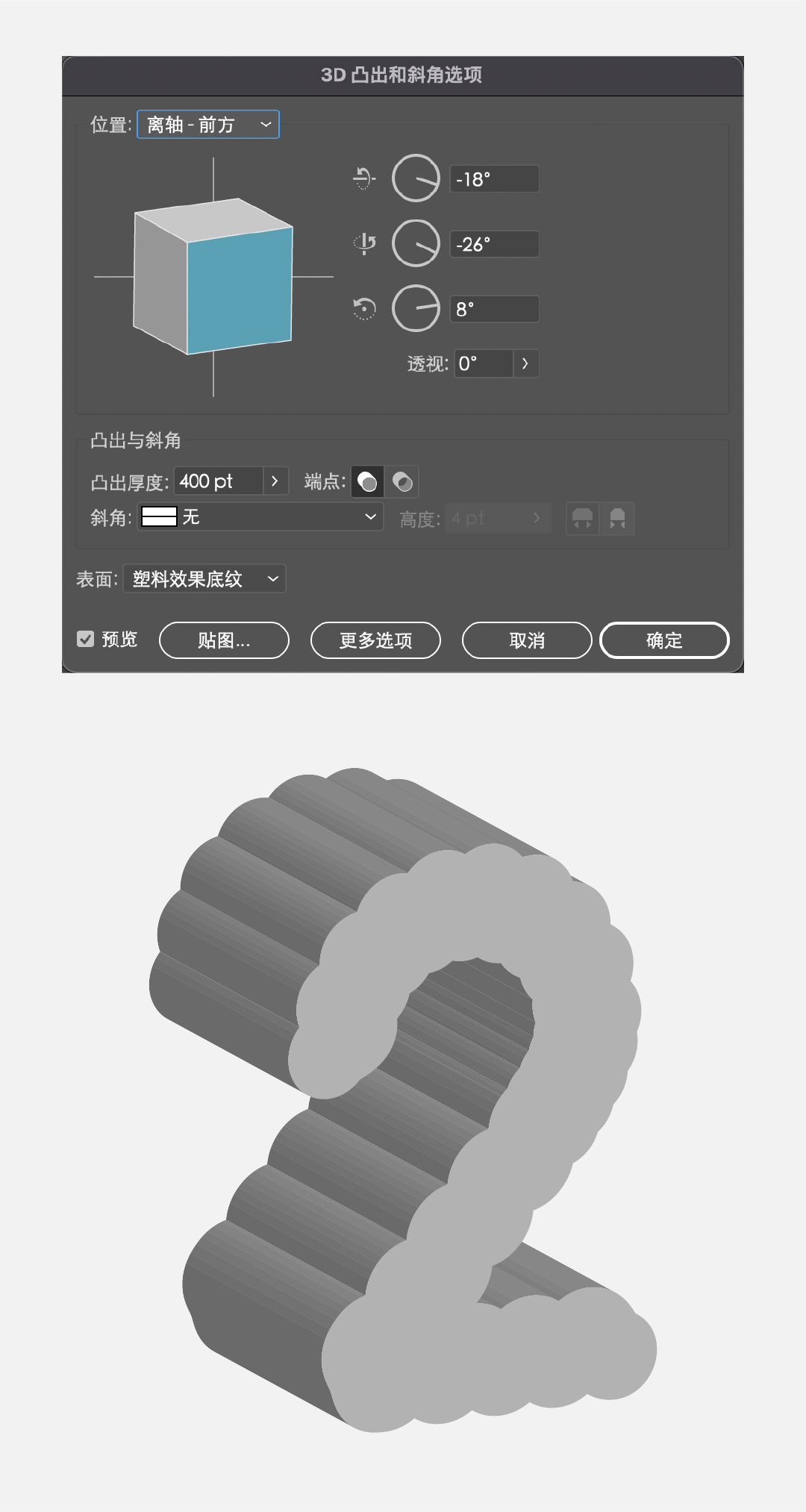
Select each face, merge it first, and then color it. 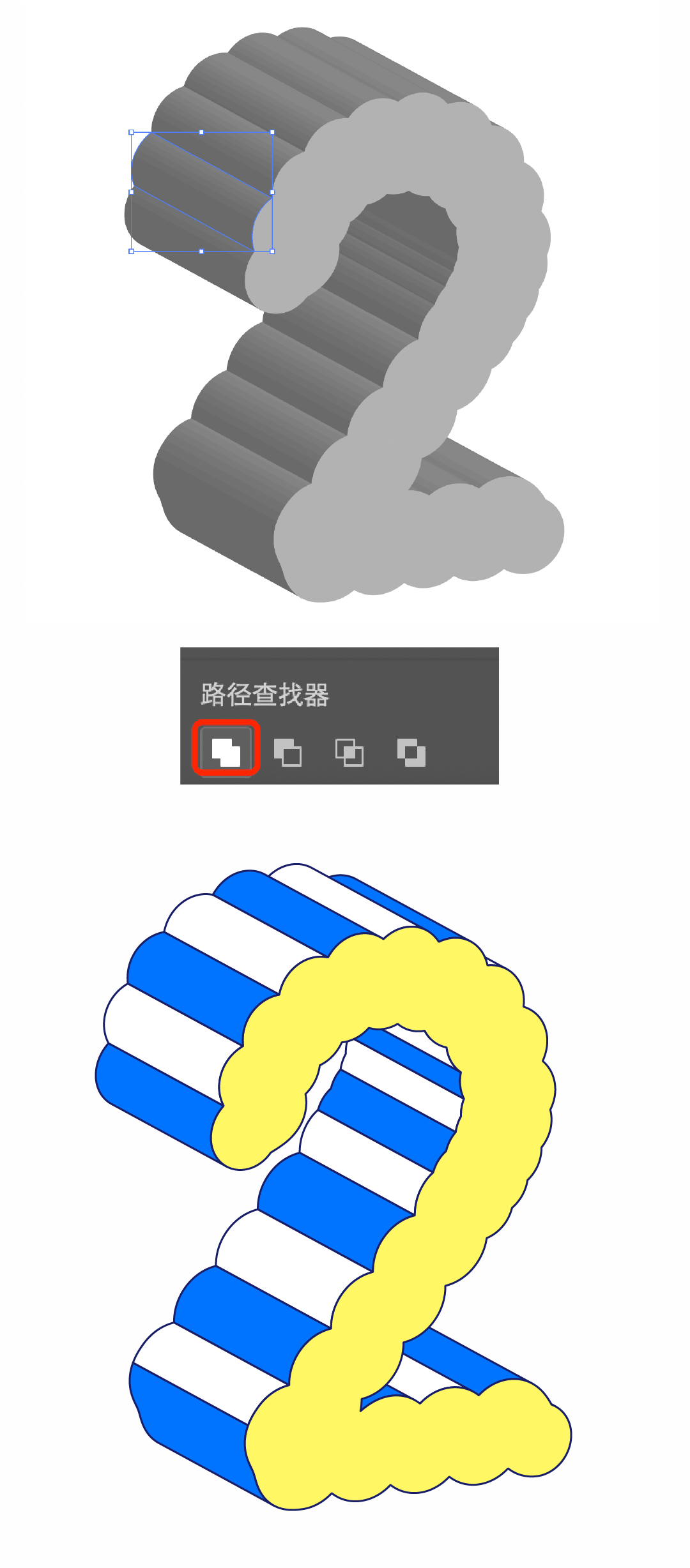
Get a few other numbers in the same way, and then color them: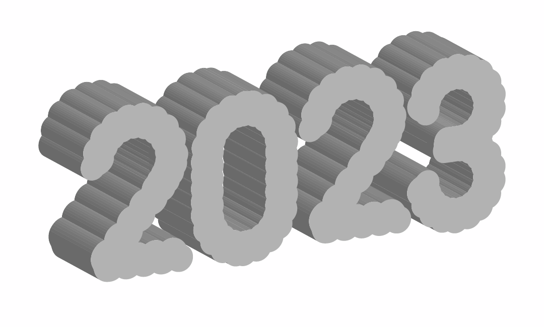

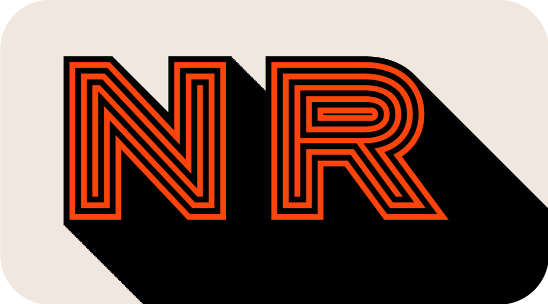
Type the desired word, then expand it, widen the kerning to facilitate the effect later, then select the object, click [Object]-[Path]-[Offset Path], the value reference is as follows, here You can choose to preview, and the size of the value is almost the same as the thickness of the original letter. 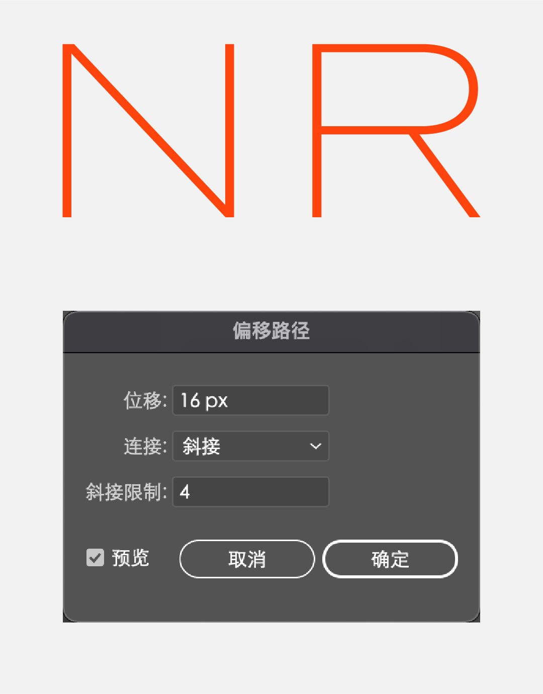
Change the color to black, then click 【Object】-【Path】-【Offset Path】for 5 times to get: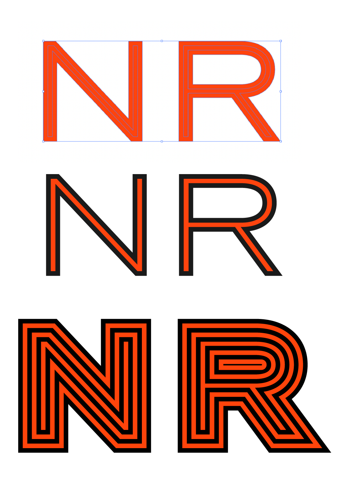
Select the bottom layer of black, copy 2 out, and then make a displacement, and then click [Object]-[Mix]-[Build], if the number of steps is not enough, click [Mix] on the toolbar Tool] button, hold down [Alt], and click the object to increase the number of steps. 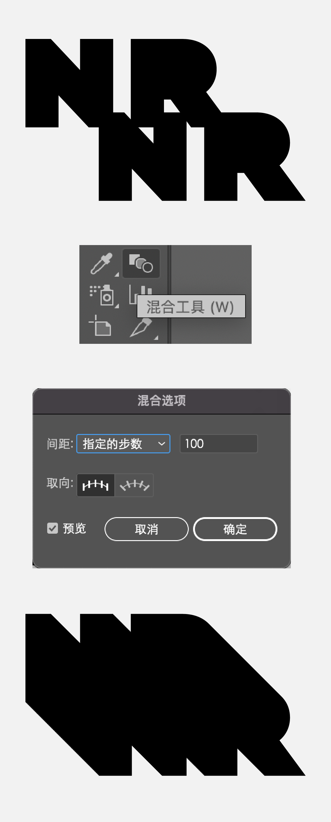
Place this blending effect under the front outline text to enhance the effect of font thickness and tension.

Draw a few circles, set the stroke effect, the position is staggered, the size and size refer to the following: < p>
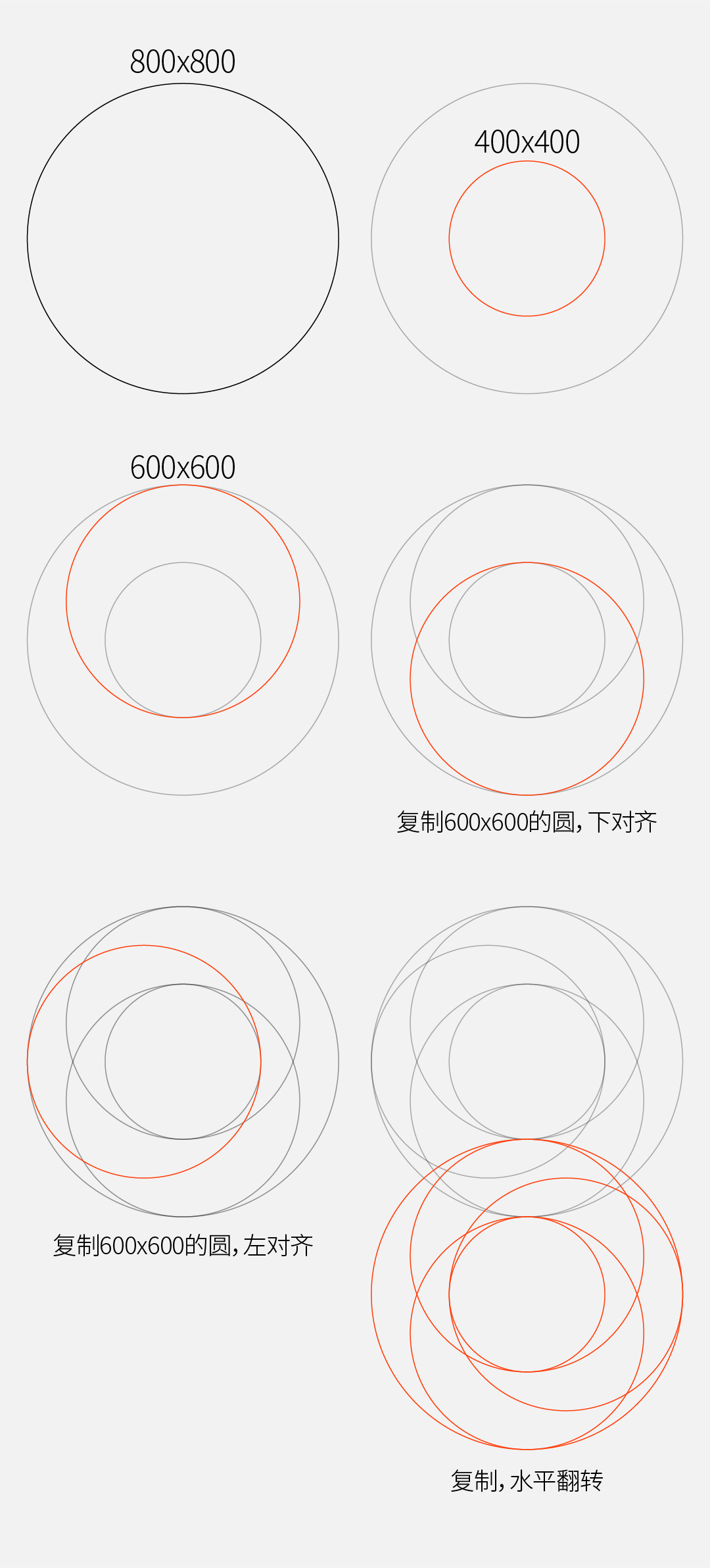 Select all the circle objects, click the [Shape Builder Tool] in the toolbar, hold down the [shift] key to merge the related paths, and the final shape is as shown in the figure below.
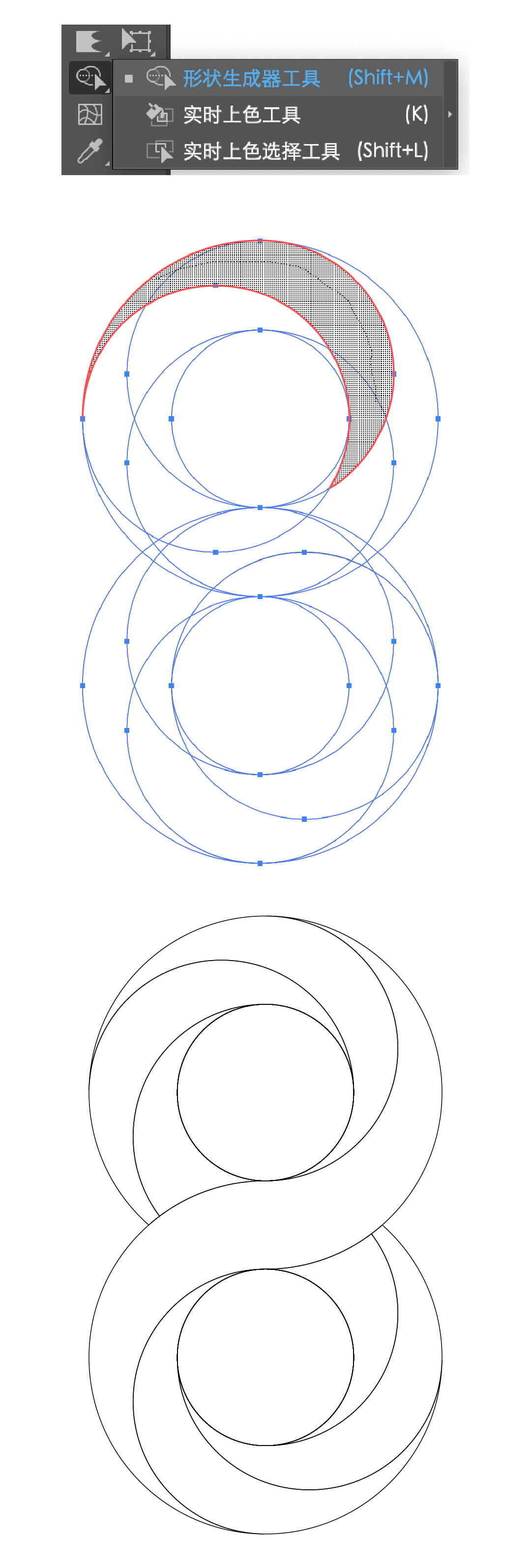
Then add color to the merged path to get:
In addition to adding colors, you can also mix lines, pick out each individual path, select the front and rear endpoints separately, and click the cut button on the top of the software. 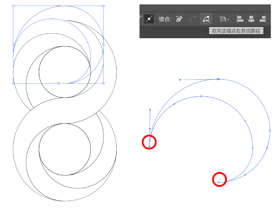
At this time, the path is cut into two (I just indicate here, the position does not shift). 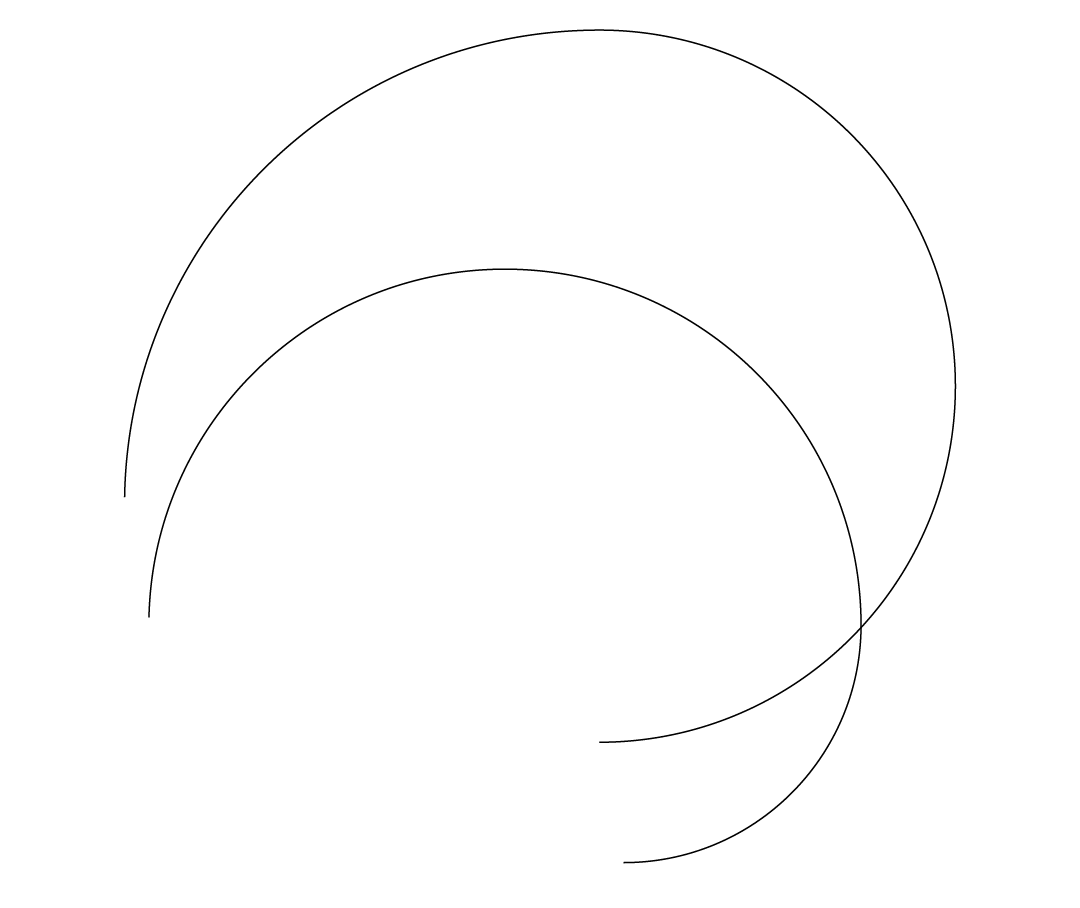
Select each stroke separately, click on the stroke, and select the second one. 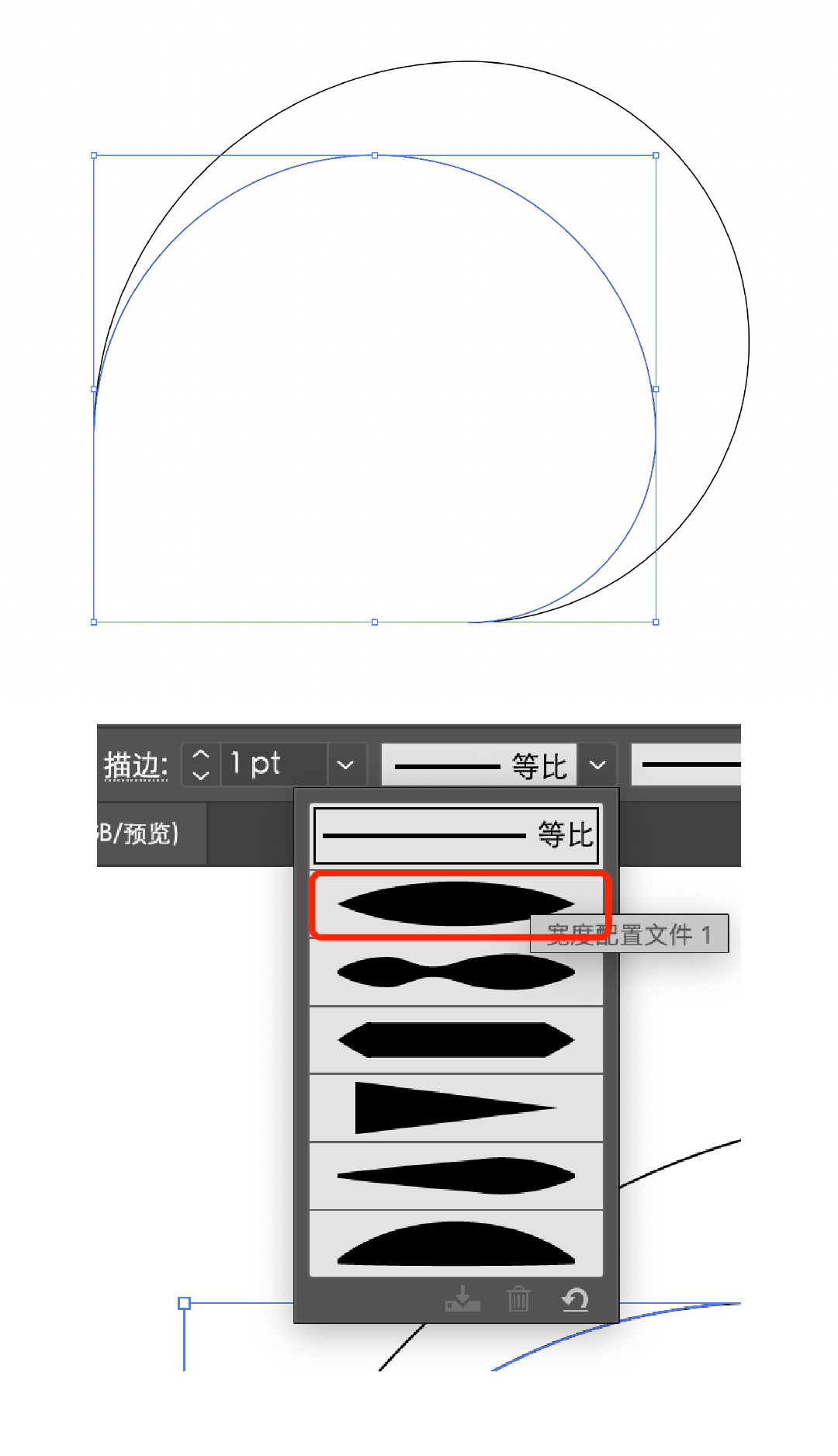
Then select two paths, click [Object]-[Mix]-[Build], if the number of steps is not enough, click [Mix tool] on the toolbar, hold down the [alt] key, click the object, Just increase the number of steps. 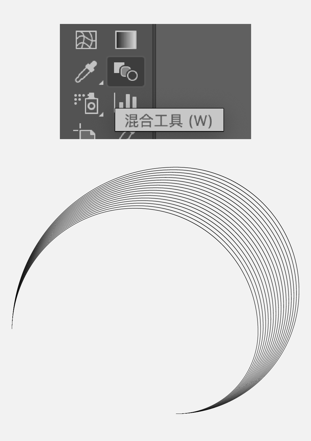
In the same way, other paths can be obtained in turn: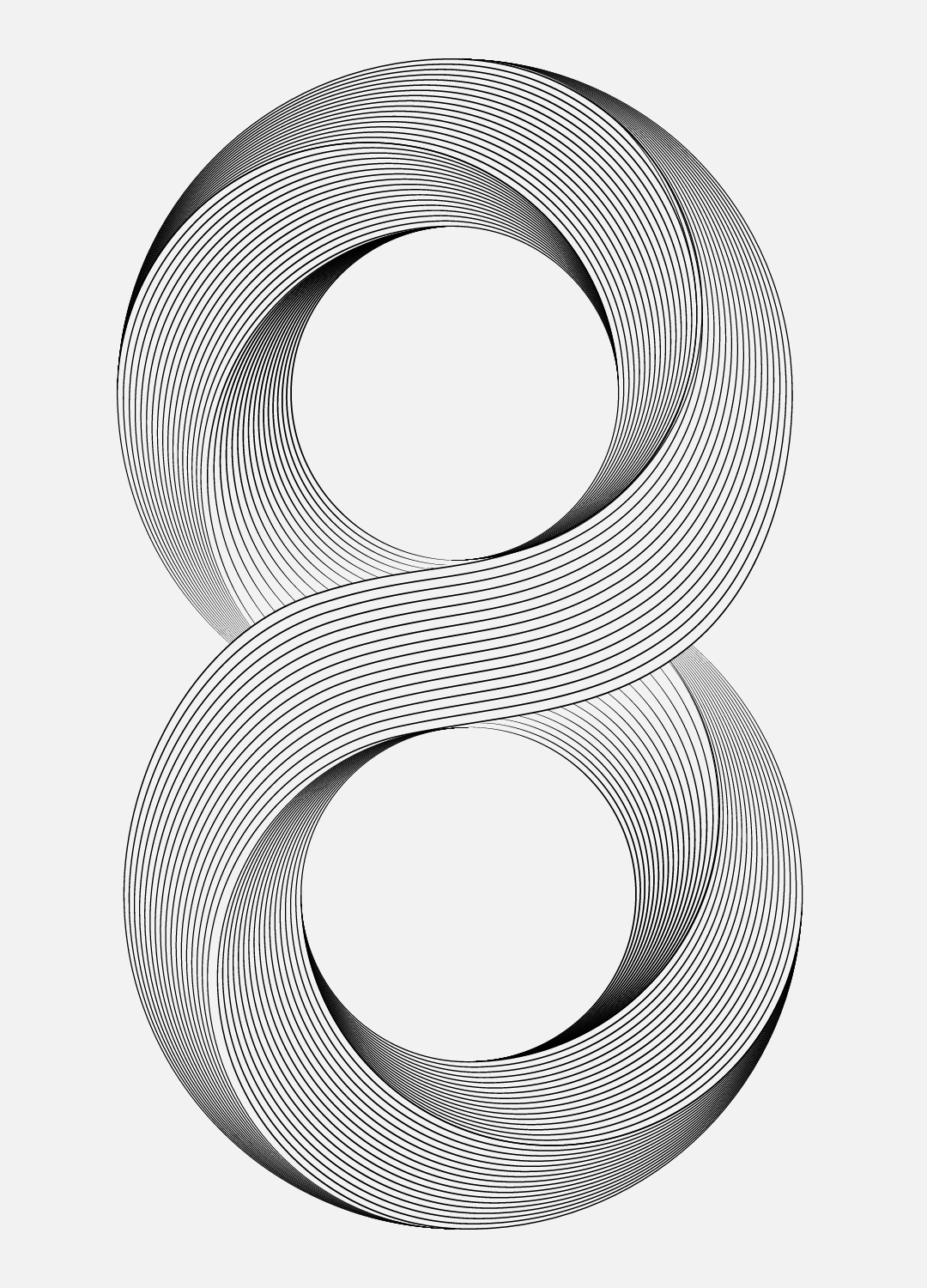
When some paths are blended, the effect is not good enough due to too many anchor points. You can select the path and use the [Smooth Tool] on the toolbar to smooth the anchor points, and then blend. 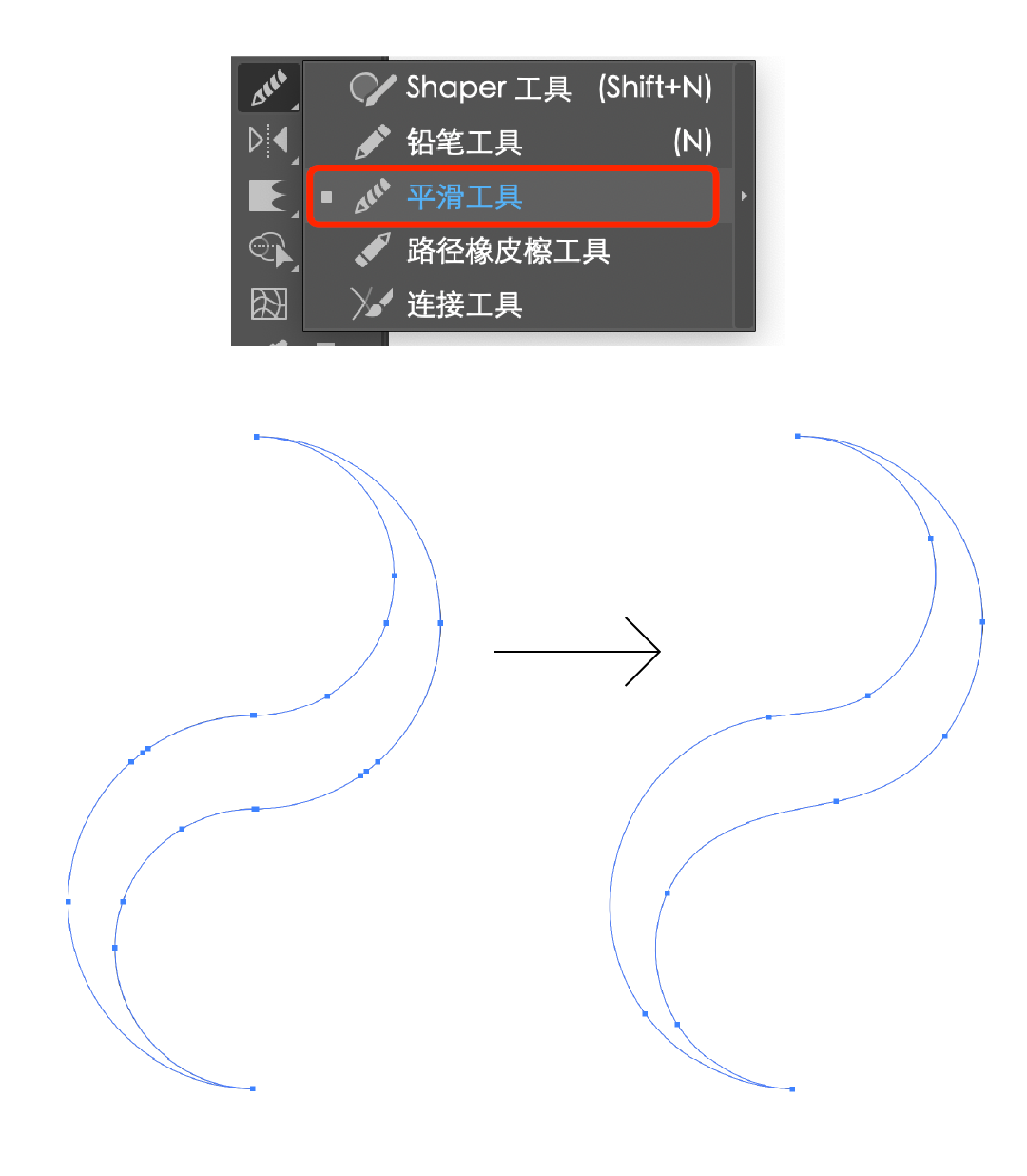
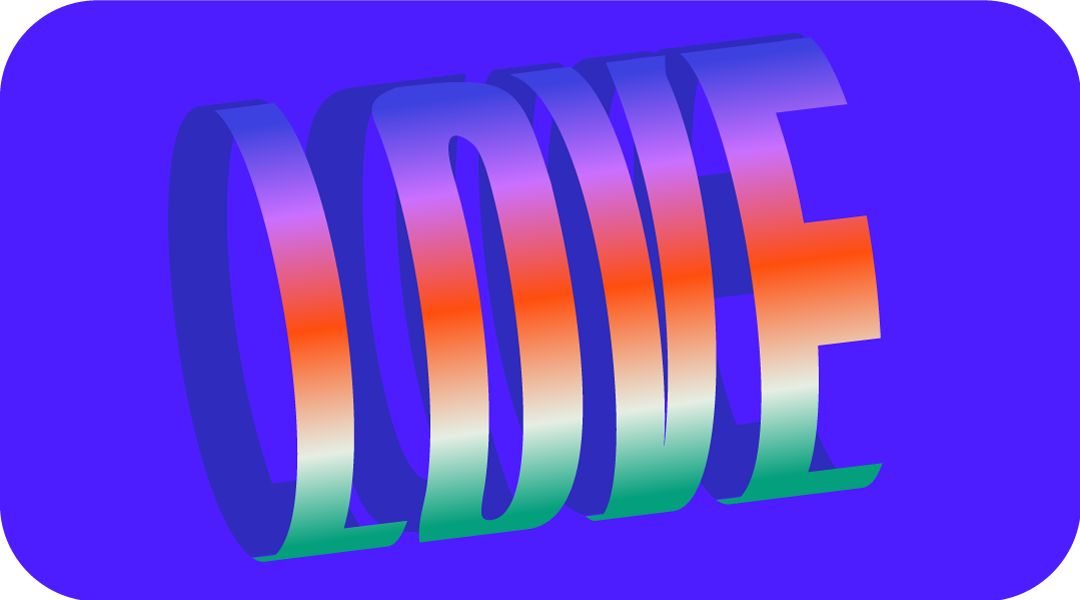
Type the font you want to make, and then expand the appearance. You can find that the endpoints at the bottom are not completely aligned. Manually adjust the endpoints to align them. 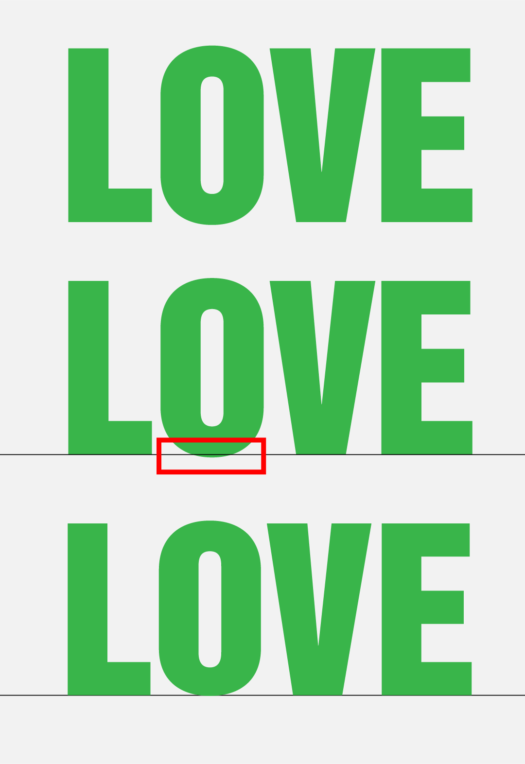
Copy a copy, mirror align, group, click [Window] to call out the [Symbol] panel, and drag it in directly. 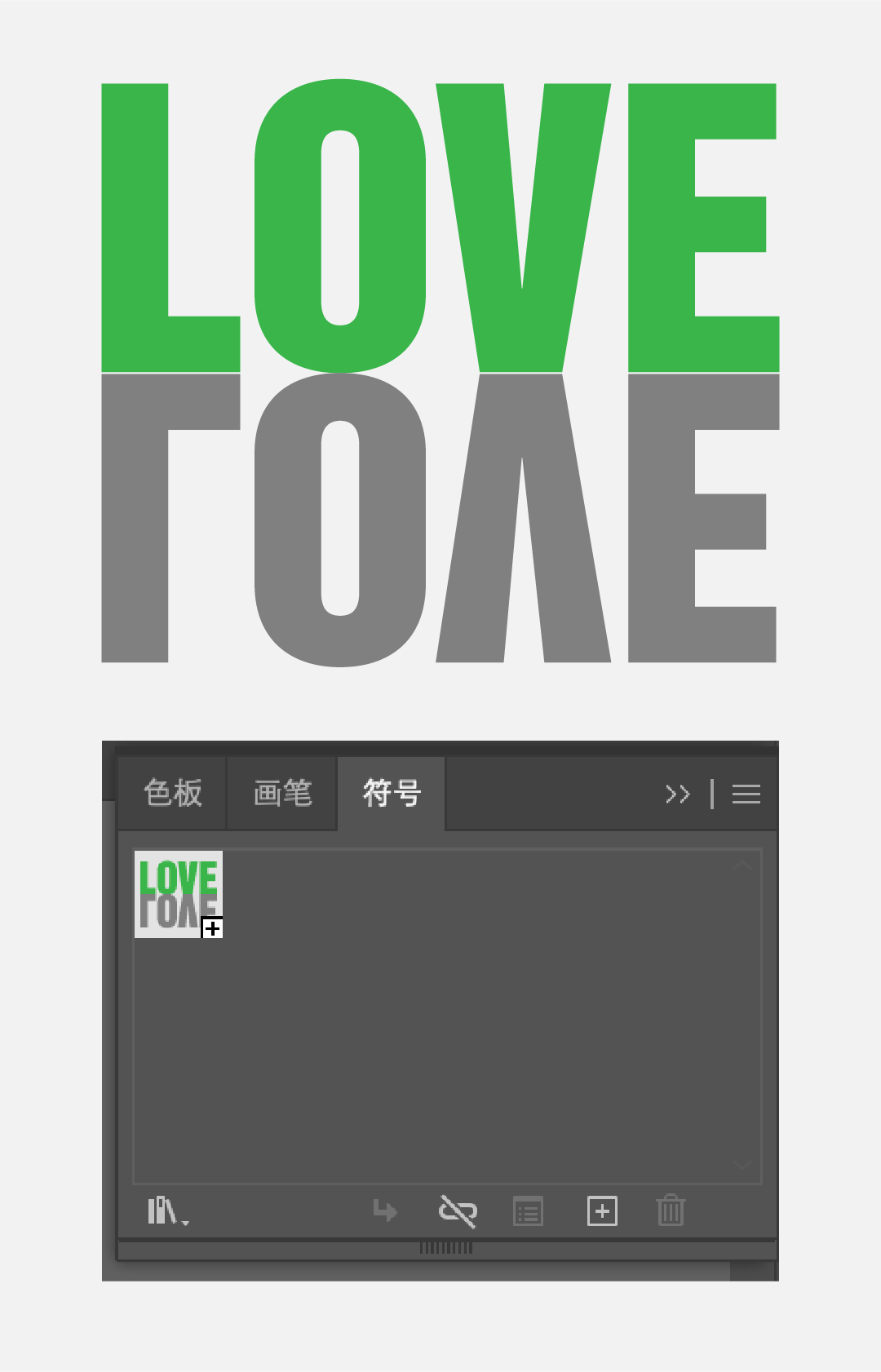
Draw an ellipse, tilt it, select the object, click [Effect]-[3D]-[Protrusion and Bevel], the values are as follows, and then click the [Map] button on the lower left to enter the map page , to preview, select the newly created symbol for one of the faces to map, and check the [3D model is not visible] at the bottom right. 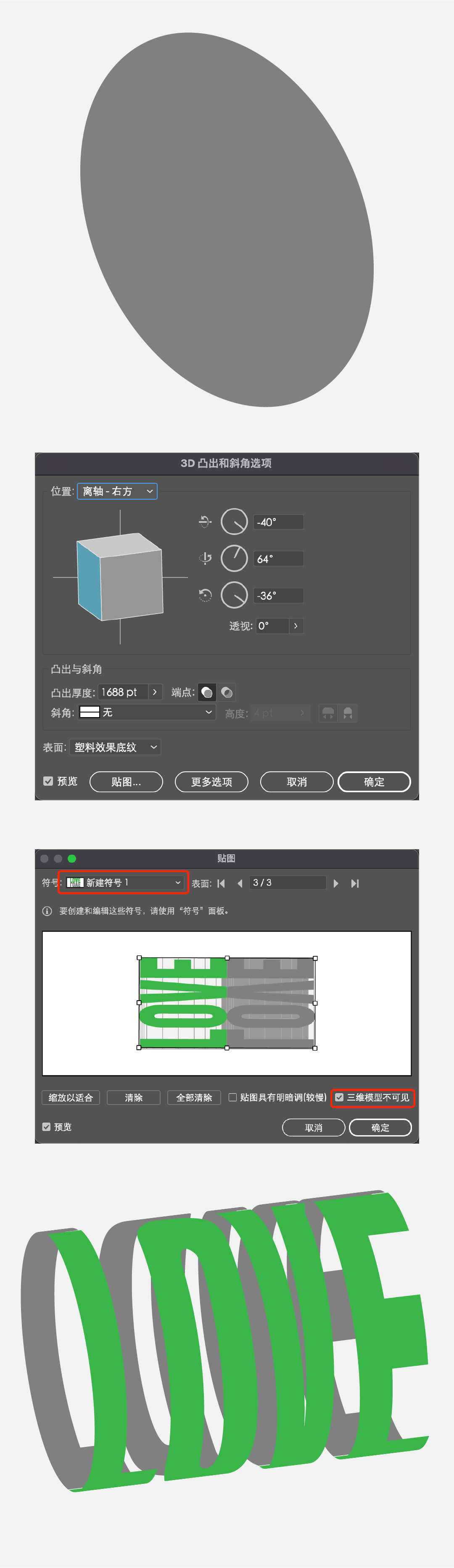
Extend the object, you can adjust the color of the face in it.
Draw a circle, select the stroke mode, add two anchor points with the pen tool, then delete the green one, copy one, mirror, select the anchor point in the middle, right click, and select [Connect];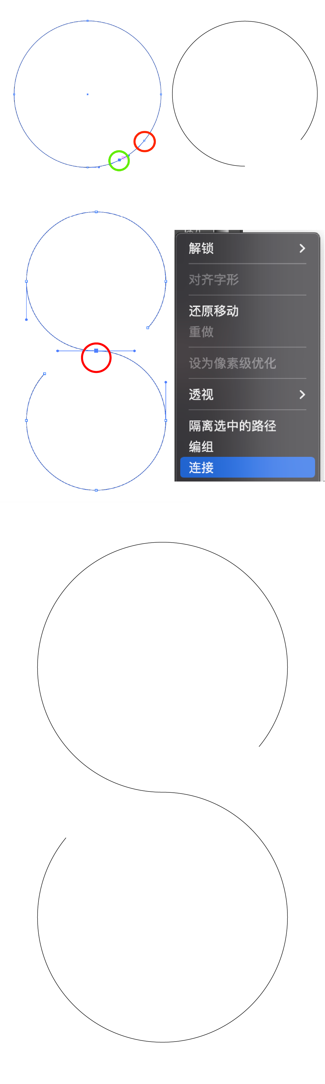
Draw a circle, fill it with color, then draw a line, stroke mode. Align the line to the center of the circle. 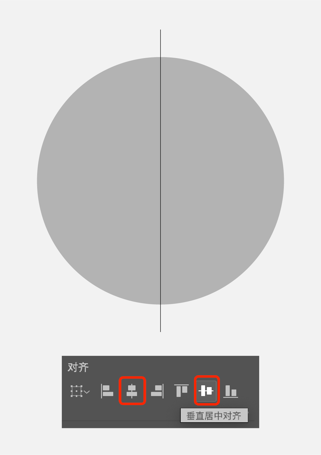
Select the line, click [Effect]-[Distort and Transform]-[Transform], and input the angle and copy value. 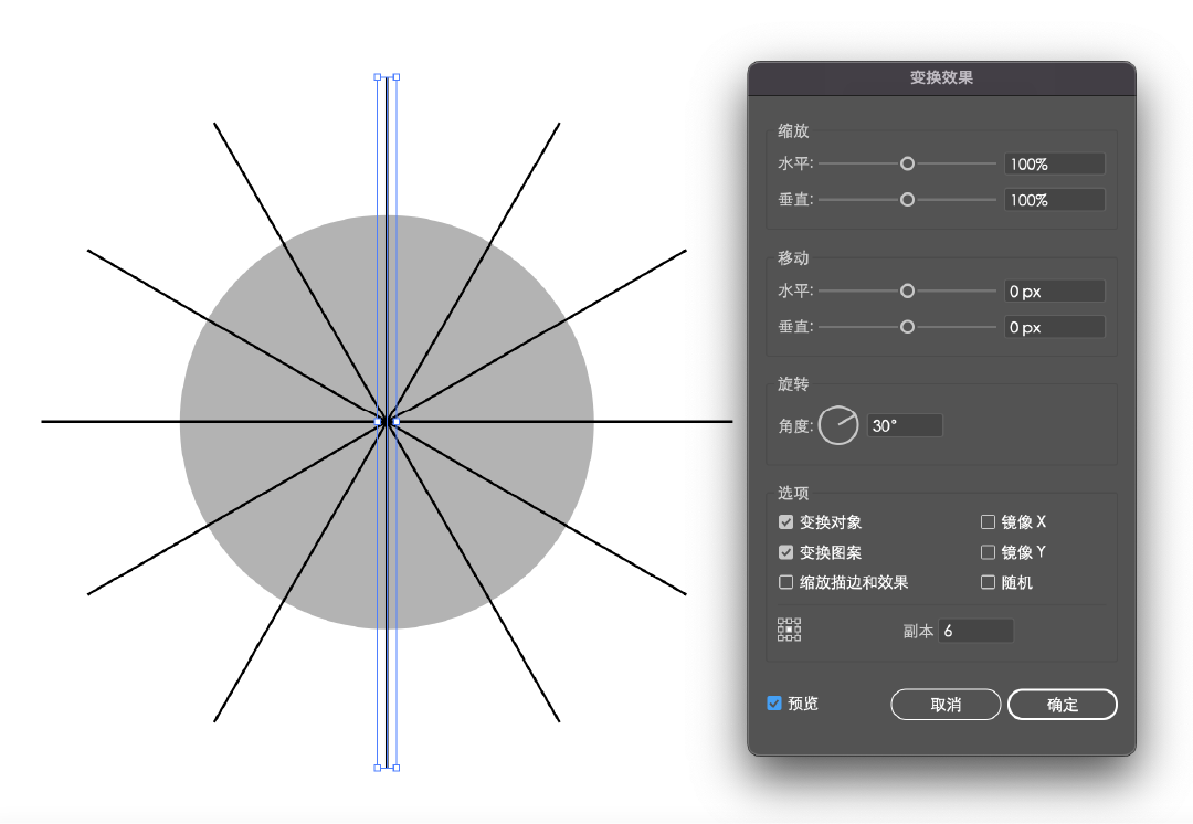
Extend the appearance to get this group of lines, ungroup them, and then select the circle and these lines to cut. 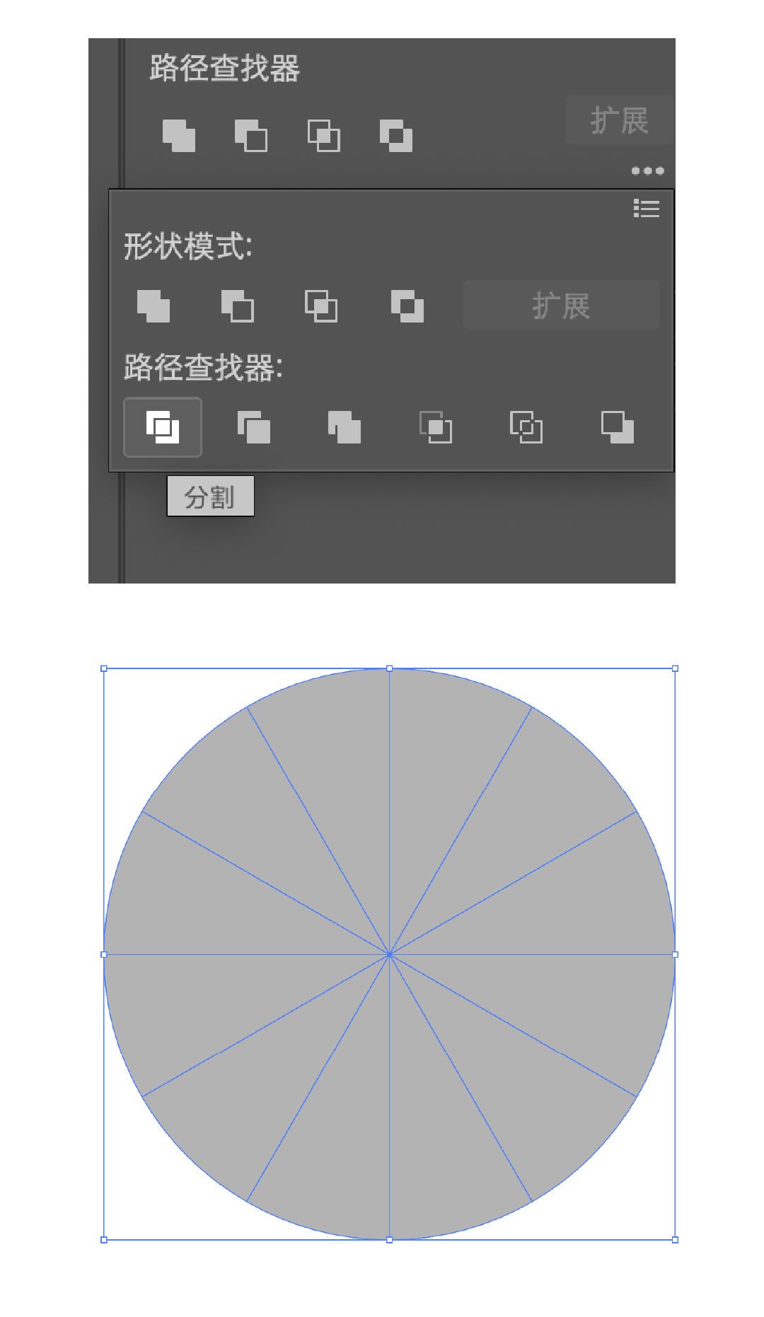
Ungroup and select a set of colors to fill individually. 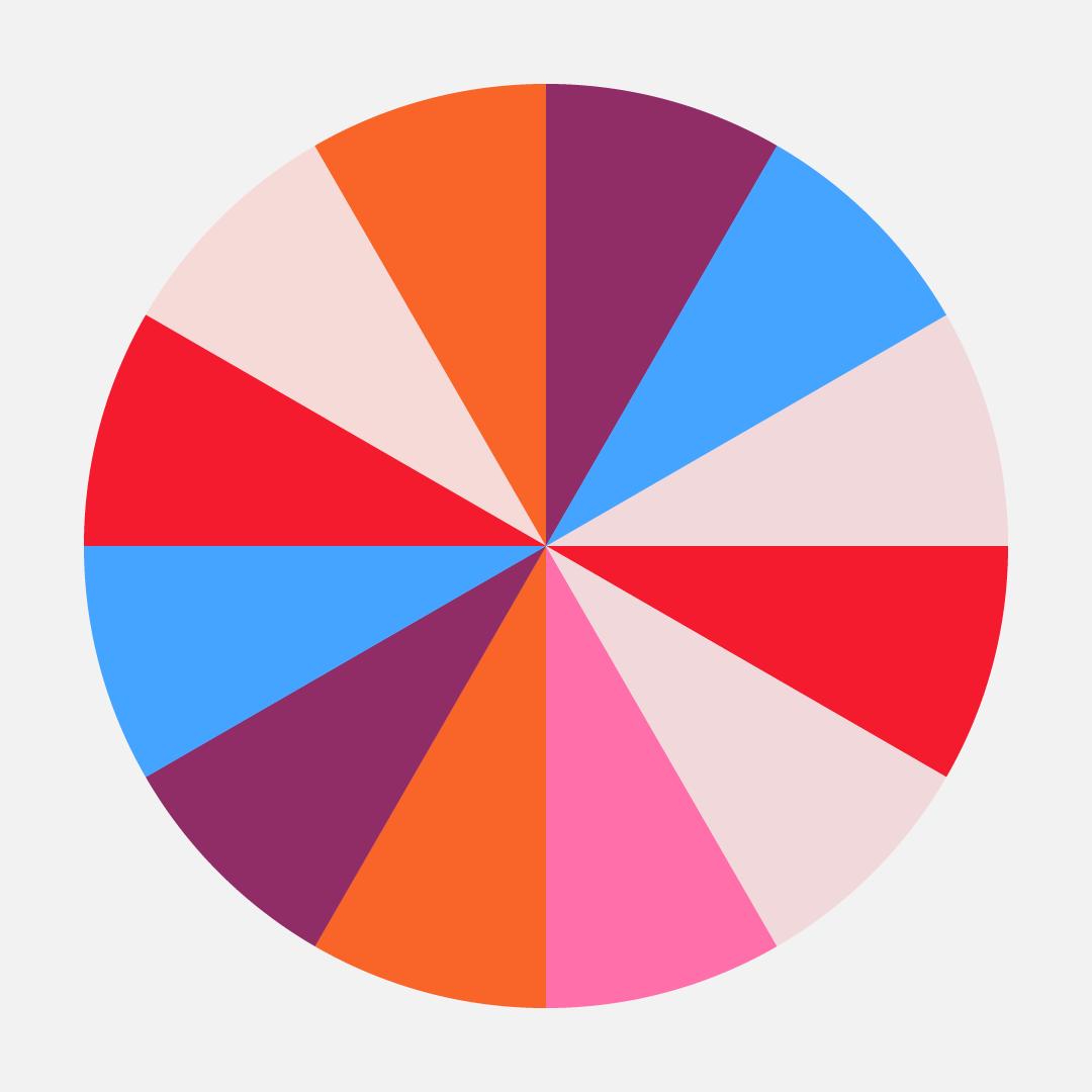
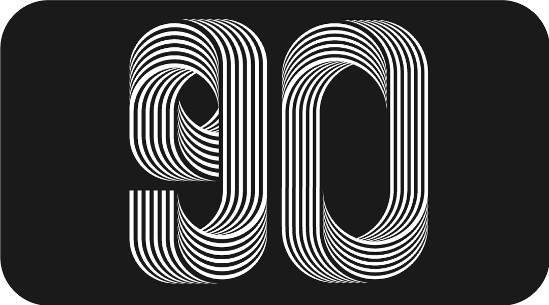
Zoom out, duplicate one, then select the two objects, blend them, the more steps you have, the smoother the path looks. 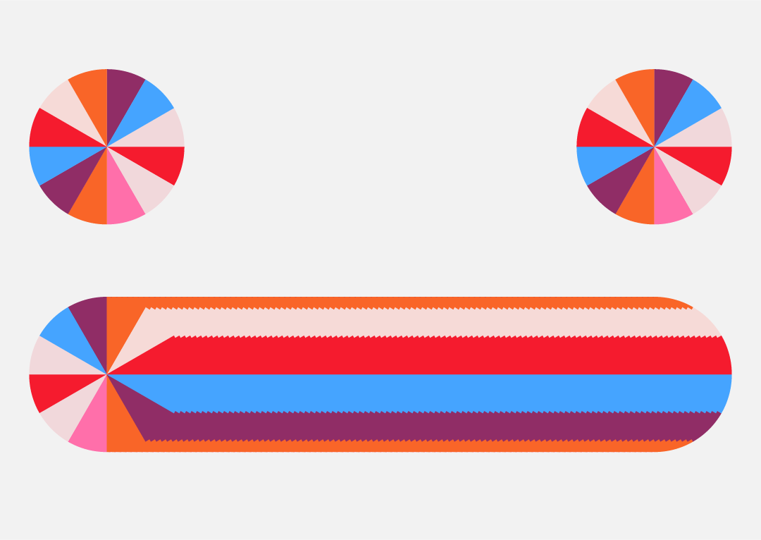
Select the previous path, blend with this effect, and then click [Effect]-[Mix]-[Replace Blend Axis]. 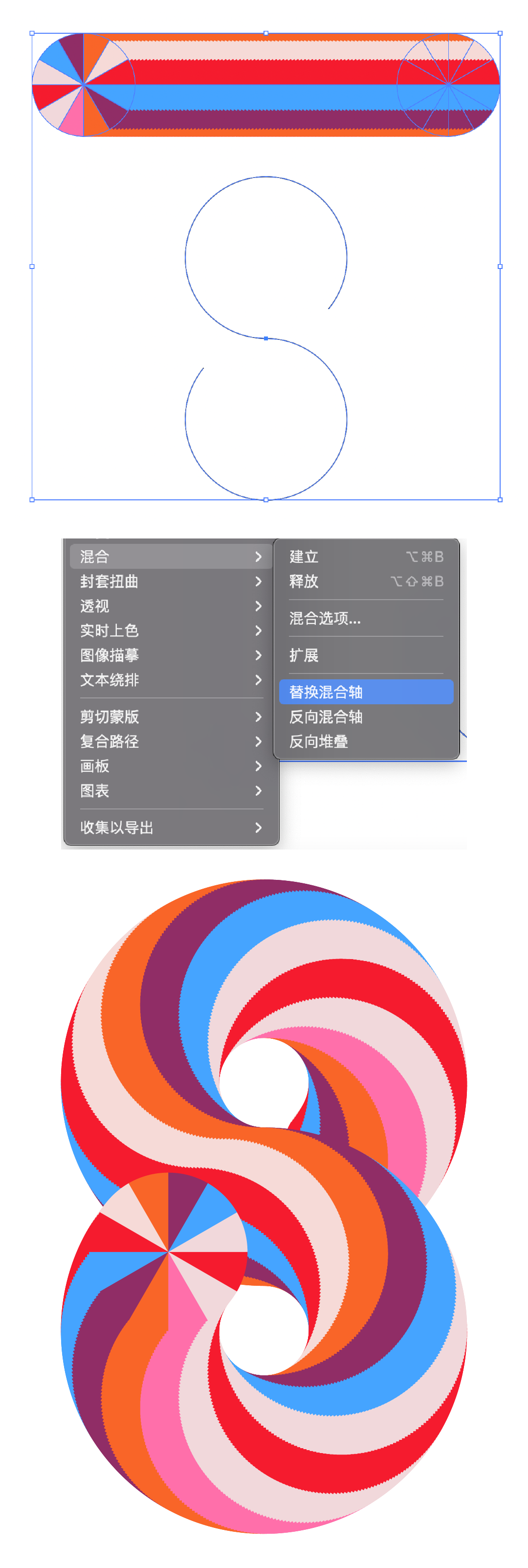
The same method, you can do different letter effects. 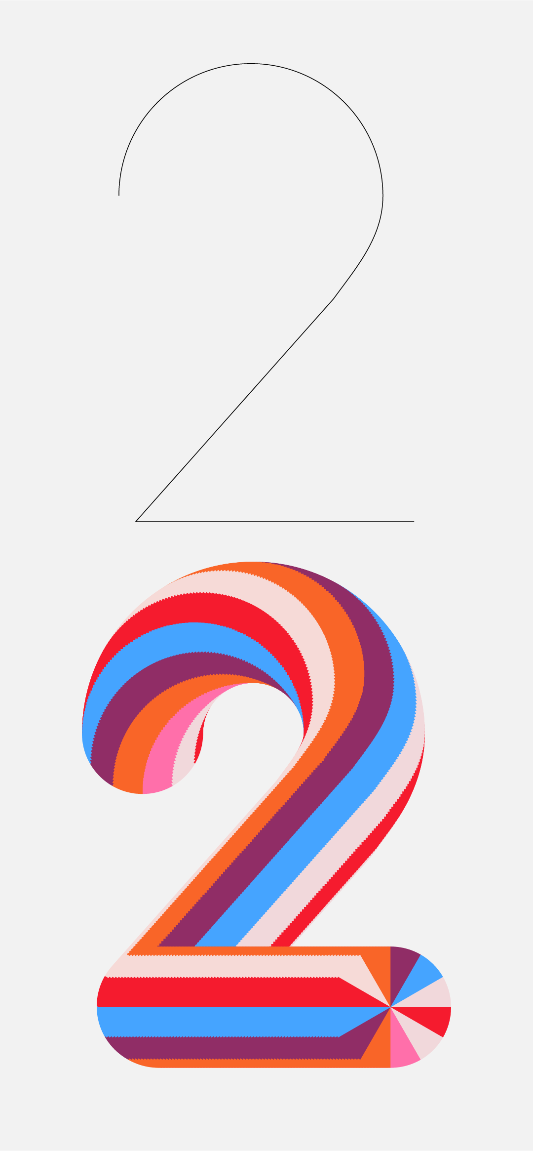
Use the rectangle tool to draw two ellipses in stroke mode. 
By adding and removing anchor points, get the right line. 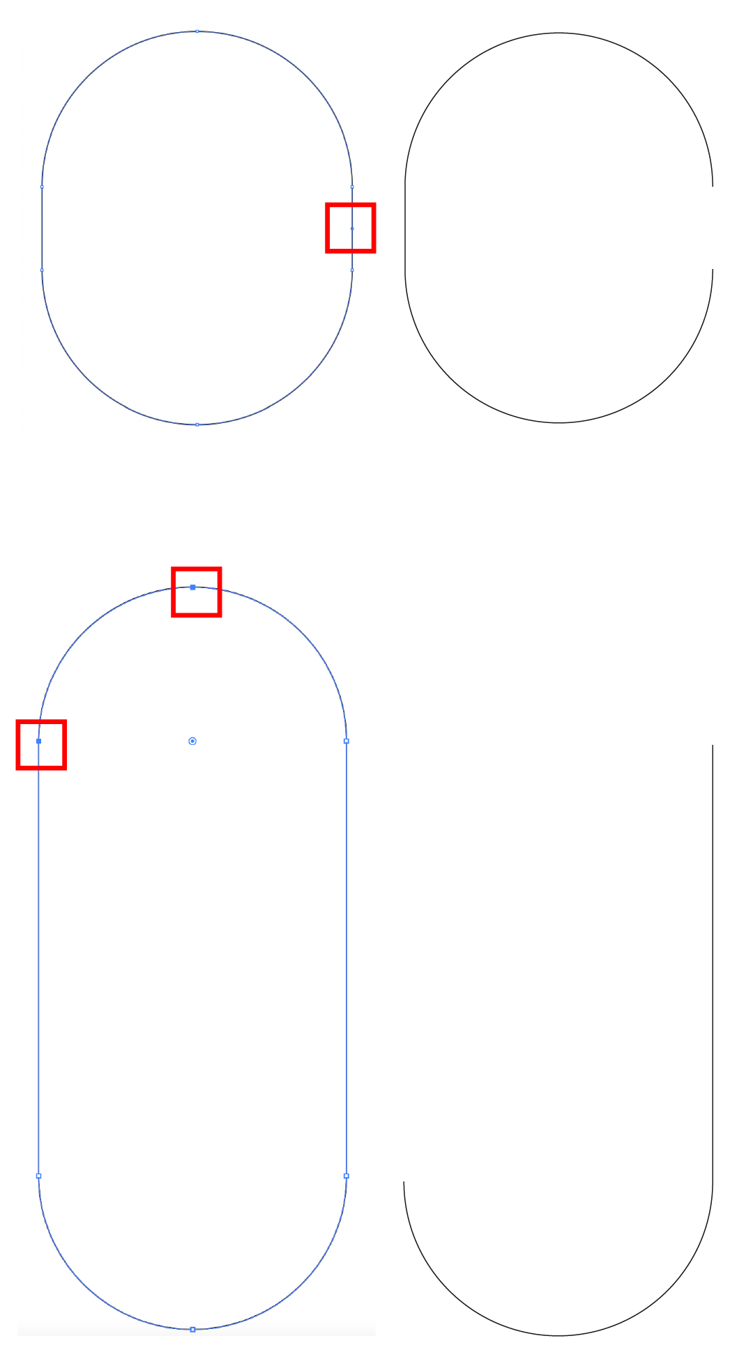
combination, select two endpoints, right-click 【Connect】. 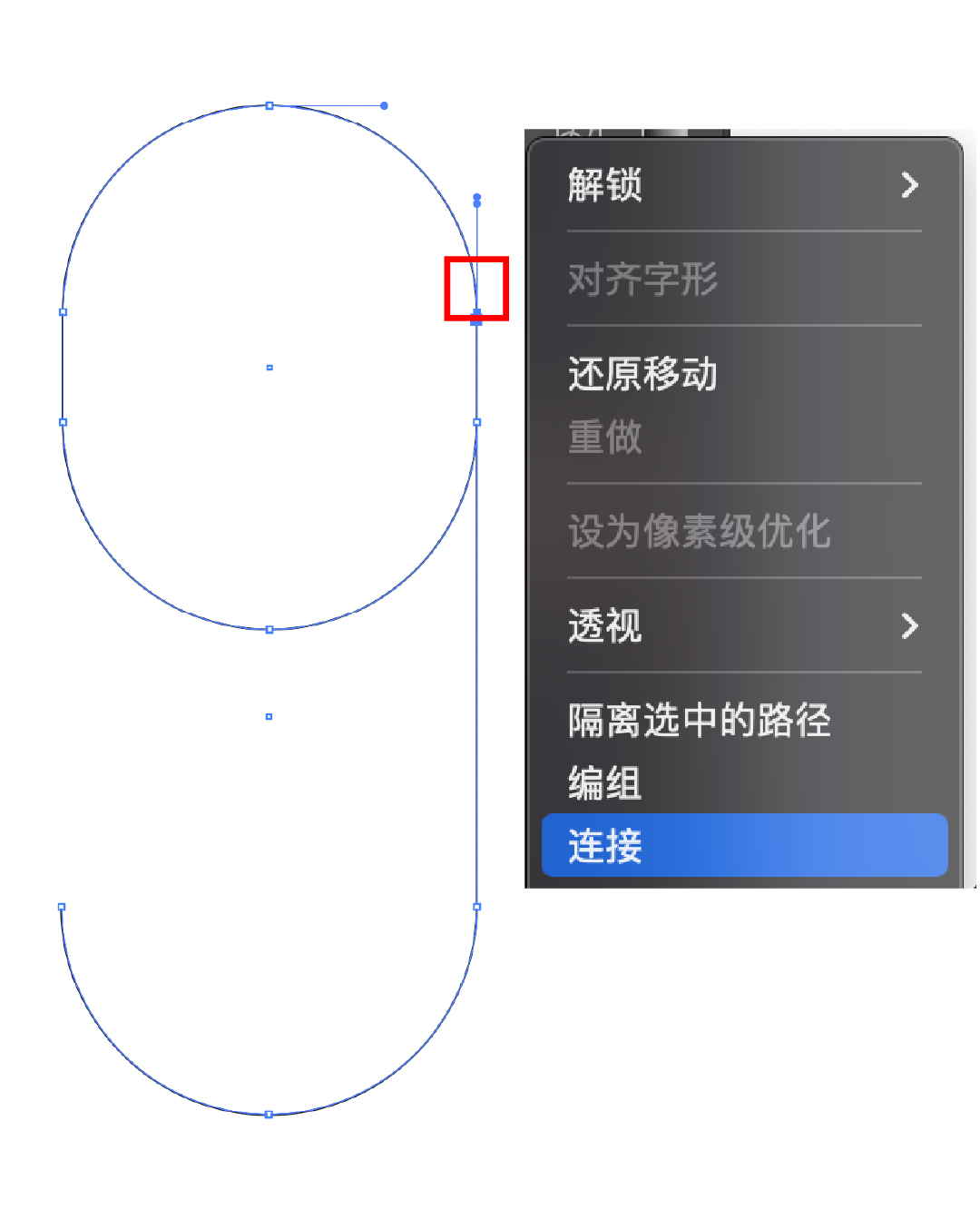
Draw two small squares, fill them with black and white, get the chess and card grid by copying, then copy one, select two objects, click [Effect]-[Mix]-[Create] to mix, the number of mixing steps Need more, here is 500. 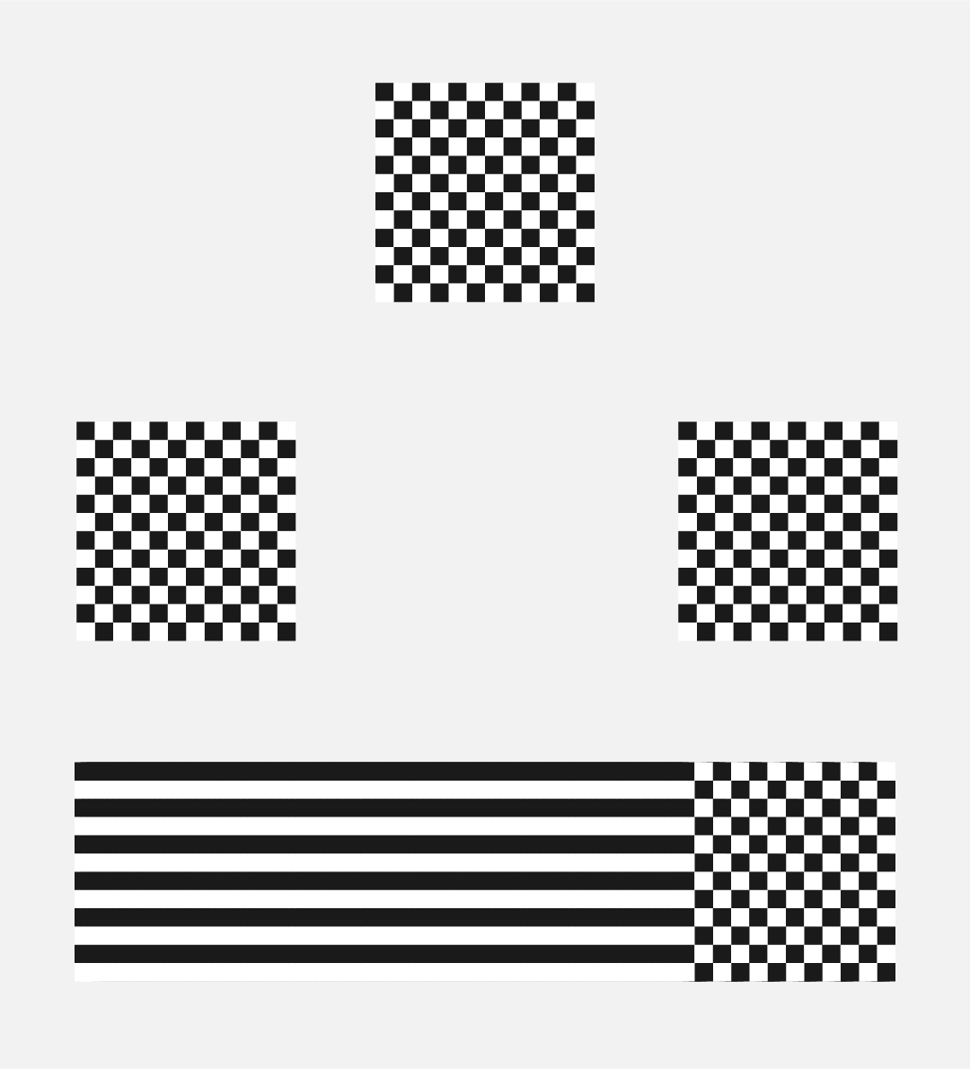
Select the path and the blending object, and select 【Effect】-【Mix】-【Replace Blend Axis】. 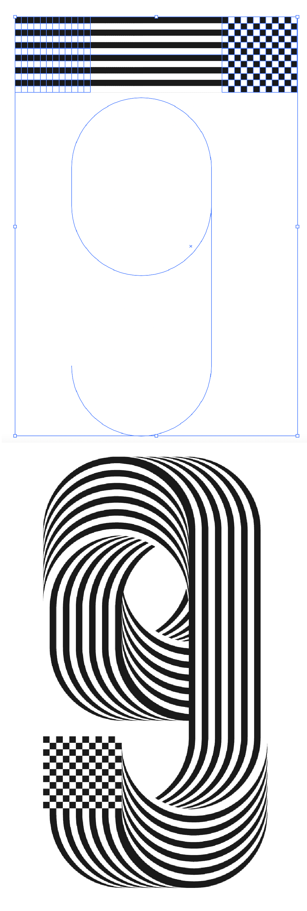
Similarly, draw another ellipse, add an anchor point, then select this anchor point, and click the cut button at the top of the software;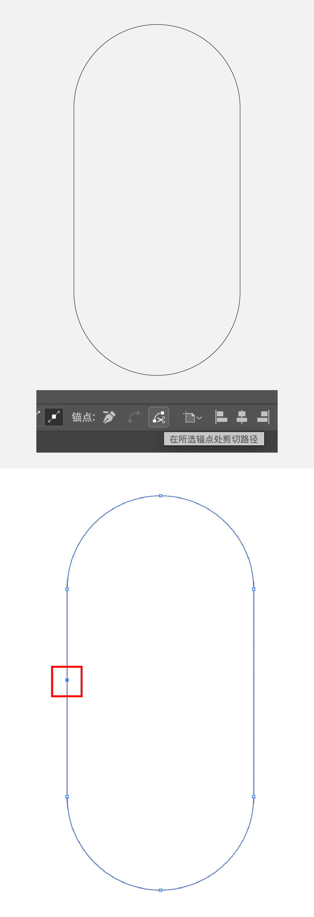
The same method, replace the mixed axis to get: 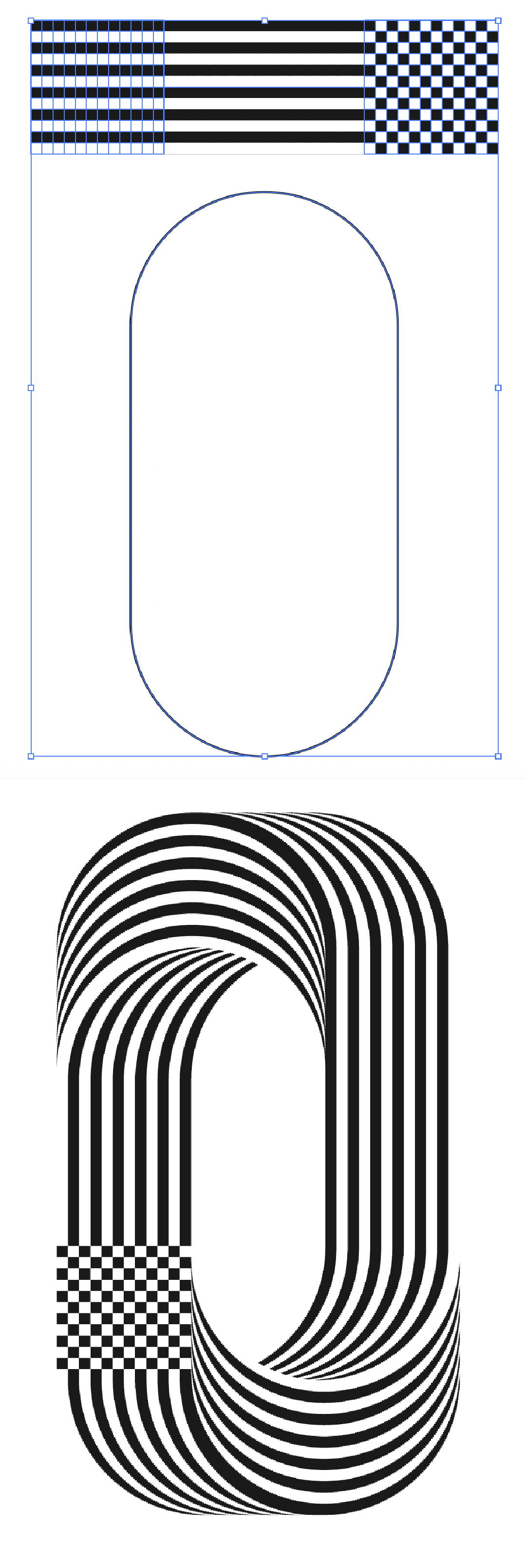
Then at the end, draw a black and white block and copy it to cover the chess box, and there will be a circular line effect. 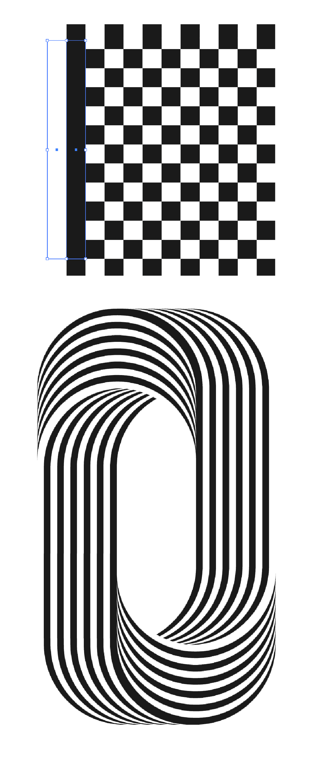
You can use the font library, or vector shape or pen tool to get this font path, and set it as a stroke effect. 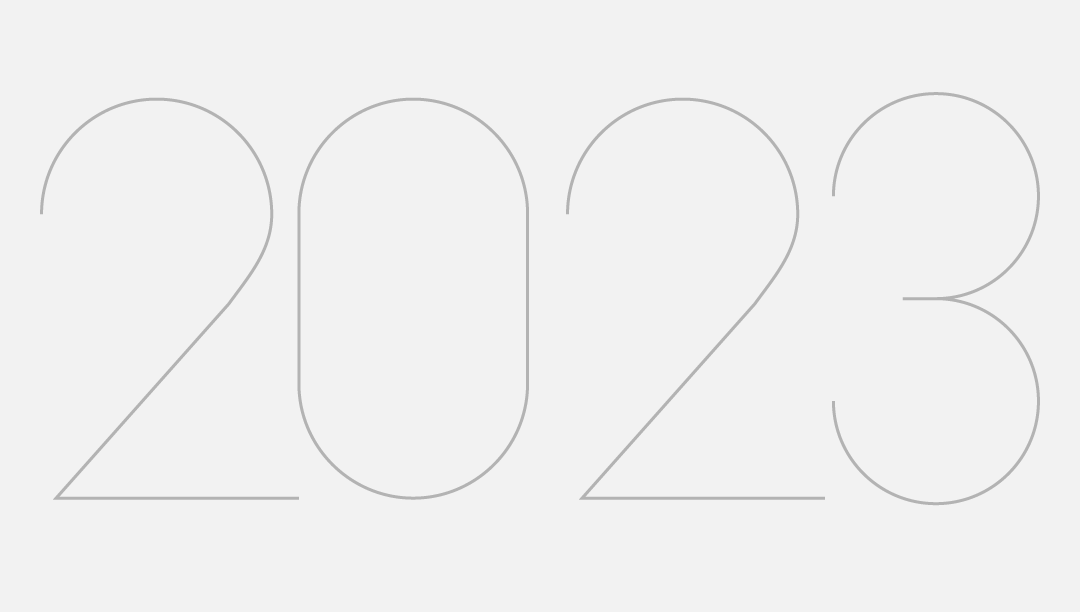
Draw a group of color blocks, group them, and drag them into the symbol panel. 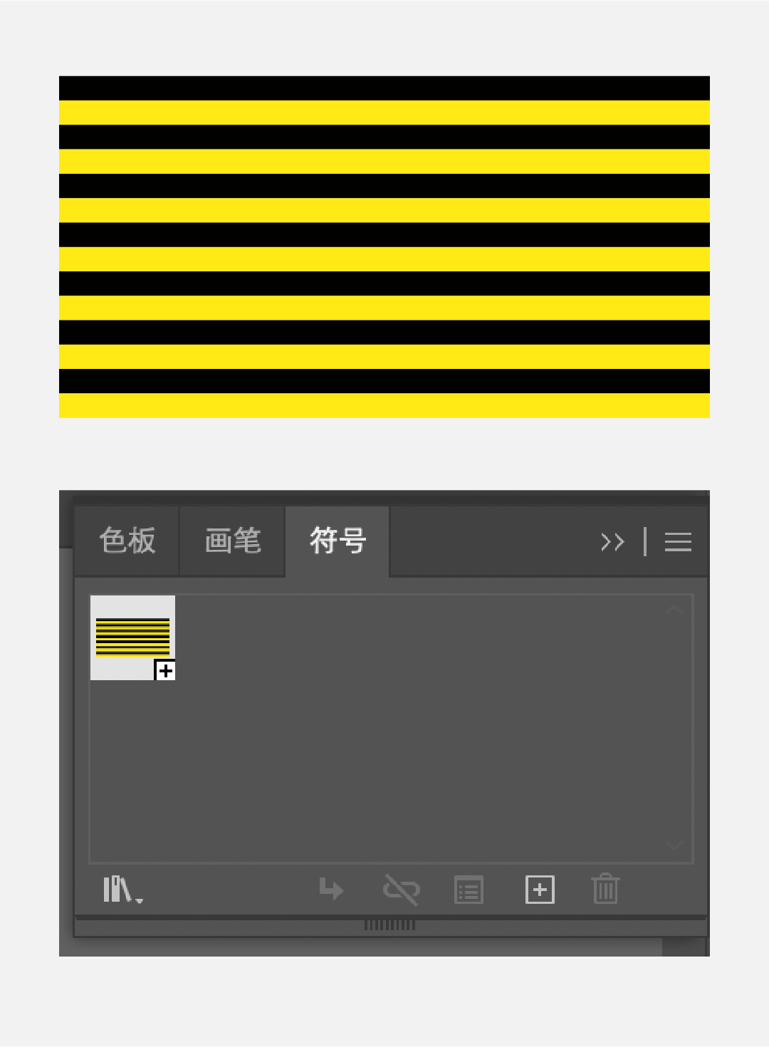
Select the number, click [Effect]-[3D]-[Protrusion and Bevel]. Select the newly created symbol for multiple faces to map, check [Scale to fit] at the bottom left and [3D model is not visible] at the bottom right. 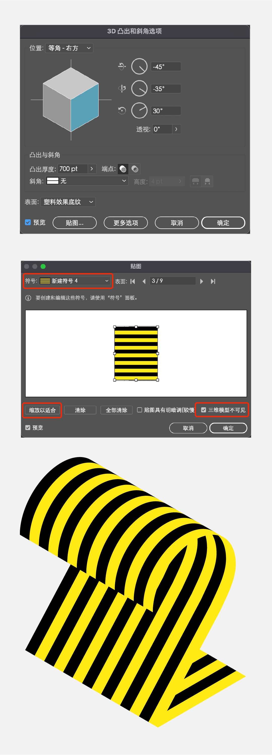
In the same way, treat several other numbers in the same way, you can get:
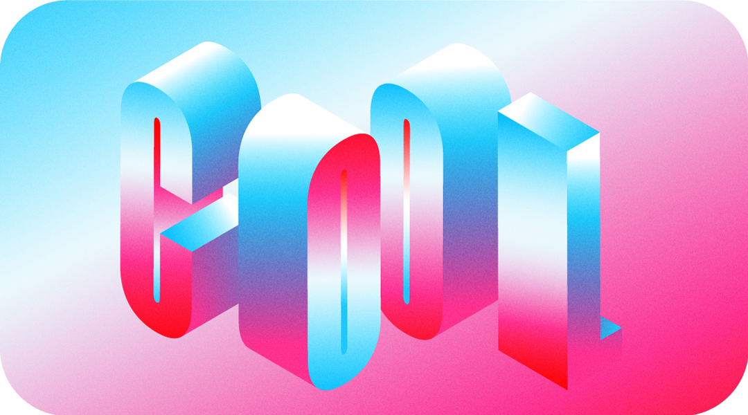
Choose a slender font, re-select larger characters, and type the desired words; 
Select a single letter, click [Effect]-[3D]-[Protrusion and Bevel], the numerical reference is as follows: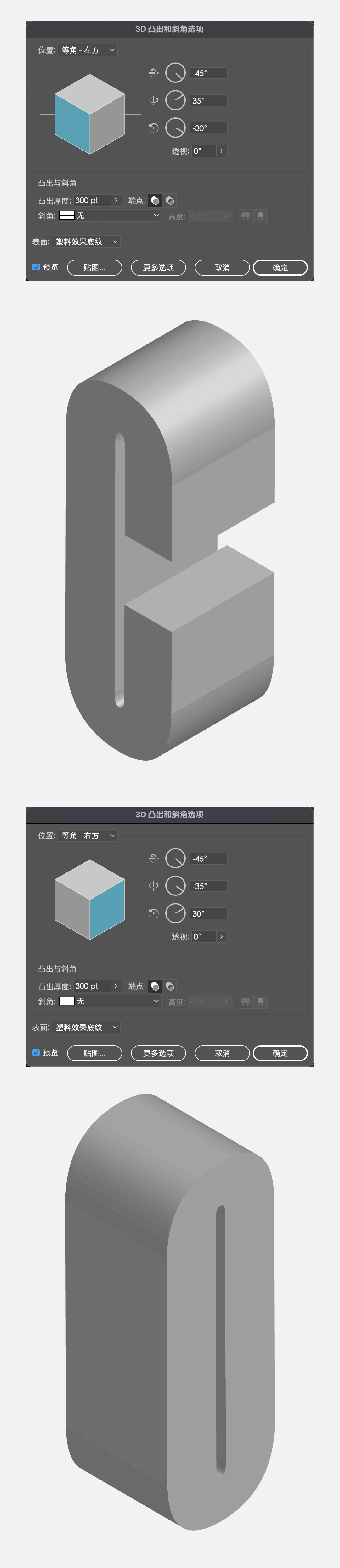
Expand the appearance, then merge the block faces, and then set a gradient color to color several faces separately. During the coloring process, different gradient angles can be adjusted according to different faces. 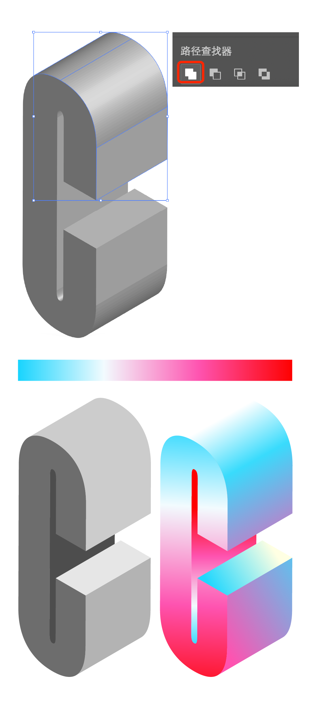
In the same way, color the other letters one by one. You can draw a dark block, and then click [Effect]-[Artistic Effect]-[Film Grain] to add some noise effect , covering the top layer, and select the soft light effect. 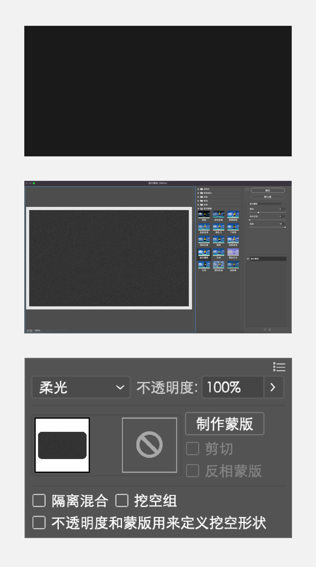
Click [Polygon Tool] to draw a 6-gon, no fill, black stroke mode, and then use the pen tool to draw 3 lines to connect several endpoints. 
Zoom down and copy repeatedly to get the following picture:
Select all the polygonal objects, click the [Shape Builder Tool] in the toolbar, hold down the [Shift] key to merge the relevant paths, and the final shape is as shown in the figure below. 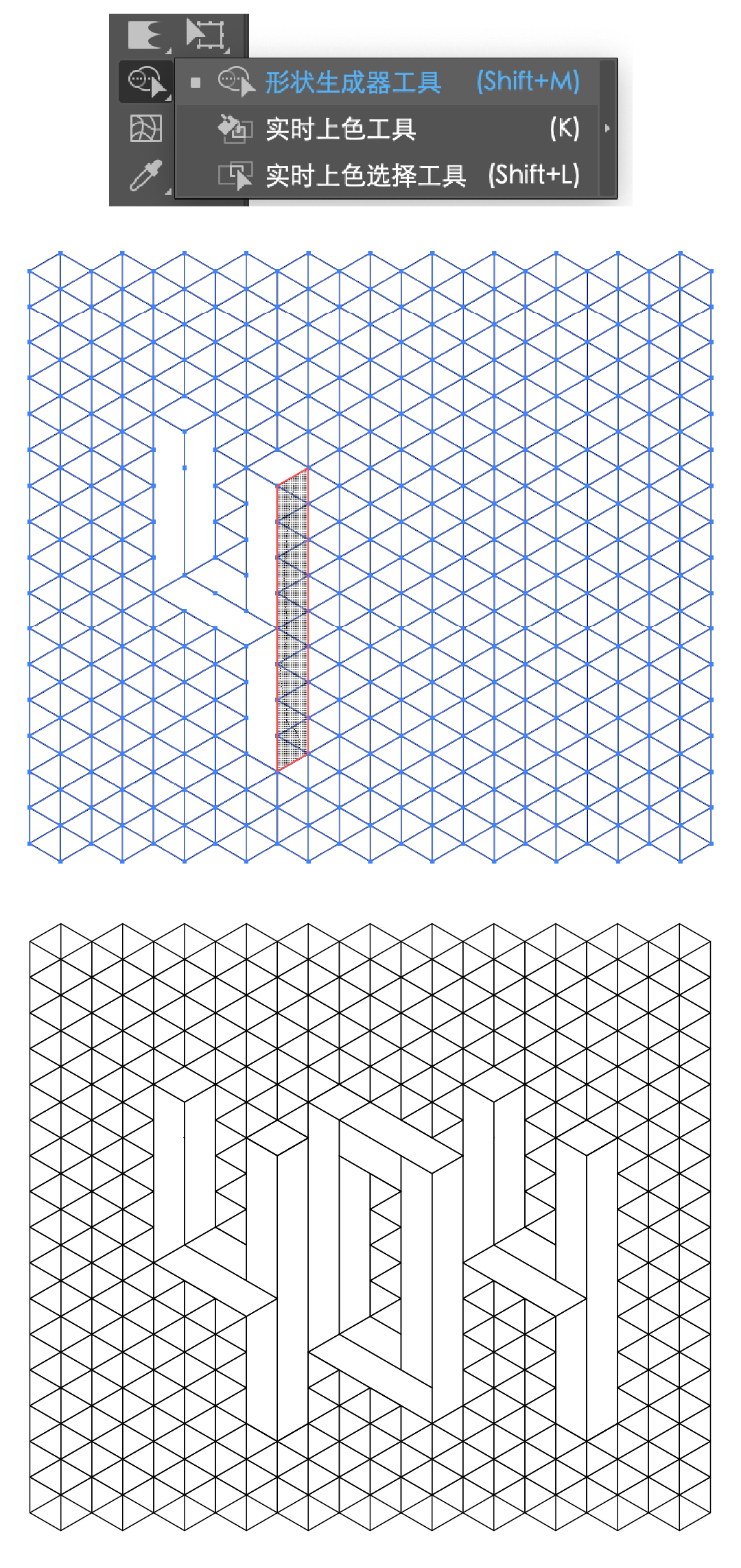
Select the generated shape, extract it, and then fill each color block with color. 
Enter favorites to eat ashes!

Author: Big Bear
Source: Hu Xiaobo Studio
ReadRecommended
Secondly know three AI magic skills!
5 simple and practical AI tips, you can get started as soon as you learn it!
About those very popular skills, how did you play them? Those very popular skills are here again, each of them is very practicalSuch a simple and practical AI trick , If you don't learn, you will lose!
The popular AI skills are here again, each one is very practical
The popular AI technique is here again, and the personal test is effective! !
The hot AI technique is here again! ! Very practical
Very popular AI skills come again and again, personal test is effective! !
8 AI skills add BUFF to your LOGO!
< /section>6 advanced AI techniques, if you don't know it, it will be too late!
9 cool Ai graphics process skills
Dry goods! ! 28 AI Super Practical Tips! ! ! (Favorites)
Dry goods! ! AI super practical tips!
Even if you have a good design, you may not know these 6 AI skills
7 Practical Details Tips in Design
Typesetting skills of 11 subtitles of dry goods
Ten Tips to Improve Album Design
Dry goods! ! AI super practical tips!
More than 50% of designers do not know these 7 Ps tips. Share a few practical design tips! These 12 AI tips, you will know them at a glance!
AI & PS uses simple techniques to design efficiently
Super practical new AI 3D Function tips, come get it! 8 Ai Practical Tips in Layout Design
Keyword reply: (You can see the corresponding knowledge article)
Printing, business card, poster, logo design, tea packaging, color spectrum, folding page, BANNER, Tucao video, takeaway, AV, quote, Japanese poster, layout, Republic of China, Software, Olympics, benefits, resumes, moon cakes, Tmall, Double Eleven, recipes, red envelopes...
Like it if you learn "waste"
↓↓↓
Articles are uploaded by users and are for non-commercial browsing only. Posted by: Lomu, please indicate the source: https://www.daogebangong.com/en/articles/detail/10%20Ai%20font%20effects%20you%20dont%20know.html
 支付宝扫一扫
评论列表(196条)
测试