Click on the top blue word, Set me as a star ☆ bar


Illustration by MeimeiMao
Today is the summer solstice. The 10th solar term in the twenty-four solar terms is between June 21st and 22nd in the Gregorian calendar every year. On this day, the sun shines directly on the Tropic of Cancer. It is the longest day and the shortest night in the northern hemisphere throughout the year.

This day, I would like to introduce WINGYEEYAO, a female designer currently living in London, England. After reading her works, you will find that she is a versatile designer.
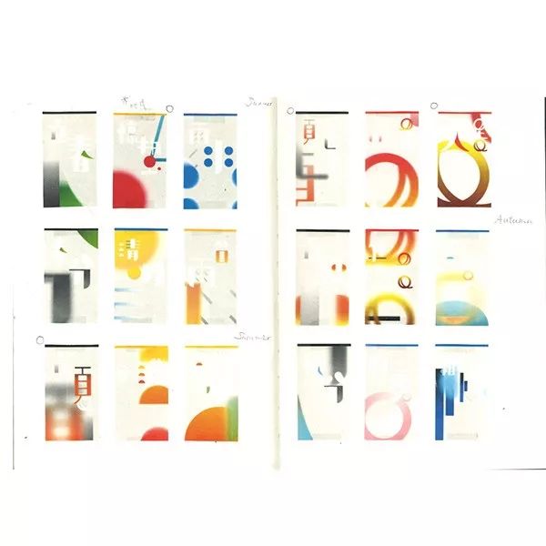
First, I would like to share with you her last year's WeatherCalendar- solar terms calendar font design project.
"Daily/routine"-Usually refers to something that is preset and difficult to change. Such as rules, and the cycle of life.
The calendar on the desktop counts down one by one, and the mobile phone reminds us when we should wake up.
We go faster and faster, but become less and less sensitive.
I always feel that what we get from nature should actually be more.
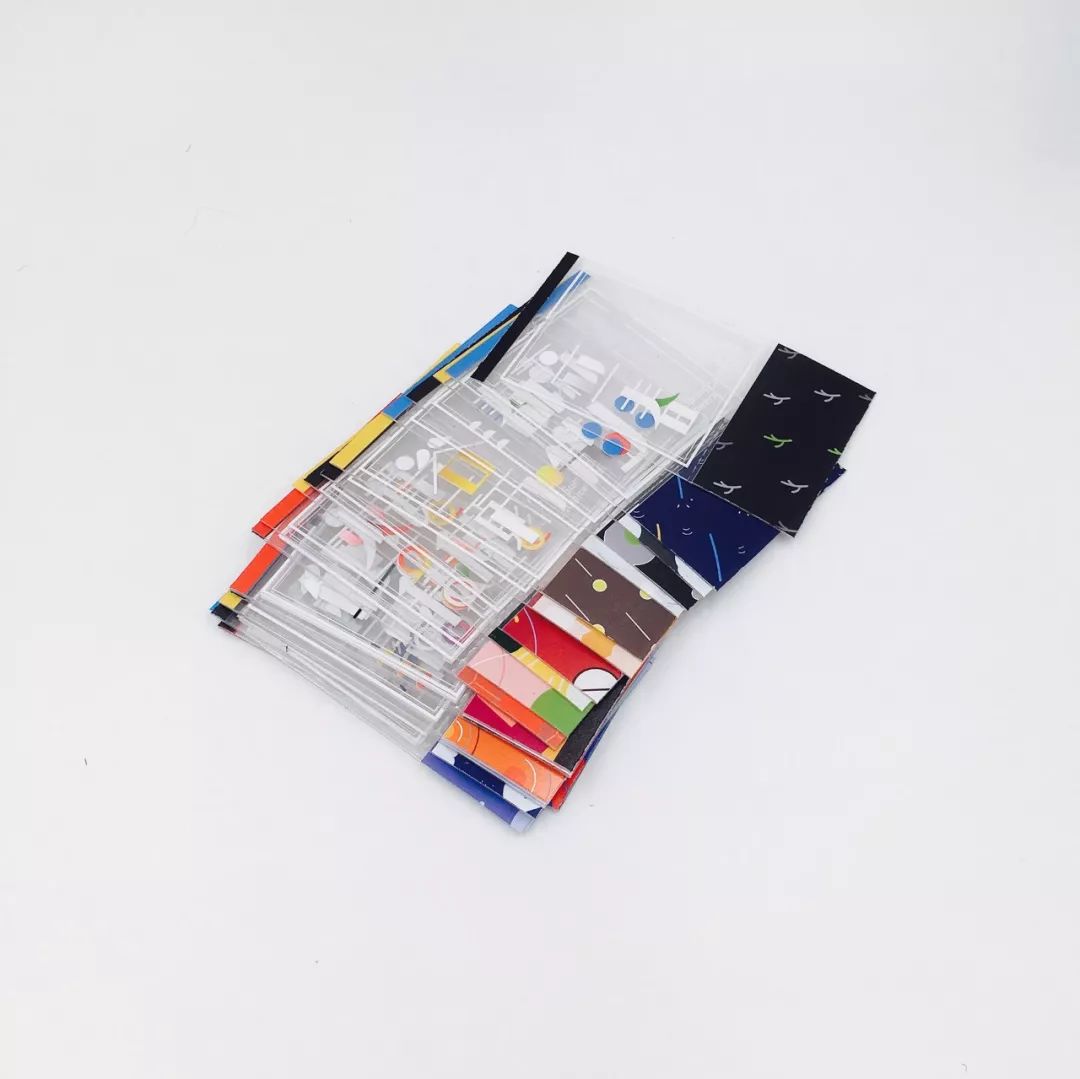
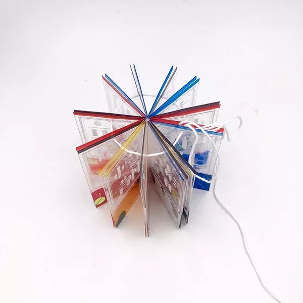
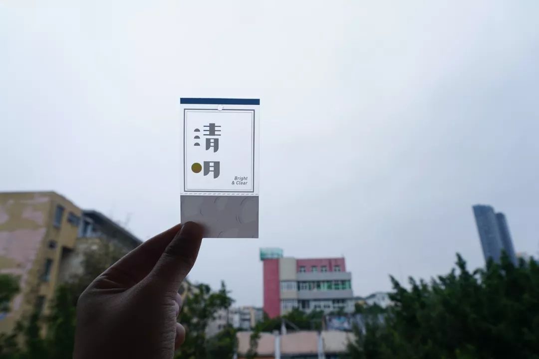
So WINGYEEYAOdesigned a carry-on for myself, asking me to remind myself to go out as much as possible. A set of transparent solar terms calendar, easy to share, always remind yourself, make good use of your senses.




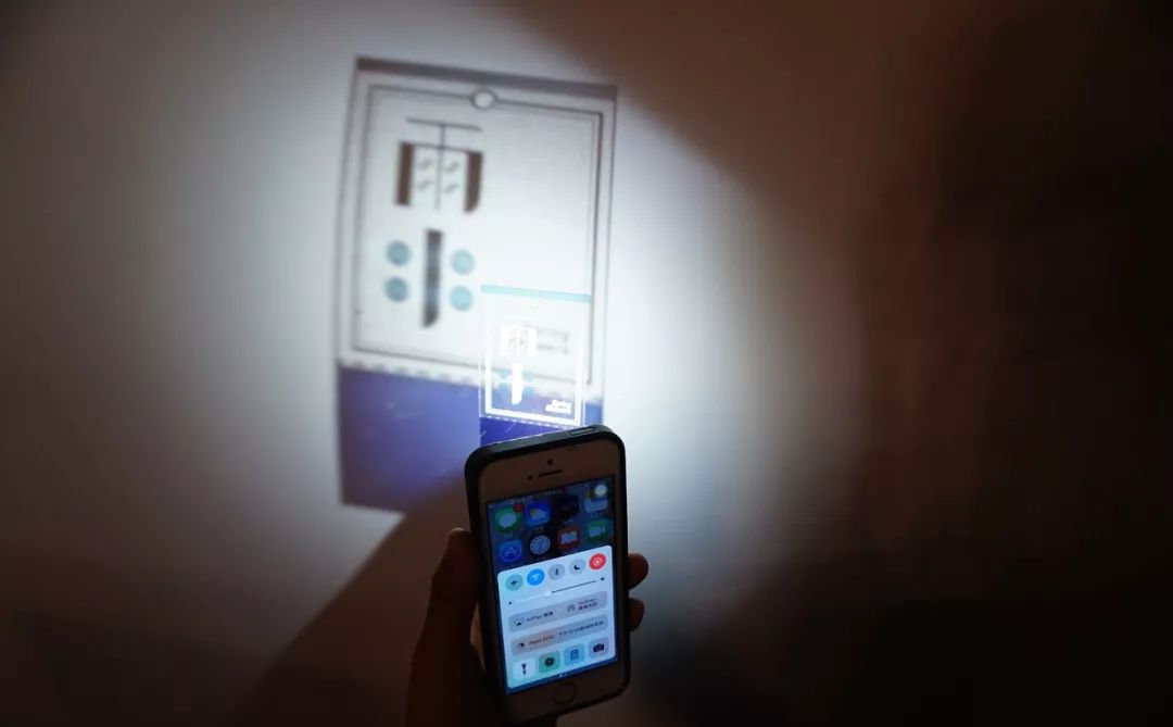

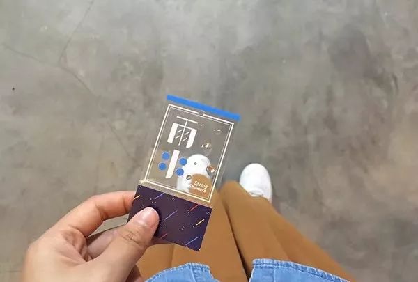
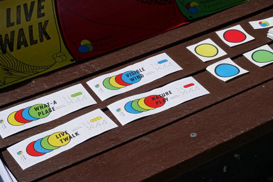
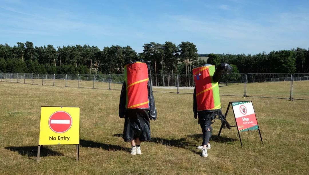
Last year, WINGYEEYAO also made a poster design about NomadicTours|Floatingspaces floating space, which was very interesting. It can be seen that she enjoyed the design very much.







In addition, she also designed the project SingleCycleSongsI|Single Cycle I in February this year.
Let's take a look.
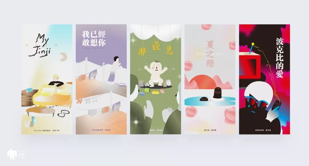
The reason for her design: I have always liked to listen to music while designing. I believe many people are like me. Ever since, Yipat Thigh opened a new series called Single Cycle, sharing some songs that I love single cycle when I was doing design. The following is the playlist for this time, and I would like to share with you my thoughts on these music and colors.


Soothing drum beats, hazy voice, as if you can see someone lazily leaning on the sofa and singing this song softly, he sings softly, "Only you can conquer time". Time seems to have stopped, and the memories are still in place. To create a soothing feeling, the main color is the soothing brown series, and the yellow-blue-orange gradient is used for brightening, which makes the eyes comfortable and fresh.
MyJinji-Sunset Speeder
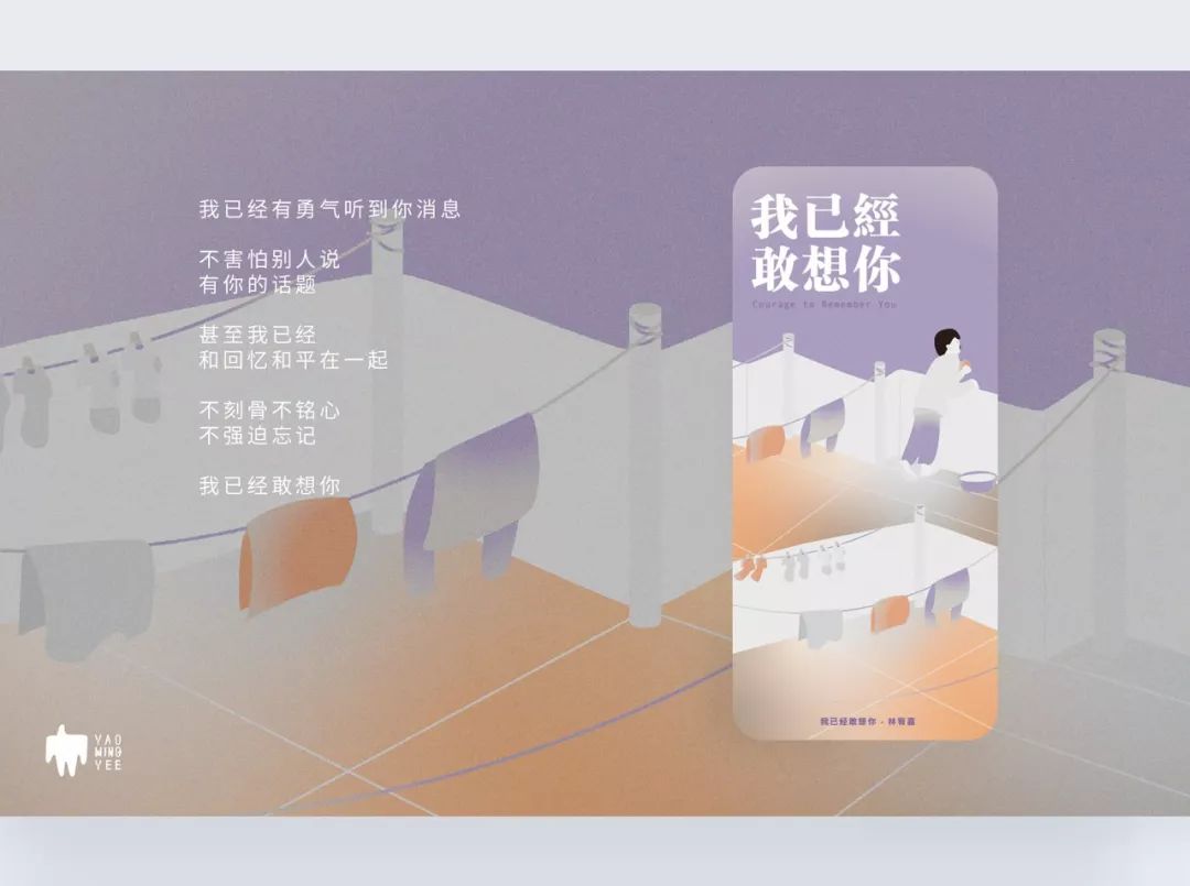
The long-lost good weather, in the evening, I hang your clothes on the top floor, go back and forth between clothes, eat your favorite apple, then stop on the terrace and look into the distance, and then find , I already dare to miss you. The background is gray-purple, the floor uses white, gray, and orange for contrasting gradients, and the characters and clothes use white to light gray to brighten the picture. Purple has a soothing effect, expressing a mood that is neither happy nor sad.
I already dare to miss you-Youjia Lin

Things usually have two sides. Looking at things from another angle, bitterness is also sweet. This is a Cantonese song, the rhythm of the music and the lyrics feel very soothing, making people feel very warm. Instead of constantly worrying about what will happen tomorrow, it is better to learn to cherish the present, be yourself with peace of mind, and let go of attachments. Who is not a baby? The main color of the screen is green, and the other accessories are gray to highlight the cleanliness and warmth of children.
See you over there-SWING
This is a gentle electronic music that makes people sway gently. If there is love, even in the cold winter, even if we soak in the cold sea water, our hearts are still warm, and it is always summer. The picture uses relatively simple graphics to express a romantic scene. The pink mountain and the orange circular sunset express the feelings of the characters in the illustration after being enlarged and exaggerated, and also create a gentle atmosphere with the picture.
Summer Love - Tour
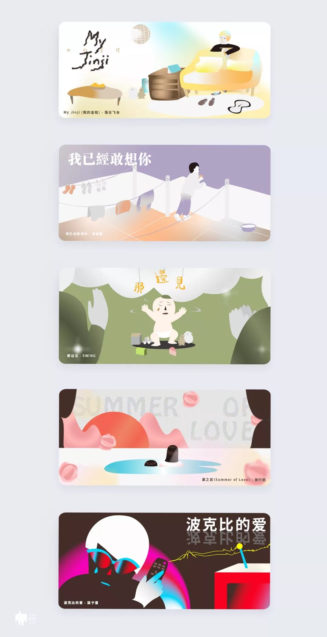
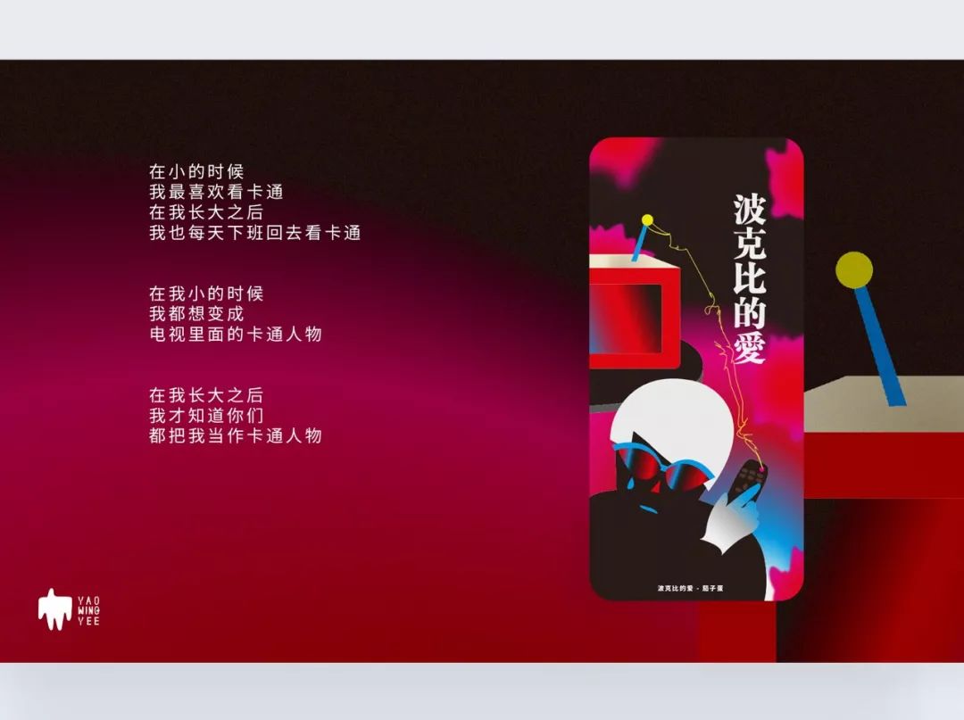
I loved watching cartoons when I was a child, and I also loved watching cartoons when I grew up, but I found that you also regarded me as a cartoon character. A song I found by chance, the melody is very fresh and exciting, at first it sounds like being handsome, but I feel that it is actually a big boy expressing his true love. The background color is black with a brownish tone. The TV uses red, rose red, and blue as gradient colors, giving people a visual stimulation. There are six Poppys hidden in the background. I wonder if you can see it?
Pokeby's Love - Eggplant Egg


She also uses a 5 yuan card box to create three pocket series with different themes: travel notes, random thoughts, and character illustrations (Pon and John).

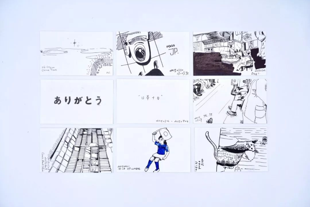

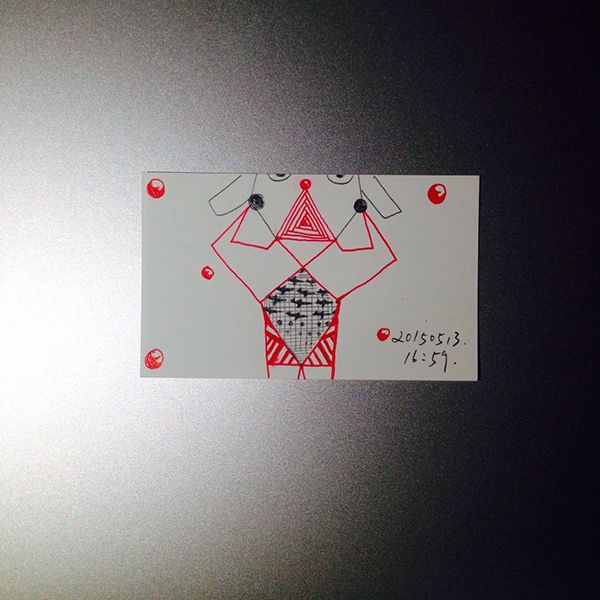


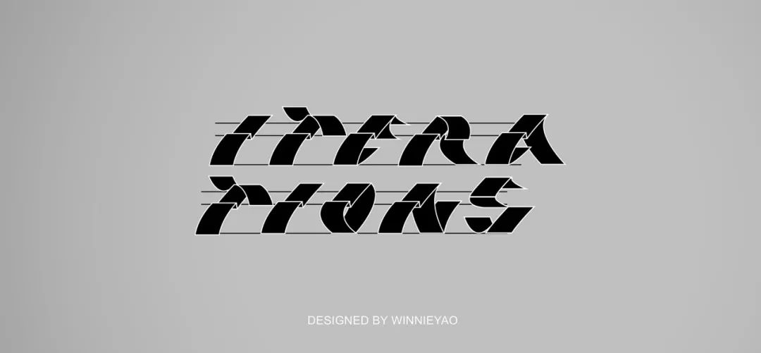
In addition to vector and hand-drawn illustrations, she also has her own understanding of typography.
Iteration|English font design/poster design is her work design in February this year.
The "Iterative" design exhibition expresses a conscious and critical design thinking. We use language, design methods and design practices to interpret and explore the traditional design industry, and communicate with various disciplines. All endings are a new beginning, and "iteration" is to add new reserves on the basis of the original to prepare for the next progress, just as graduates start a new chapter of life.


This font proposal uses two visual elements to express the concept of "iteration".
The first one is clean, overlapping paper, implying that stepping out of the society, students will open a new chapter in life and absorb new nutrients like white paper. Every page has a meaning of existence, because every Each chapter will have new accumulation.
The second is the game idea of Snake. This idea compares the design to a game. Every Pacman score is a new iterative process. The pixelated Snake is supplemented by a perspective space, which creates a new exit for Snake outside the screen, so that the design is not limited to the original There is space inside.


In addition to being good at illustration, font design and graphic design, and product development and design, WINGYEEYAO's three-dimensional design ability is also outstanding.

What does the future look like? Maybe a hundred people can give a hundred different answers. Some people imagine the future as a colorful jungle, while others imagine the future as a cyberpunk electronic world. The future attracts us because we all look forward to those unknown and exciting moments. No matter what, the future will come, and the Vision of Tomorrow uses different scenarios as opportunities to provide one of the future possibilities. In this futuristic city, everything happens just like this, there is no noise or splendor, and life is orderly, as it should be.
As the city continues to grow and the settlements begin to saturate, the city begins its folding vision. Every morning at nine o'clock, the smart alarm clock set in the room will remind you to go out before the house starts to fold. After five o'clock, the residential area slowly unfolds, and people return home to rest, and Saturdays and Sundays are no exception. In this future, everything is arranged, the city is more efficient, and the future just happens.


This is her Be:winnieywy, visit for more works.
Finally, share a video of this design project:
|Click to watch the video|
In this future city, everything happens just like this. It is neither noisy nor splendid, and life is orderly, as it should be.
As the saying goes, "Too many skills do not overwhelm one's body". Although learning more does not guarantee more benefits, in addition to increasing performance opportunities and leaving more opportunities for oneself, it can also cultivate sentiment and enrich life. What to learn mainly depends on which aspect you think is more suitable for you and more conducive to your future development.
Of course, not everyone can be multi-talented, but from a personal point of view, it is much safer to learn one more skill than to only know one skill. In the workplace, at any time, don’t overestimate your situation too optimistically. It’s good to be positive and optimistic, but at the same time, you must also have a sense of crisis.
It is harmless to make more plans for your future.
****************
The copyright of the work belongs to the author
@Font design editor release
Why is illustration packaging design more and more popular?
How did Godzilla stand in the 4km deep sea?
tutorial|How to iconify text?
Design includes font design, observation and association are very important
Offline|Liu Hen's 25-day design training camp is recruiting students
Articles are uploaded by users and are for non-commercial browsing only. Posted by: Lomu, please indicate the source: https://www.daogebangong.com/en/articles/detail/A%20versatile%20designer%20good%20at%20illustration%20font%20design%20C4D%20product%20development%20and%20design.html

 支付宝扫一扫
评论列表(196条)
测试